
Your landing page’s weakest score is Trust.
How Twinkl ranks
63Growth scoreupdated
category scores
category scoresShowHide
Trust
52FairProof that the product is real, competent, and safe to try.
| Trust read | |
|---|---|
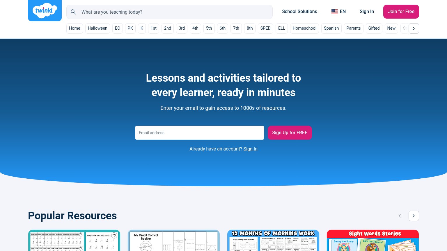
| Twinkl | Real resource previews in the "Popular Resources" carousel (e.g., "My Pencil Control Booklet", "Sight Words Stories", "1 |
| BUILT ON GHANA'S NATIONAL CURRICULUM — NaCCA, GES, KG 1–B9, 4,500+ indicators | |
| Privacy banner linking to the "Global Privacy Statement" | |
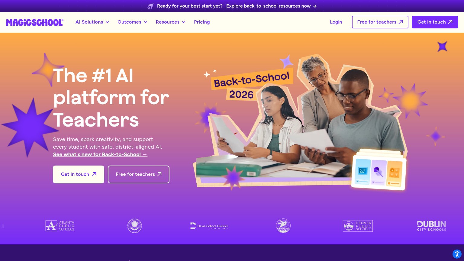
| District customer logo strip (Atlanta Public Schools, Davis School District, Denver Public Schools, Dublin City Schools) | |
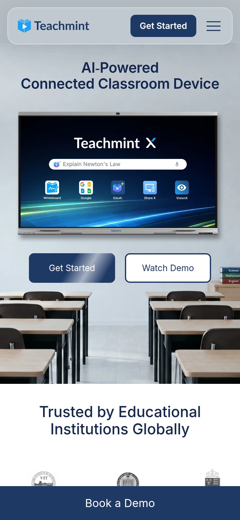
| "Trusted by Educational Institutions Globally" section with institutional seals (e.g. VIT) on mobile |
Information hierarchy
58FairDoes the design help or inhibit what the page is trying to say?
1234- Grade filter rail — 20+ equal-weight pill links drain attention from the signup form before the headline is even read.
- Join for Free button — Duplicates the hero's Sign Up CTA at similar weight, splitting the one conversion action across two targets.
- Header search bar — Largest element in the top band, inviting a browse detour before the value prop and signup are seen.
- Sign In links — Hero repeats the header's Sign In, adding a third exit inside the conversion zone.
Mobile web
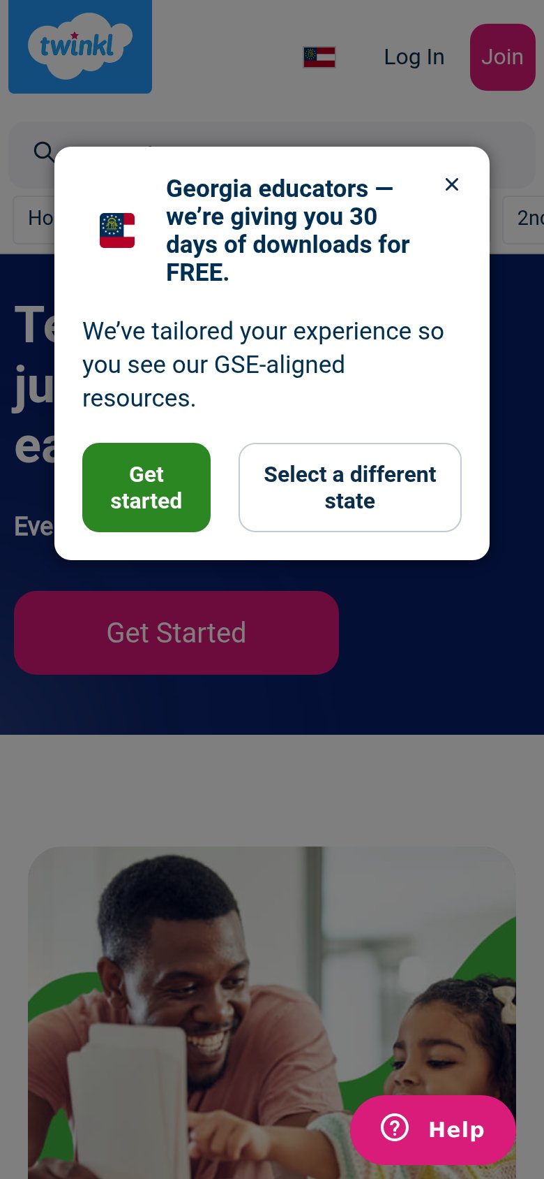
58FairThe phone experience as a first-class citizen.
What works
What to improve
Value props
72FairTitle, subtitle, hero — do they sell the product's true value?
Twinkl’s headline
Lessons and activities tailored to every learner, ready in minutes
Enter your email to gain access to 1000s of resources.
Working
Could improve
CTA
76FairCopy, size, verb, cost-feel — does the primary CTA earn the click?
How Twinkl compares
Recommended rewrites