
Your landing page’s weakest score is Information hierarchy.
How truthsystems ranks
65Growth scoreupdated
category scores
category scoresShowHide
Information hierarchy
62FairDoes the design help or inhibit what the page is trying to say?
 1234
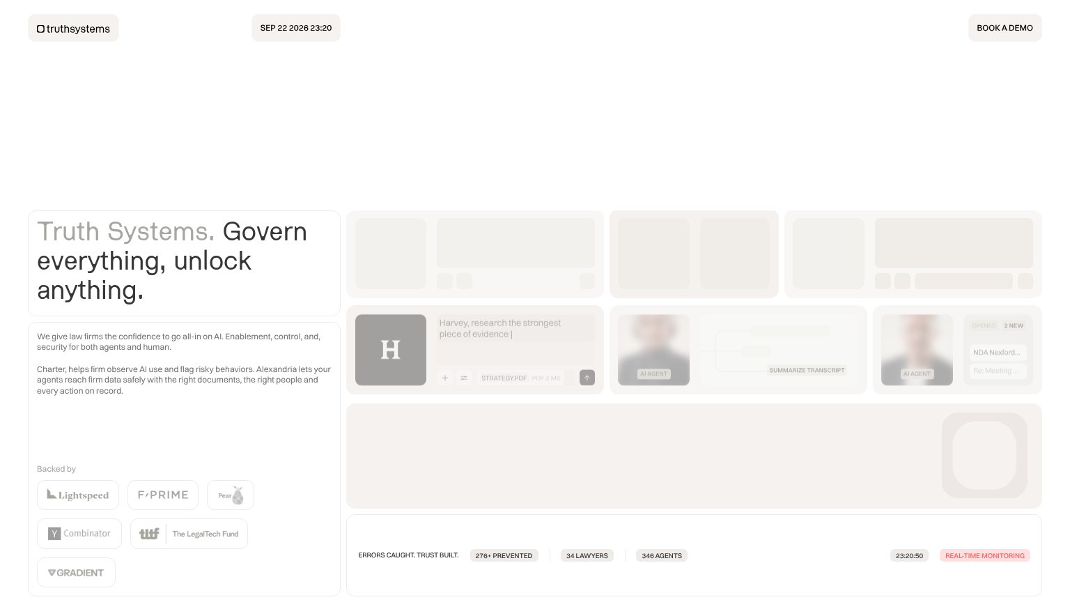
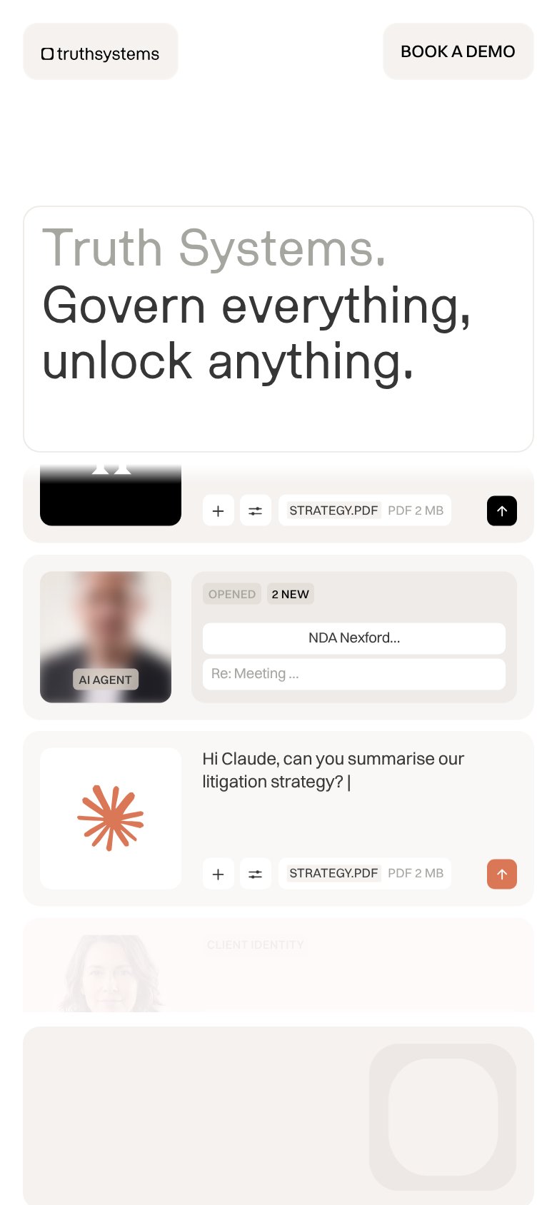
- Faded demo grid — Entire right-hand product showcase is washed out to near-invisibility, communicating nothing at a glance.
- Half-greyed headline — "Truth Systems." fades into the background, splitting the headline's weight and slowing comprehension.
- Faint body paragraph — The Charter/Alexandria explanation is light grey on cream, forcing effort to read the core pitch.
- Muted CTA button — "BOOK A DEMO" shares the same beige pill styling as the date chip, weakening one-second findability.
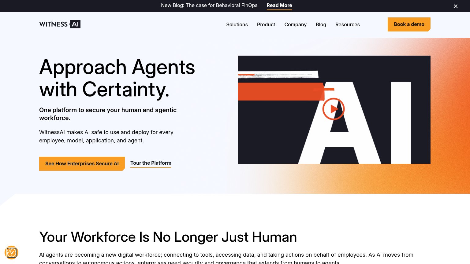
CTA
62FairCopy, size, verb, cost-feel — does the primary CTA earn the click?
Problems
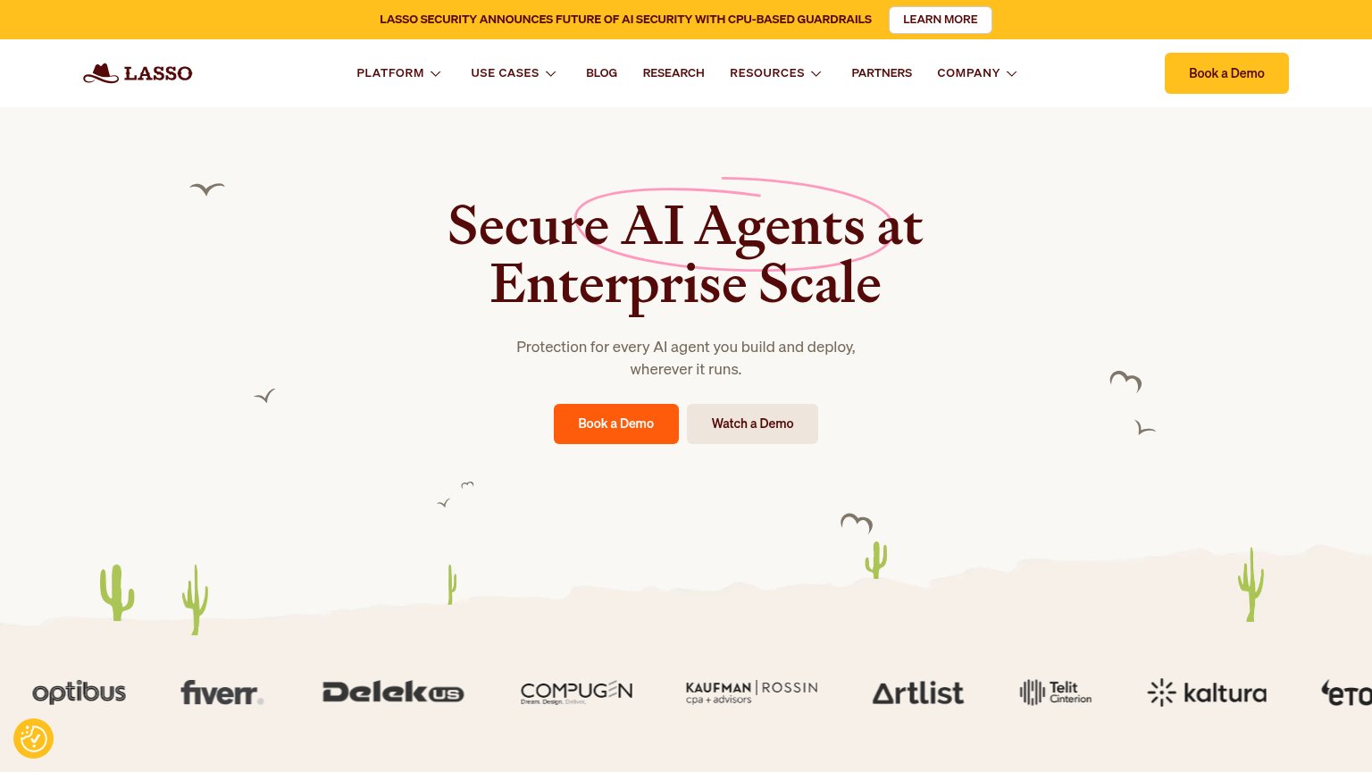
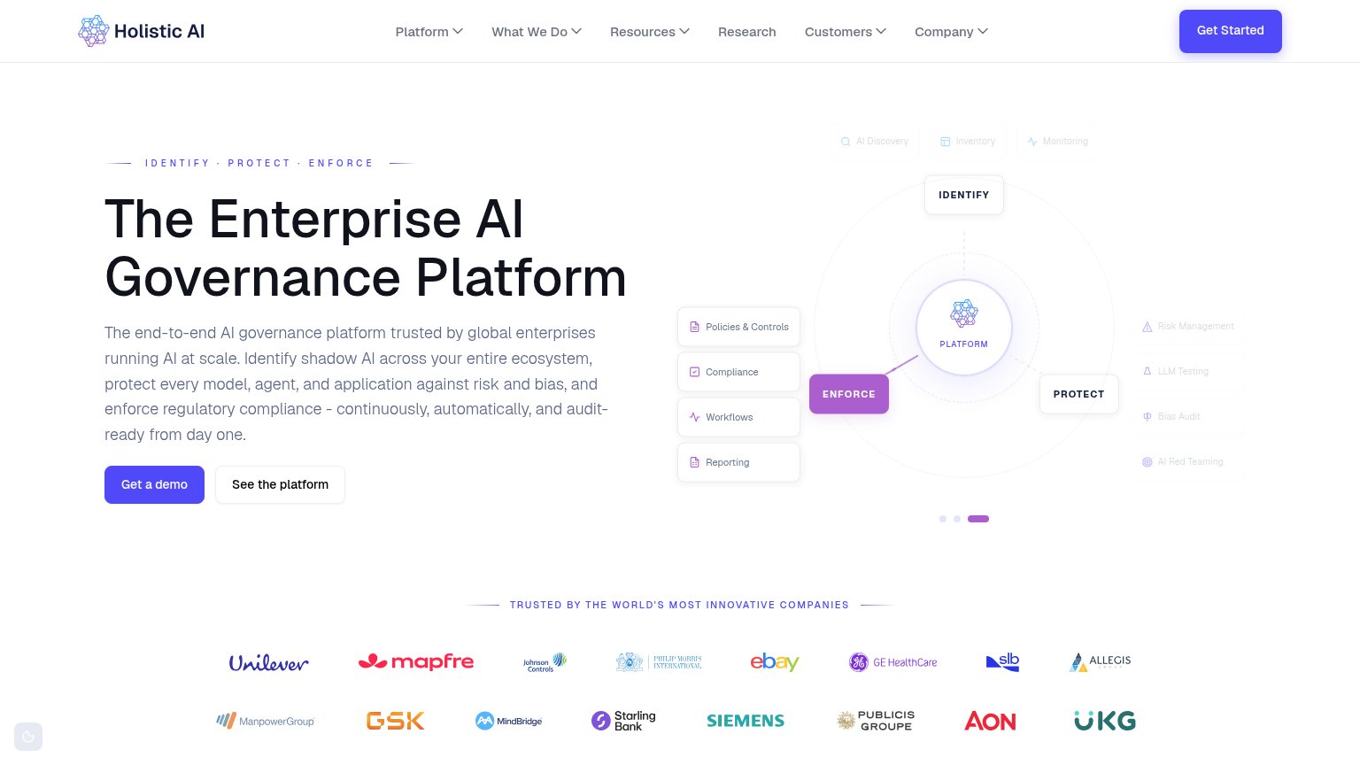
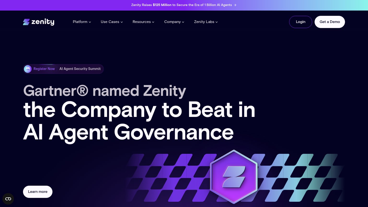
- demo click feels costly, sales-y
- nav-sized, no hero CTA
- no low-commitment alternative
Trust
62FairProof that the product is real, competent, and safe to try.
How truthsystems compares
Trust read
Mobile web
68FairThe phone experience as a first-class citizen.
What works
What to improve
Value props
72FairTitle, subtitle, hero — do they sell the product's true value?
truthsystems’s headline
Truth Systems. Govern everything, unlock anything.
We give law firms the confidence to go all-in on AI. Enablement, control, and, security for both agents and human. Charter, helps firm observe AI use and flag risky behaviors. Alexandria lets your agents reach firm data safely with the righ
Working
Could improve