
Your landing page’s weakest score is Trust.
How tiremusu.app ranks
- 1.
Conductor81
- 2.
tiremusu.app74
- 3.
CodeLayer (Humanlayer)66
- 4.
Vibe Kanban62
74Growth scoreupdated
category scores
category scoresShowHide
Trust
58FairProof that the product is real, competent, and safe to try.
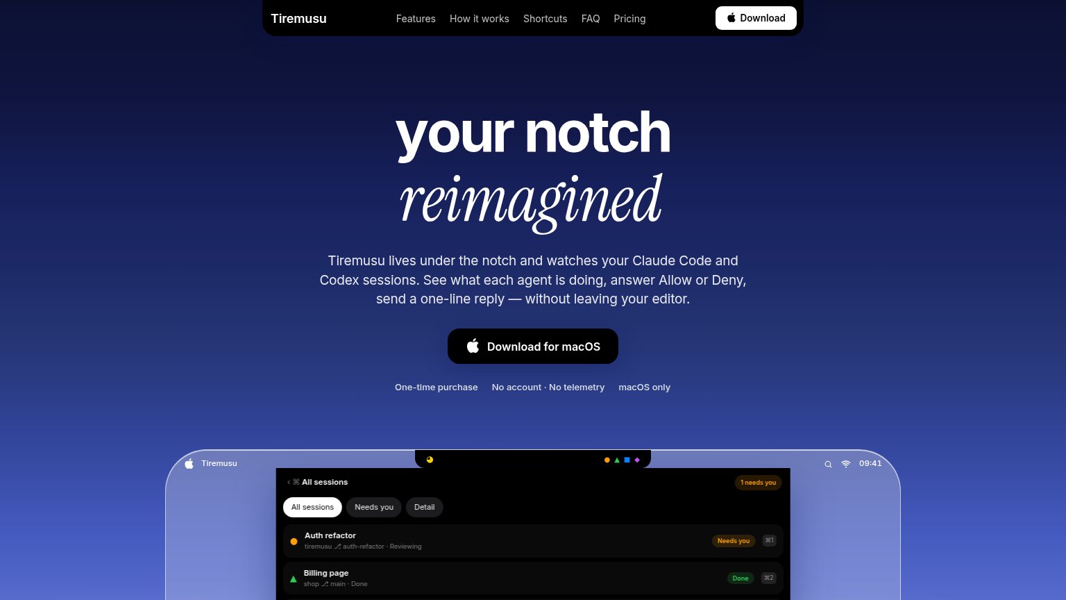
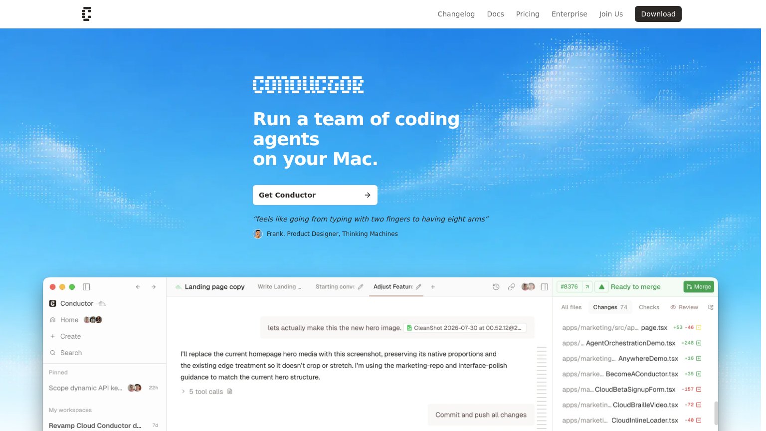
| Trust read | |
|---|---|
| tiremusu.app | Product screenshot showing real session UI with "Auth refactor · Needs you" and "Billing page · Done" states |
| "feels like going from typing with two fingers to having eight arms" — Frank, Product Designer, Thinking Machines | |
| "Works with" integration icon row showing recognizable AI tool logos (including OpenAI) beneath the CTA | |
| "TRUSTED BY ENGINEERS AT" logo strip (Upstart, Casco, Osmosis, Ambral, Nautilus, Squads, Weave, Risotto, Roadrunner) |
Value props
68FairTitle, subtitle, hero — do they sell the product's true value?
tiremusu.app’s headline undersells
your notch reimagined
Tiremusu lives under the notch and watches your Claude Code and Codex sessions. See what each agent is doing, answer Allow or Deny, send a one-line reply — without leaving your editor.
Working
- Subhead names users, agents, exact actions
- Hero screenshot shows real session states
- Trust chips: one-time buy, no telemetry
Could improve
- H1 is a metaphor, says nothing to new users
- No numbers or quantified outcome anywhere
- True value buried in the subhead
Mobile web
76FairThe phone experience as a first-class citizen.
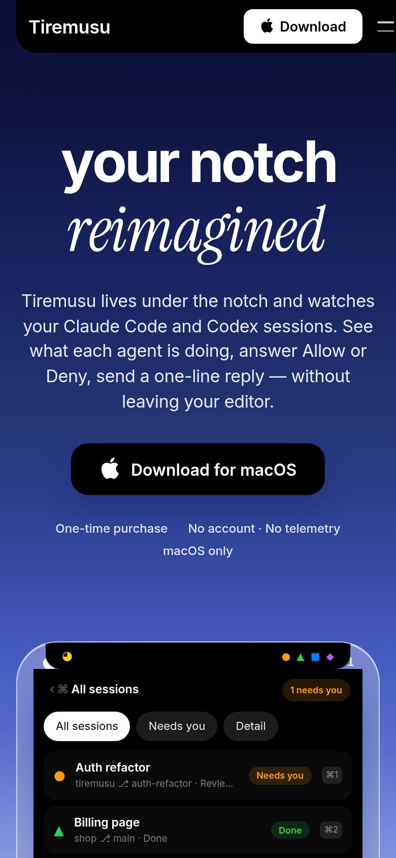
What works
What to improve
CTA
82StrongCopy, size, verb, cost-feel — does the primary CTA earn the click?
How tiremusu.app compares
Recommended rewrites
Information hierarchy
86StrongDoes the design help or inhibit what the page is trying to say?
What works
What to improve