
Your landing page’s weakest score is Trust.
How Tango ranks
74Growth scoreupdated
category scores
category scoresShowHide
Trust
42PoorProof that the product is real, competent, and safe to try.


| Trust read | |
|---|---|
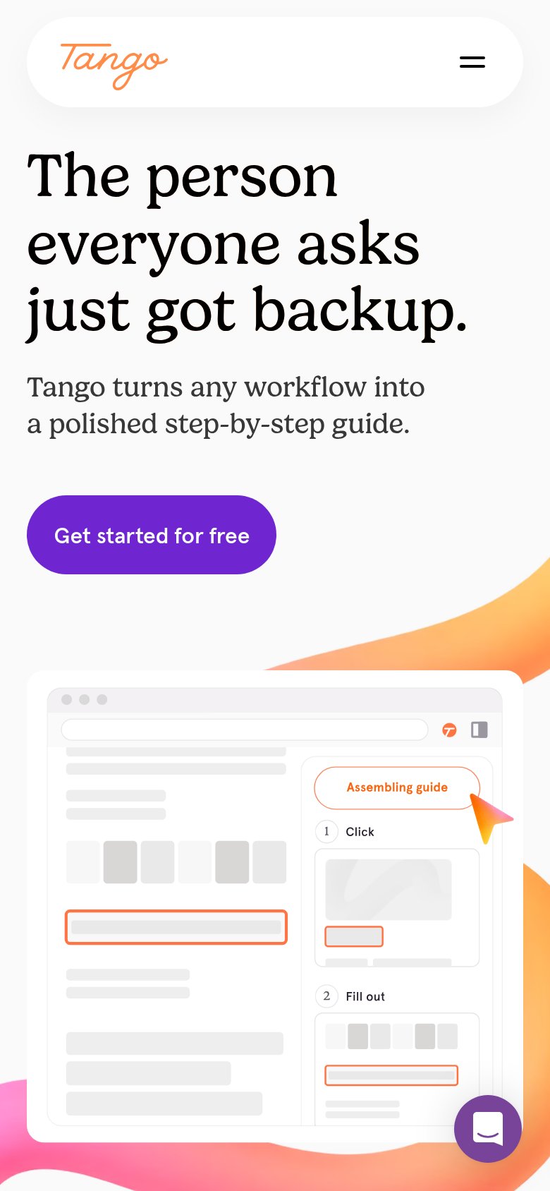
| Tango | Stylized product demo panel showing "Capturing your clicks" with numbered Click and Fill out steps |
| "Backed by Y Combinator" badge in the desktop navigation | |
| Detailed product screenshot showing the "Infrastructure Fund Utility and Energy Investments Process" workflow with numbe | |
| implicit context Scribe may benefit from pre-existing familiarity among its target audience. | |
| "Trusted by Global Leaders" stat band: "4 in 5 Top US Banks" through "1 in 4 Fortune 50" | |
| No visible trust signal identified. |
Information hierarchy
76FairDoes the design help or inhibit what the page is trying to say?
 123
- Duplicate header CTA — 'Get started for free' repeats in the nav at equal weight to the hero button, splitting the primary action's authority.
- See a demo button — Outlined secondary CTA sits directly beside the primary in the nav, adding a competing choice at the decision moment.
- Product/Resources dropdowns — Two dropdown menus multiply exit paths before the visitor reaches the hero promise.
Value props
80StrongTitle, subtitle, hero — do they sell the product's true value?
Tango’s headline
Turn any process into a shareable step-by-step guide in minutes.
Built for the person everyone turns to.
Working
Could improve
CTA
86StrongCopy, size, verb, cost-feel — does the primary CTA earn the click?
How Tango compares
Recommended rewrites
Mobile web
87StrongThe phone experience as a first-class citizen.
What works
What to improve