
Your landing page’s weakest score is Trust.
How Talon ranks
Trust
34PoorProof that the product is real, competent, and safe to try.
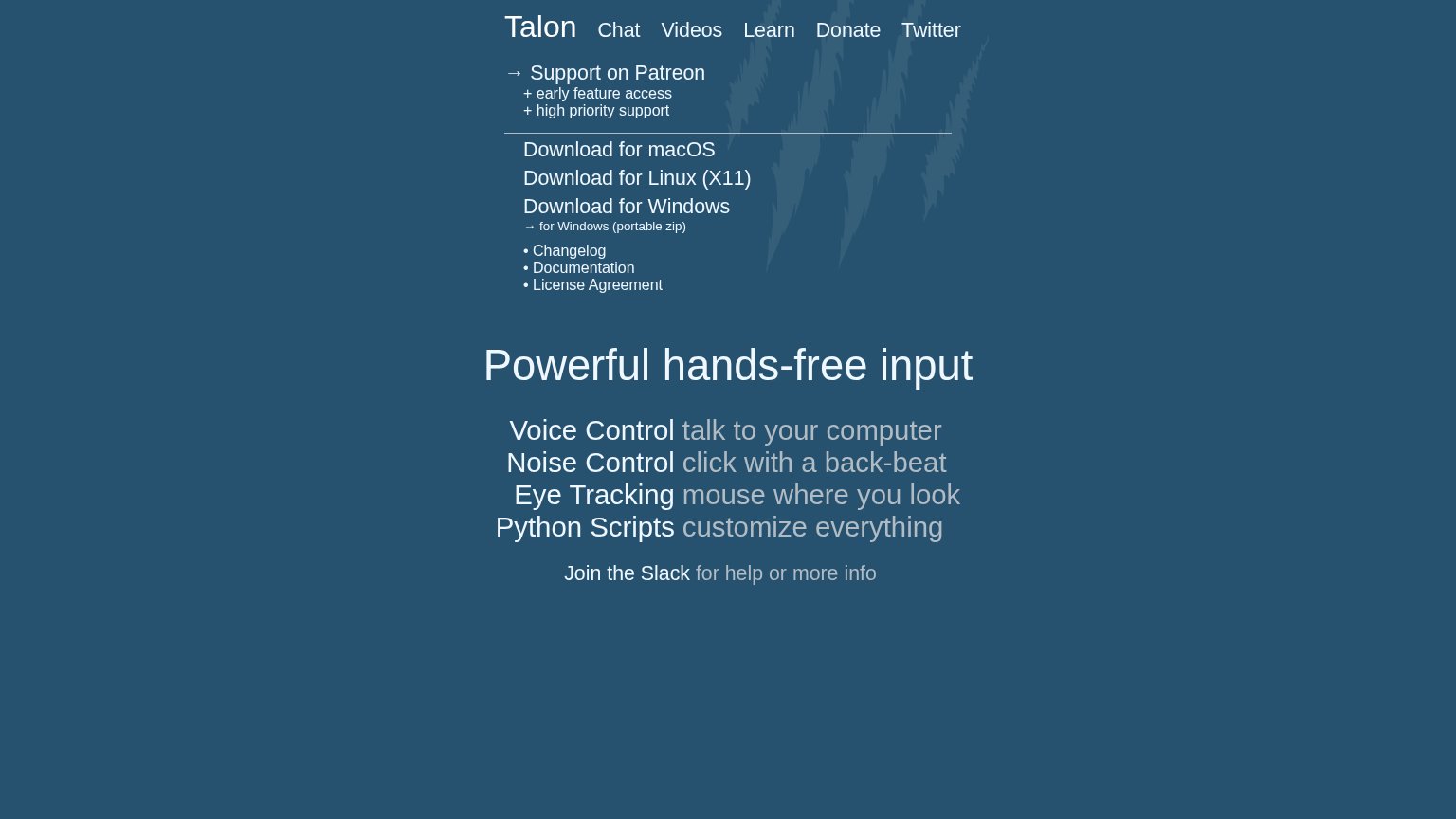
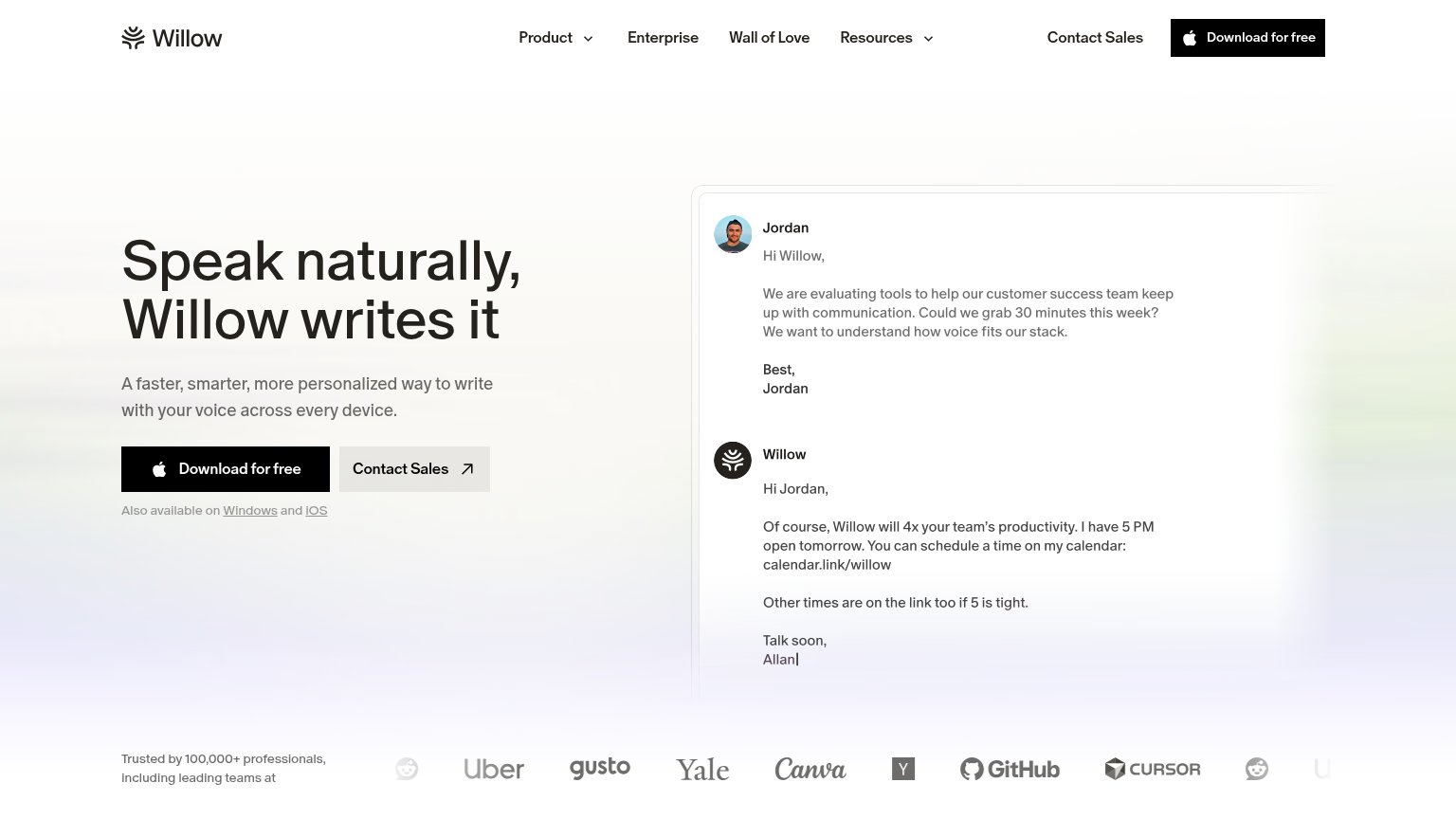
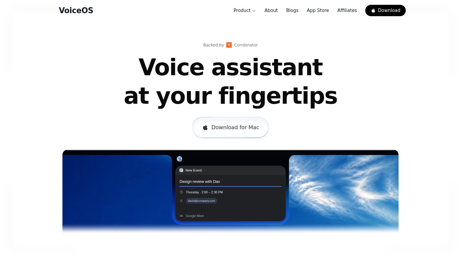
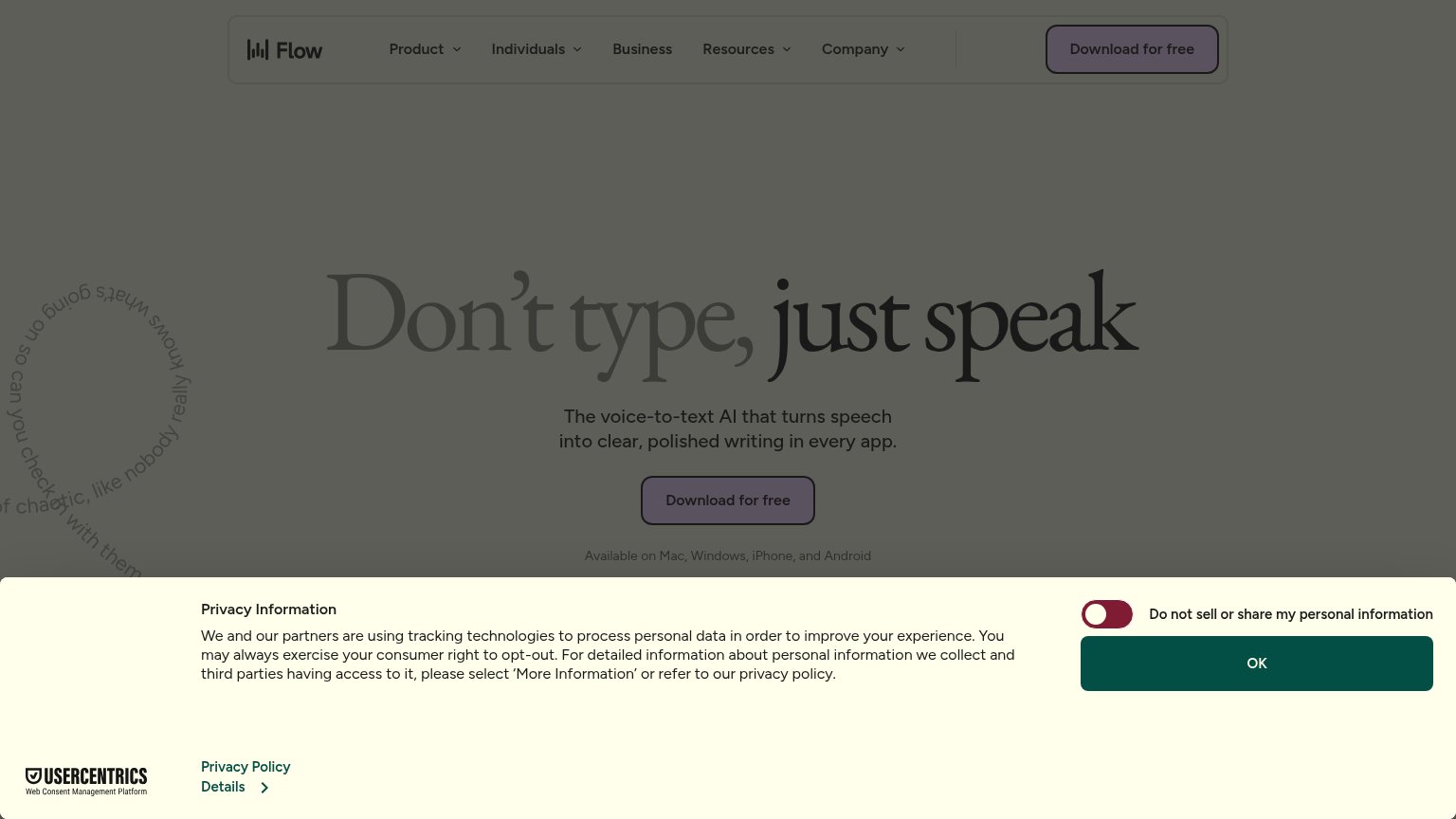
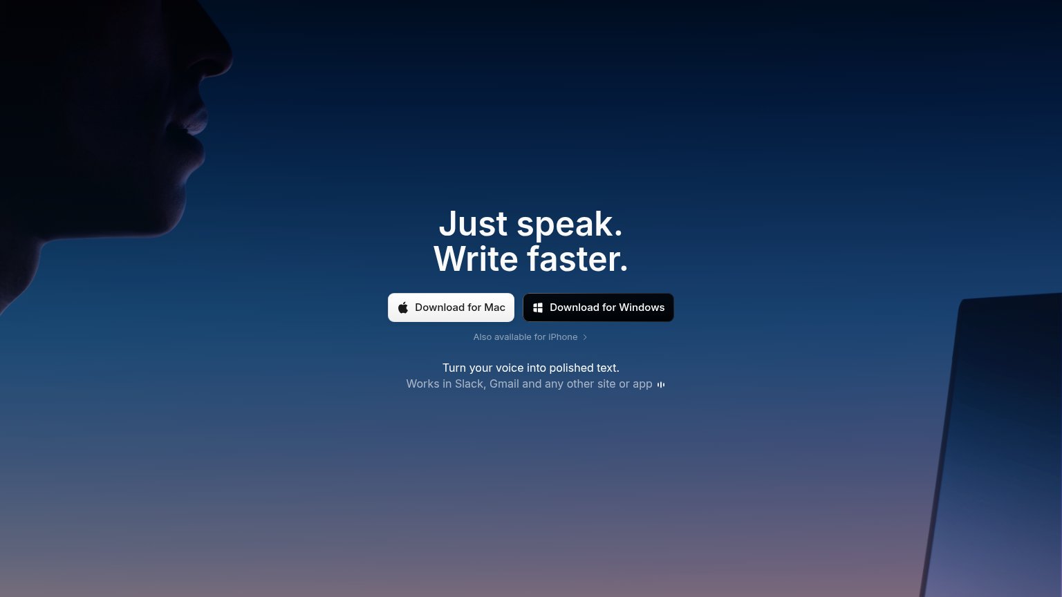
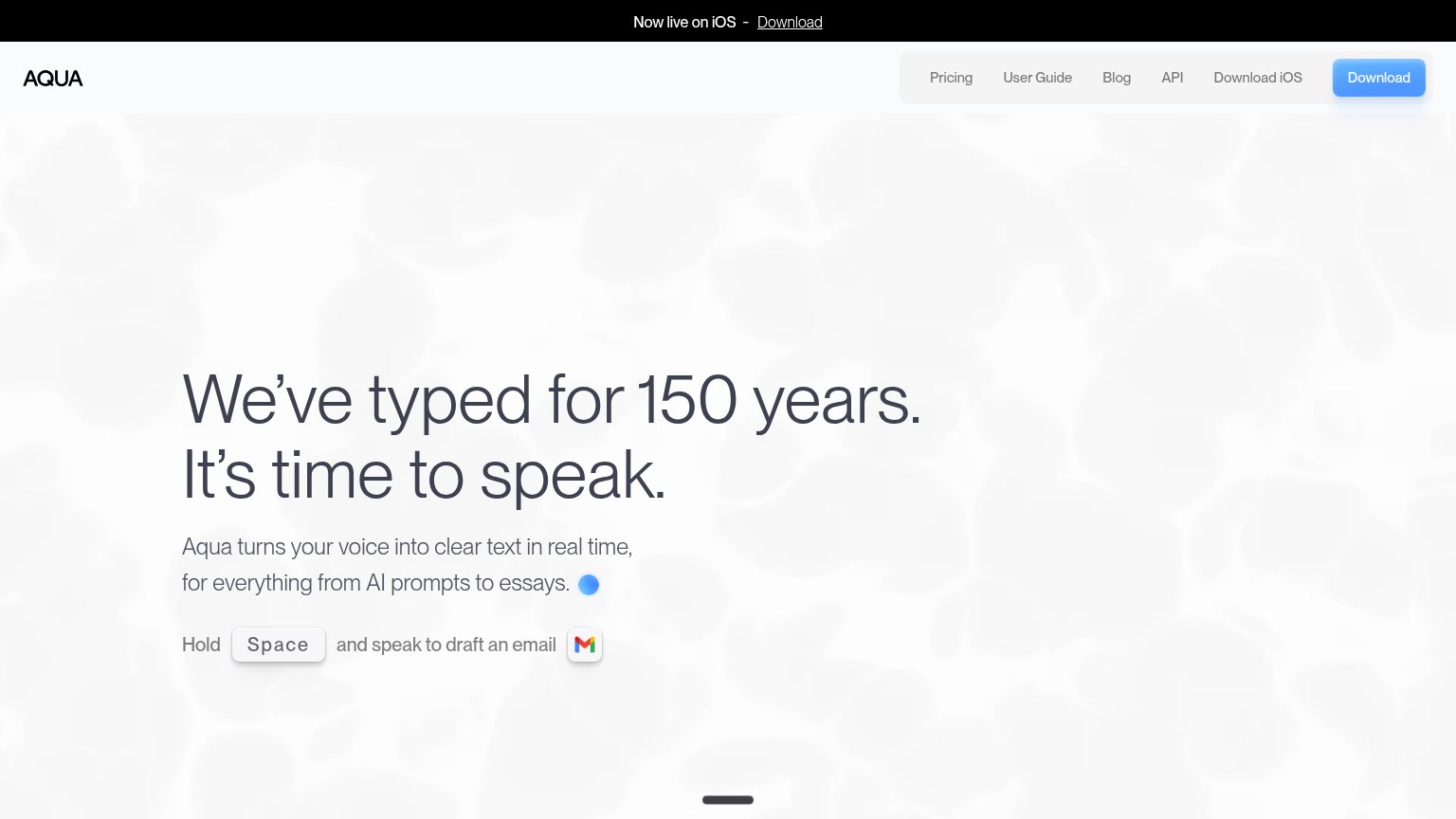
| Trust read | |
|---|---|
| Talon | "• Changelog / • Documentation" links beside the download CTAs, signaling an actively maintained project |
| "Backed by Y Combinator" badge above the headline | |
| Available on Mac, Windows, iPhone, and Android | |
| "Trusted by 100,000+ professionals, including leading teams at" with Uber, Gusto, Yale, Canva, GitHub, and Cursor logos | |
| Works in Slack, Gmail and any other site or app | |
| 'Hold Space and speak to draft an email' interactive demo prompt |
Mobile web
34PoorThe phone experience as a first-class citizen.
 1234
- Overlapping Patreon link — "Support on Patreon" text collides with the "Videos" nav link — the layout is broken on phones.
- Uncollapsed vertical nav — Chat/Videos/Learn/Donate/Twitter stack down the right edge with a stray divider instead of a hamburger, crushing the fold.
- Download text links — The primary action is three unstyled text links, not a thumb-sized full-width button.
- Linux link under divider — "Download for Linux (X11)" runs beneath the vertical rule, clipping its tap target.
Information hierarchy
42PoorDoes the design help or inhibit what the page is trying to say?
What works
What to improve
CTA
58FairCopy, size, verb, cost-feel — does the primary CTA earn the click?
How Talon compares
Recommended rewrites
Value props
62FairTitle, subtitle, hero — do they sell the product's true value?
Talon’s headline
Powerful hands-free input
Voice Control talk to your computer / Noise Control click with a back-beat / Eye Tracking mouse where you look / Python Scripts customize everything
Working
Could improve