
Your landing page’s weakest score is Value props.
How Stockal ranks
58Growth scoreupdated
category scores
category scoresShowHide
Value props
48PoorTitle, subtitle, hero — do they sell the product's true value?
Stockal’s headline vague
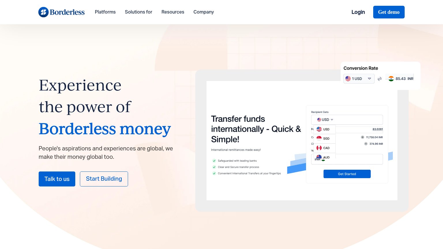
Experience the power of Borderless money
People's aspirations and experiences are global, we make their money global too.
Working
- Hero mockup shows the product working
- Live FX rate widget adds specificity
- Dual CTAs split buyer vs builder intent
Could improve
- Headline could fit any fintech
- Subhead repeats headline, adds nothing
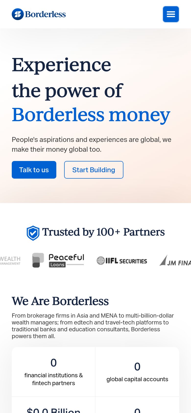
- Stat counters show 0 — broken proof
Information hierarchy
58FairDoes the design help or inhibit what the page is trying to say?
 1234
- Overlapping currency dropdown — USD/SGD/CAD/AUD dropdown renders open over the transfer card, obscuring form fields and reading as a rendering bug.
- Conversion Rate widget — Clipped at the right viewport edge and floats over the hero card, adding a third competing panel to the fold.
- Get Started button — A third solid-blue CTA inside the product mockup competes at equal weight with the real 'Talk to us' CTA.
- Talk to us / Start Building — Two adjacent buttons of similar footprint split the primary action; neither reads as THE next step.
CTA
58FairCopy, size, verb, cost-feel — does the primary CTA earn the click?
How Stockal compares
Recommended rewrites
Trust
58FairProof that the product is real, competent, and safe to try.
How Stockal compares
Trust read
Mobile web
68FairThe phone experience as a first-class citizen.
What works
What to improve