
Your landing page’s weakest score is Trust.
How Stoa ranks
Trust
58FairProof that the product is real, competent, and safe to try.

| Trust read | |
|---|---|
| Stoa | BACKED BY Y COMBINATOR badge next to the headline |
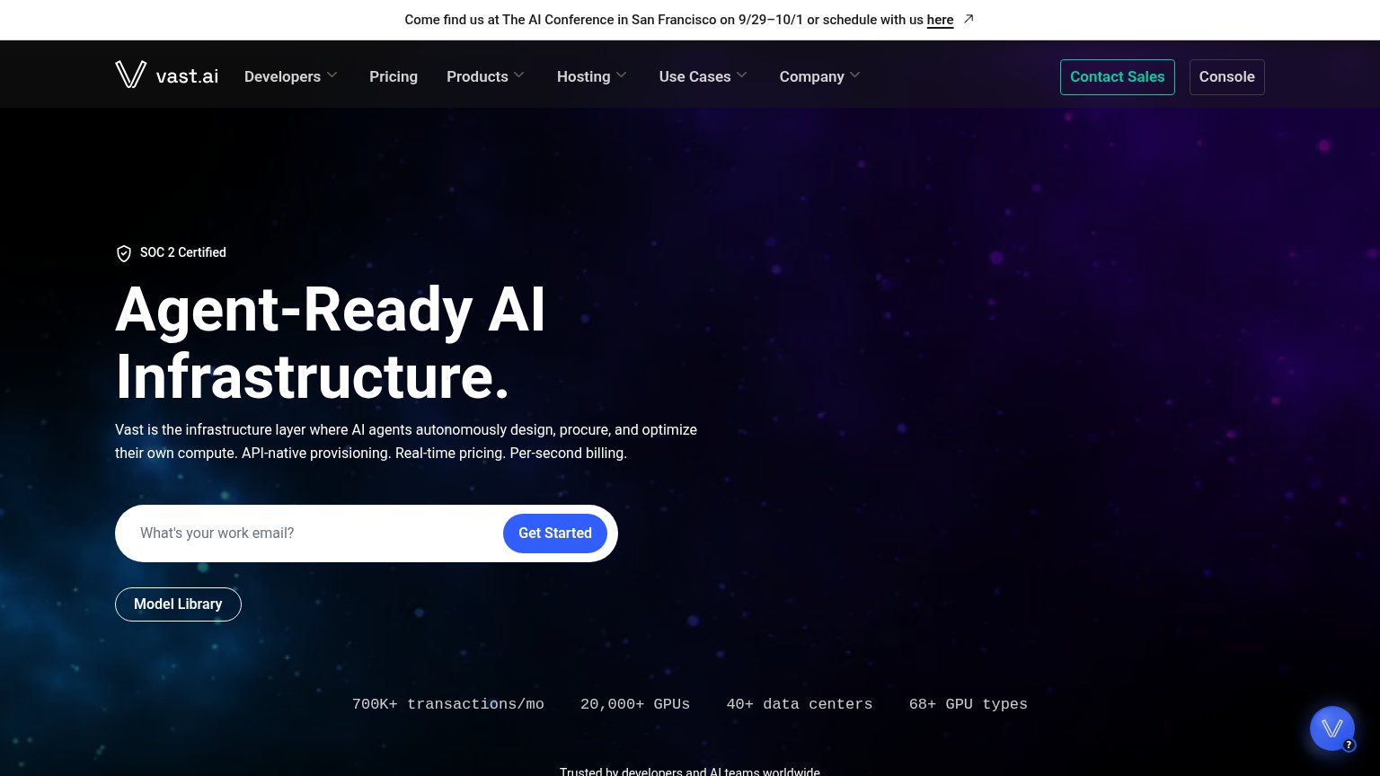
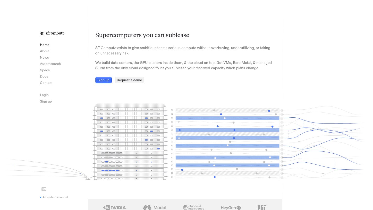
| Logo strip featuring NVIDIA, Modal, Standard Intelligence, HeyGen, and MIT at the bottom of the fold | |
| Stats bar: "700K+ transactions/mo · 20,000+ GPUs · 40+ data centers · 68+ GPU types" | |
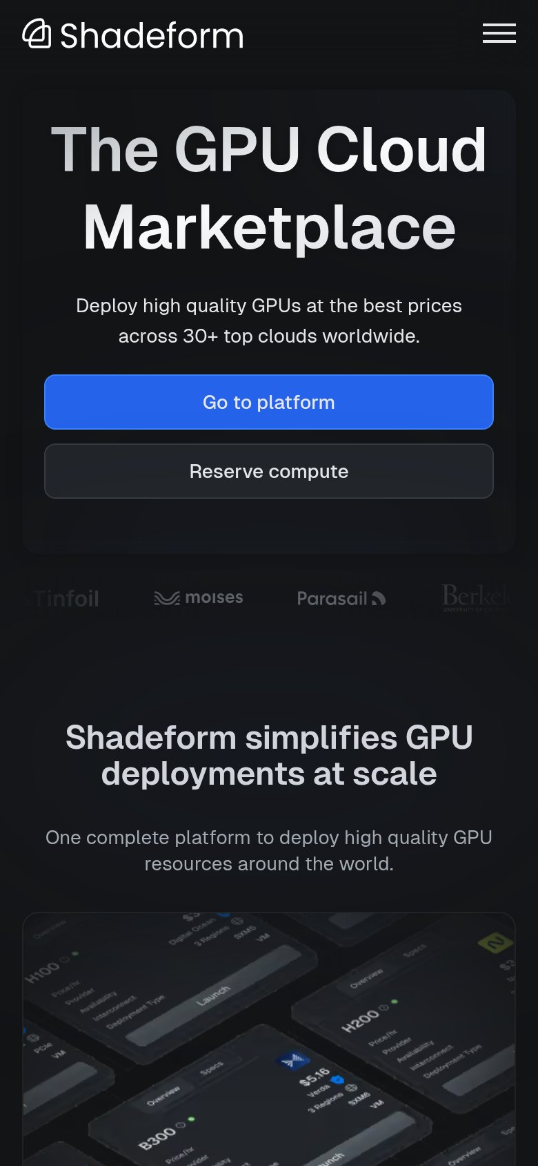
| Customer logo strip (Tinfoil, Moises, Parasail, Berkeley) below the mobile hero | |
| "Currently serving $1.49B of listings." above a live feed of dated, priced GPU listings |
CTA
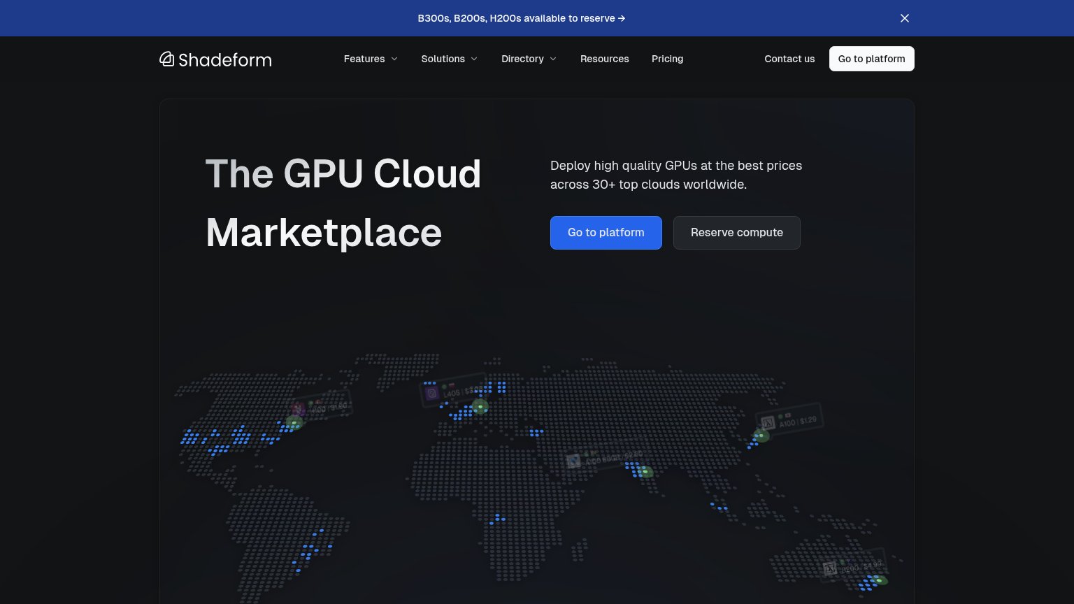
62FairCopy, size, verb, cost-feel — does the primary CTA earn the click?
Problems
- generic label, no value promise
- click feels like signup work
- doesn't echo headline's market hook
- muted color, low visual pop in hero
Value props
72FairTitle, subtitle, hero — do they sell the product's true value?
Stoa’s headline
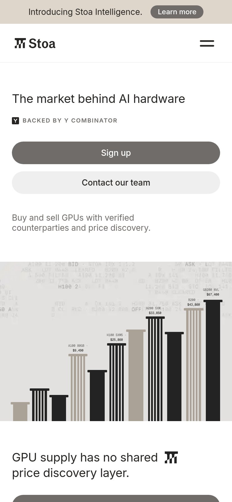
The market behind AI hardware
Buy and sell GPUs with verified counterparties and price discovery.
Working
Could improve
Information hierarchy
78FairDoes the design help or inhibit what the page is trying to say?
What works
What to improve
Mobile web
86StrongThe phone experience as a first-class citizen.
What works
What to improve