
Your landing page’s weakest score is Information hierarchy.
How Stereolabs ranks
- 1.
Stereolabs70
- 2.
Luxonis65
- 3.
Orbbec62
- 4.
Efference54
- 5.
e-con Systems48
70Growth scoreupdated
category scores
category scoresShowHide
Information hierarchy
58FairDoes the design help or inhibit what the page is trying to say?
 1234
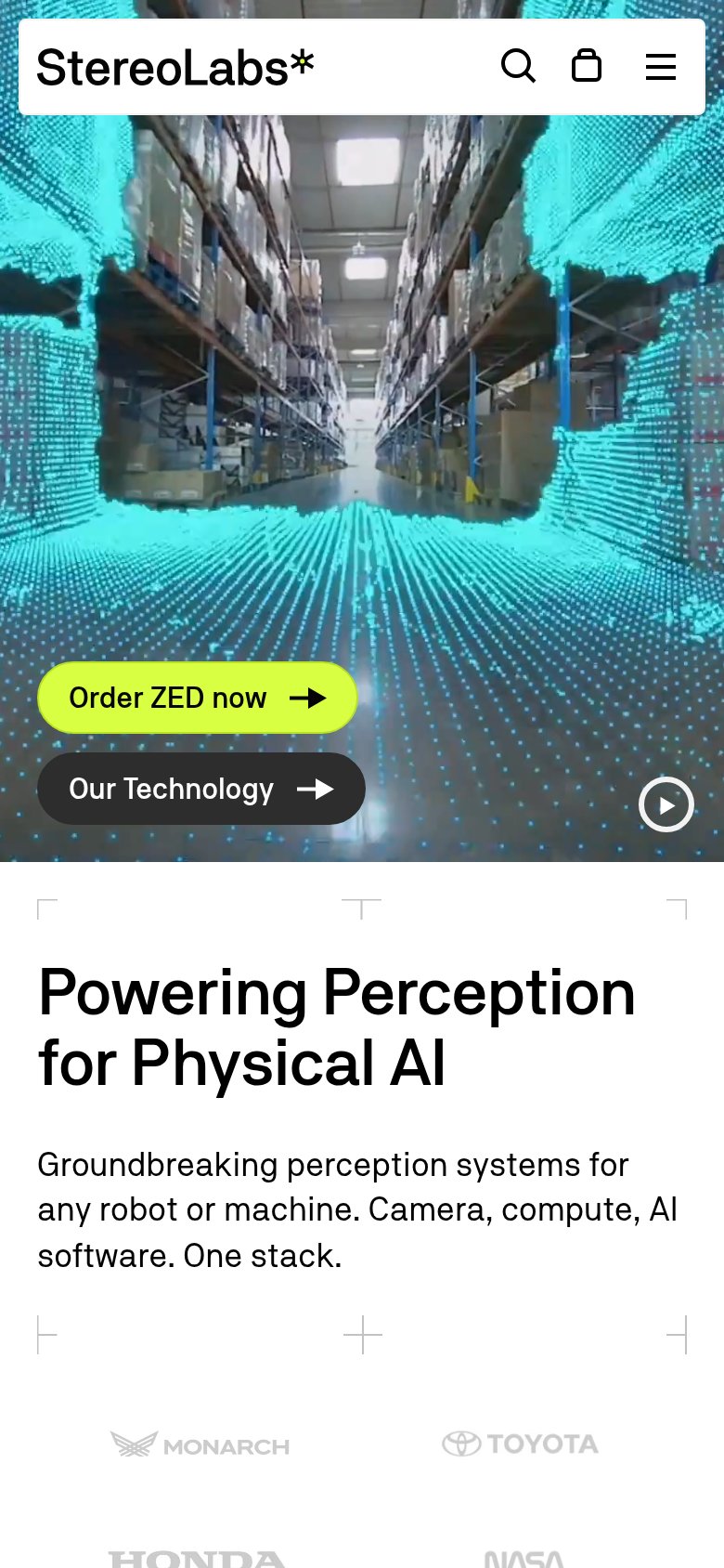
- Headline below fold — "Powering Perception for Physical AI" is cut off at the fold, so the video carries no verbal message for a full viewport.
- Lime Store pill — Shares the exact lime treatment of the primary "Order ZED now" CTA, splitting the strongest visual weight between two different actions.
- Six-item nav row — Six text links plus three utility icons offer nine exits before the visitor reaches the value proposition or CTA.
- Our Technology button — Sits at near-equal size directly beside the primary CTA, diluting the one-second scan to a coin flip between two actions.
Value props
66FairTitle, subtitle, hero — do they sell the product's true value?
Stereolabs’s headline undersells
Powering Perception for Physical AI
Groundbreaking perception systems for any robot or machine. Camera, compute, AI software. One stack.
Working
- Subhead names exact deliverables: camera, compute, software
- Mobile hero shows live 3D point-cloud output
- Toyota, Honda, NASA logos back the claim
Could improve
- Headline is category jargon, not an outcome
- Zero numbers: no range, accuracy, or unit count
- Desktop hero frame shows a pallet, not the product
Trust
72FairProof that the product is real, competent, and safe to try.
How Stereolabs compares
Trust read
CTA
76FairCopy, size, verb, cost-feel — does the primary CTA earn the click?
How Stereolabs compares
Recommended rewrites
Mobile web
76FairThe phone experience as a first-class citizen.
What works
What to improve