
Your landing page’s weakest score is Trust.
How Softr ranks
Trust
44PoorProof that the product is real, competent, and safe to try.

| Trust read | |
|---|---|
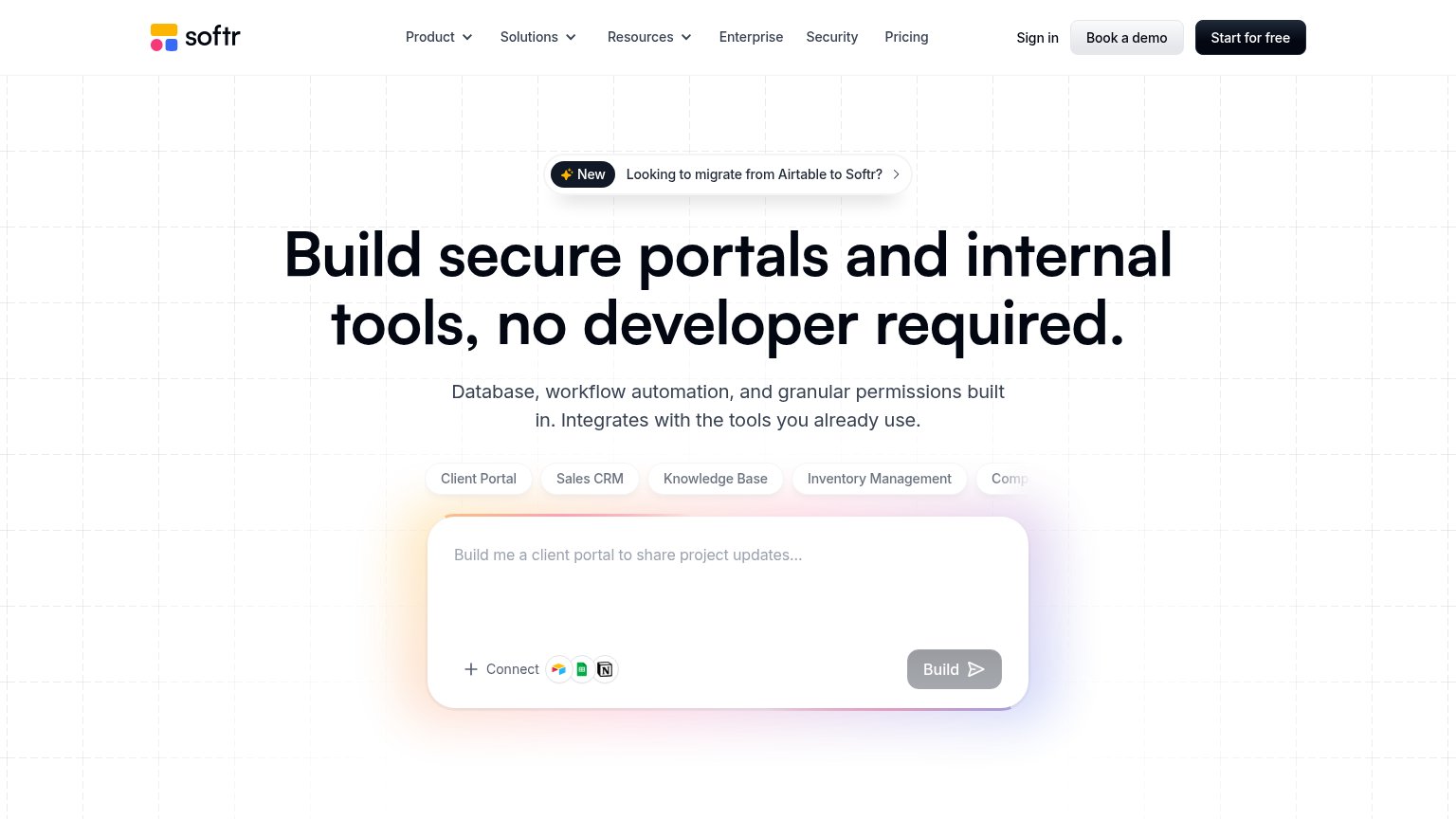
| Softr | Interactive AI prompt box with Airtable, Google Sheets, and Notion connector icons |
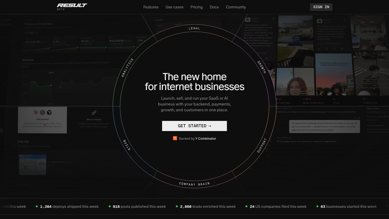
| "Backed by Y Combinator" badge directly beneath the GET STARTED CTA | |
| Gallery of generated example websites (e.g. "PICKLA" storefront) beneath the Apps/[Websites]/Games/Tools filter | |
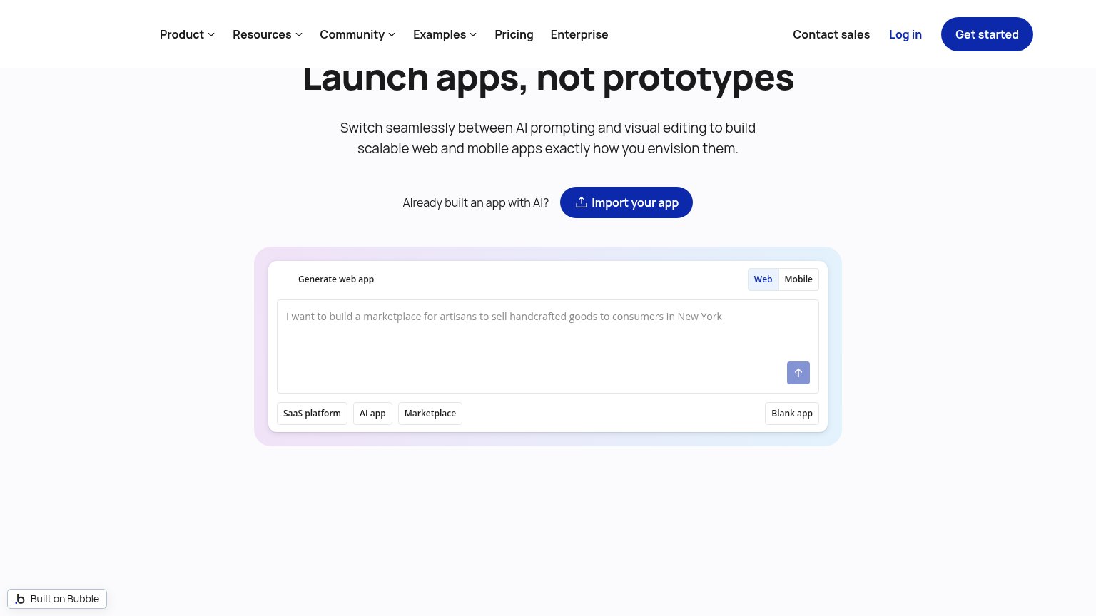
| Embedded "Generate web app" widget with example prompt "I want to build a marketplace for artisans to sell handcrafted g | |
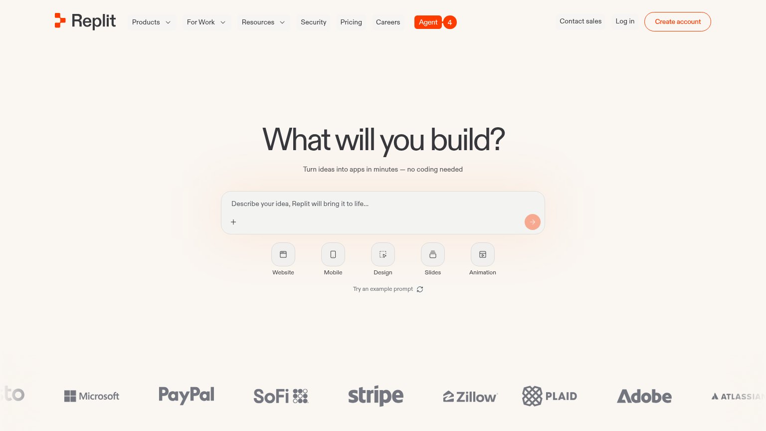
| Customer logo wall featuring Microsoft, PayPal, SoFi, Stripe, Zillow, Plaid, Adobe, and Atlassian |
Mobile web
72FairThe phone experience as a first-class citizen.
 123
- Greyed-out Build button — The primary CTA renders disabled-grey, so nothing in the fold looks tappable until the visitor types.
- Truncated placeholder text — The example prompt collapses to "B...", removing the cue that tells visitors what to type into the box.
- Clipped use-case chip — "Knowledge Ba..." cuts off mid-word with no swipe affordance, signaling broken responsive layout.
Information hierarchy
76FairDoes the design help or inhibit what the page is trying to say?
What works
What to improve
CTA
82StrongCopy, size, verb, cost-feel — does the primary CTA earn the click?
How Softr compares
Recommended rewrites
Value props
82StrongTitle, subtitle, hero — do they sell the product's true value?
Softr’s headline
Build secure portals and internal tools, no developer required.
Database, workflow automation, and granular permissions built in. Integrates with the tools you already use.
Working
Could improve