
Your landing page’s weakest score is Information hierarchy.
How Snorkel AI ranks
- 1.
Snorkel AI68
- 2.
Turing65
- 3.
Scale AI61
- 4.
Petrarch60
- 5.
Mercor54
- 6.
Surge AI46
68Growth scoreupdated
category scores
category scoresShowHide
Information hierarchy
62FairDoes the design help or inhibit what the page is trying to say?
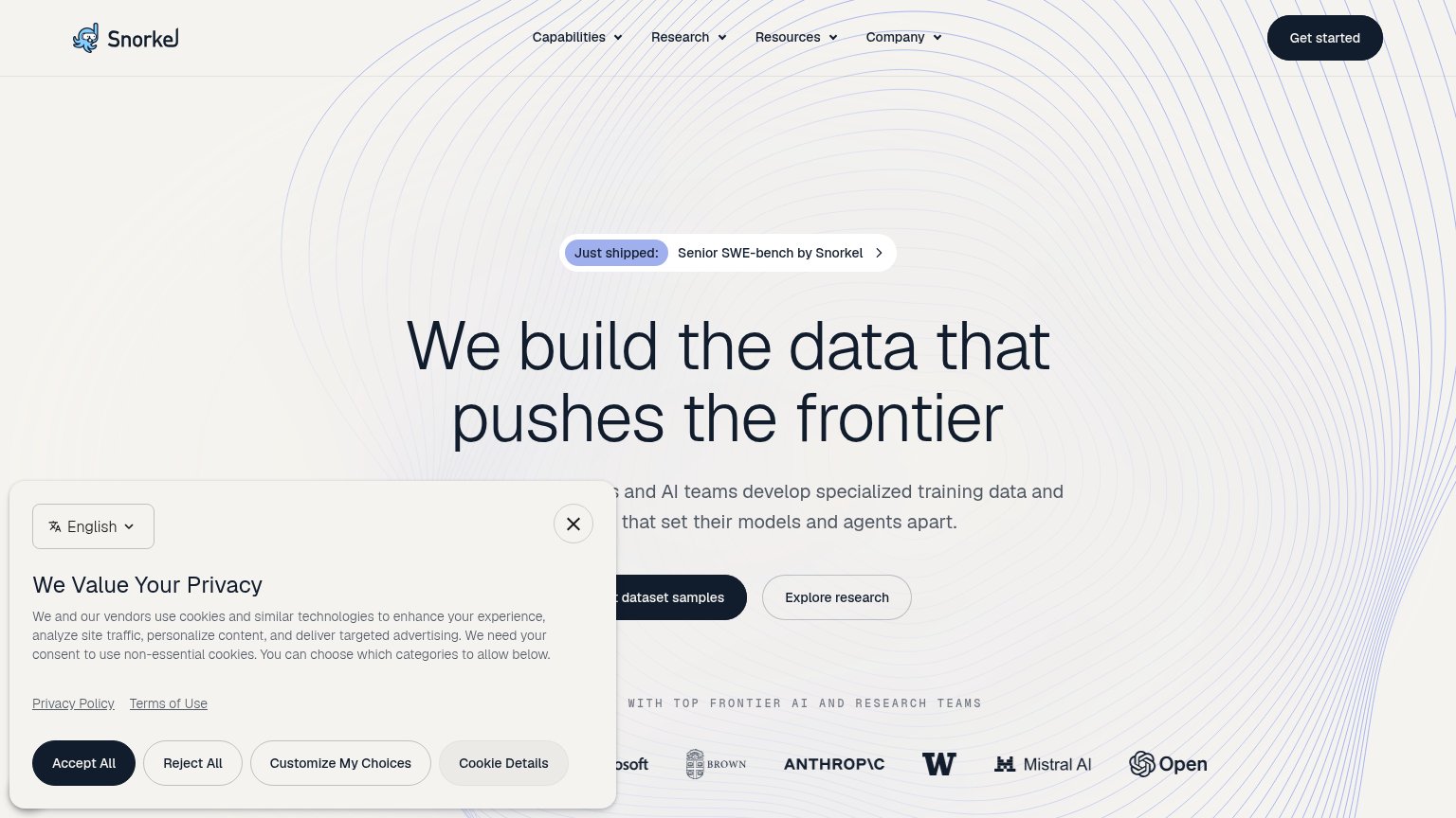 1234
- Cookie consent panel — Covers the left half of the fold and occludes the subheadline and primary CTA label on desktop.
- Request dataset samples CTA — Primary CTA is partially hidden behind the cookie panel, so the one action the fold wants is unreadable at a glance.
- Explore research button — Secondary CTA sits at nearly the same size and prominence as the primary, splitting the action moment.
- Just shipped banner — The 'Senior SWE-bench by Snorkel' pill with chevron sits directly above the headline and pulls first attention toward an exit.
CTA
68FairCopy, size, verb, cost-feel — does the primary CTA earn the click?
Problems
- 'Request' feels gated, not instant
- nav says 'Get started' — label split
- cookie banner covers CTA on desktop
Trust
68FairProof that the product is real, competent, and safe to try.
How Snorkel AI compares
Trust read
Mobile web
68FairThe phone experience as a first-class citizen.
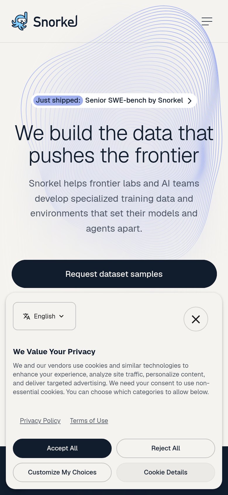
What works
What to improve
Value props
76FairTitle, subtitle, hero — do they sell the product's true value?
Snorkel AI’s headline
We build the data that pushes the frontier
Snorkel helps frontier labs and AI teams develop specialized training data and environments that set their models and agents apart.
Working
Could improve