
Your landing page’s weakest score is Mobile web.
How SimScale ranks
73Growth scoreupdated
category scores
category scoresShowHide
Mobile web
62FairThe phone experience as a first-class citizen.
 1234
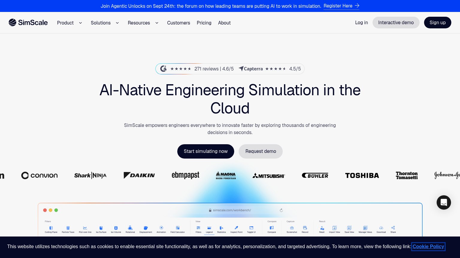
- Cookie consent banner — Dark banner eats the bottom quarter of the viewport with no visible dismiss or accept control.
- Promo announcement bar — Two-line 'Join Agentic Unlocks' bar plus header consumes a large slice of the first viewport before the hero.
- Primary CTA buttons — 'Start simulating now' and 'Request demo' sit side by side at desktop proportions instead of full-width thumb targets.
- Logo strip cropped — Toshiba and Nobel Automotive logos are cut off mid-word at the viewport edge, signaling an unadapted desktop carousel.
Information hierarchy
70FairDoes the design help or inhibit what the page is trying to say?
 1234
- Cookie consent banner — Full-width dark bar covers the bottom of the fold, cutting off the product screenshot and adding a competing message block.
- Top announcement banner — Bright blue 'Register Here' bar is the highest-contrast element on the page and pulls first attention to an event, not the product.
- Request demo button — Sits at nearly equal size beside 'Start simulating now', splitting the fold's single action into two choices.
- Navigation bar — Seven nav items plus Log in, Interactive demo, and Sign up create ~10 exits before the visitor reaches the hero.
Value props
72FairTitle, subtitle, hero — do they sell the product's true value?
SimScale’s headline
AI-Native Engineering Simulation in the Cloud
SimScale empowers engineers everywhere to innovate faster by exploring thousands of engineering decisions in seconds.
Working
Could improve
CTA
78FairCopy, size, verb, cost-feel — does the primary CTA earn the click?
How SimScale compares
Recommended rewrites
Trust
84StrongProof that the product is real, competent, and safe to try.
How SimScale compares
Trust read