
Your landing page’s weakest score is Trust.
How Simplify ranks
80Growth scoreupdated
category scores
category scoresShowHide
Trust
76FairProof that the product is real, competent, and safe to try.
| Trust read | |
|---|---|
| Simplify | "4.9/5 · Trusted by 2M+ job seekers" star-rating line beneath the Try for free CTA |
| "Backed by Y Combinator" badge above the headline | |
| "Trusted partner of Monster & CareerBuilder" banner beneath the navigation | |
| Embedded product demo showing "Automation In Progress" auto-filling a real Rippling job application | |
| "Loved by 2,064,348 users" with user avatars and five-star rating in the header | |
| "As seen on" press logos: Yahoo Finance, Product Hunt, Business Insider, MarketWatch |
Information hierarchy
78FairDoes the design help or inhibit what the page is trying to say?
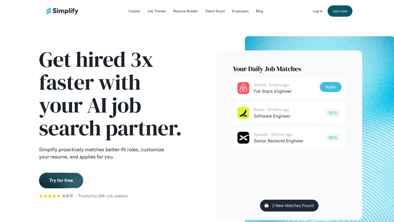 123
- Join now button — Dark pill styled identically to 'Try for free', splitting the primary action across two competing CTAs.
- Six-link nav row — Copilot through Blog gives six equal-weight exits before the visitor reaches the hero argument.
- Mock Apply pill — Bright blue button inside the demo panel reads as a clickable CTA but is a non-interactive mockup.
Mobile web
78FairThe phone experience as a first-class citizen.
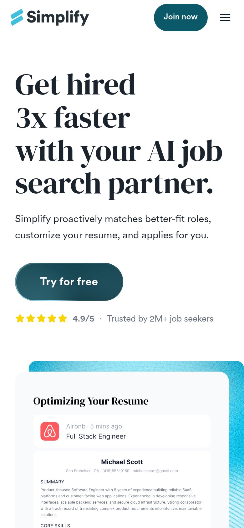
What works
What to improve
CTA
82StrongCopy, size, verb, cost-feel — does the primary CTA earn the click?
How Simplify compares
Recommended rewrites
Value props
86StrongTitle, subtitle, hero — do they sell the product's true value?
Simplify’s headline
Get hired 3x faster with your AI job search partner.
Simplify proactively matches better-fit roles, customize your resume, and applies for you.
Working
Could improve