
Your landing page’s weakest score is CTA.
How Signiant ranks
75Growth scoreupdated
category scores
category scoresShowHide
CTA
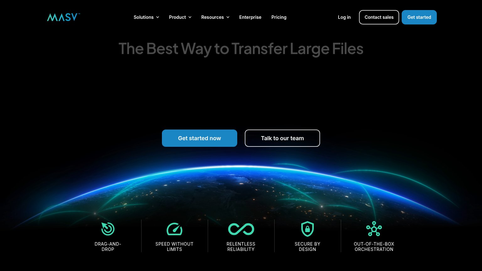
68FairCopy, size, verb, cost-feel — does the primary CTA earn the click?
Problems
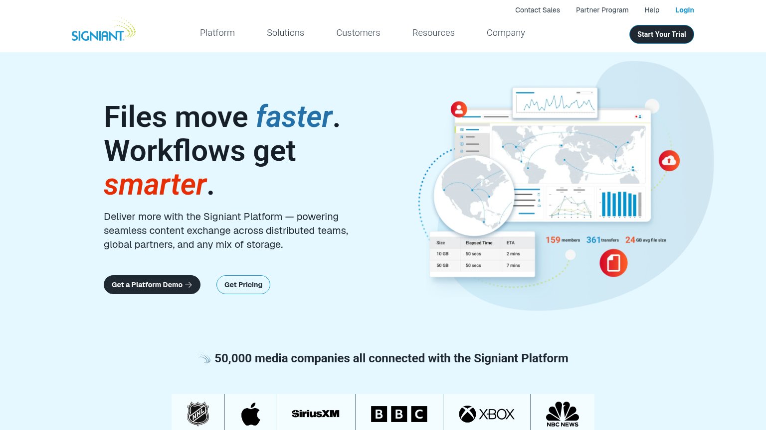
- four words, not one fixation
- demo click feels sales-heavy
- nav says 'Start Signiant's Trial' instead
- trial offer buried in nav
Information hierarchy
72FairDoes the design help or inhibit what the page is trying to say?
123- Triple CTA competition — "Start Signiant's Trial", "Get a Platform Demo", and "Get Pricing" all sit in the fold with no clear winner — trial and demo share the same dark pill styling.
- Utility nav row — Contact Sales, Partner Program, Help, and Login add four exit paths above the main nav before the visitor reaches the headline.
- Five-item main nav — Platform through Company are five equal-weight dropdowns that siphon attention away from the hero's conversion pair.
Value props
78FairTitle, subtitle, hero — do they sell the product's true value?
Signiant’s headline
Files move faster. Workflows get smarter.
Deliver more with the Signiant Platform — powering seamless content exchange across distributed teams, global partners, and any mix of storage.
Working
Could improve
Trust
78FairProof that the product is real, competent, and safe to try.
How Signiant compares
Trust read
Mobile web
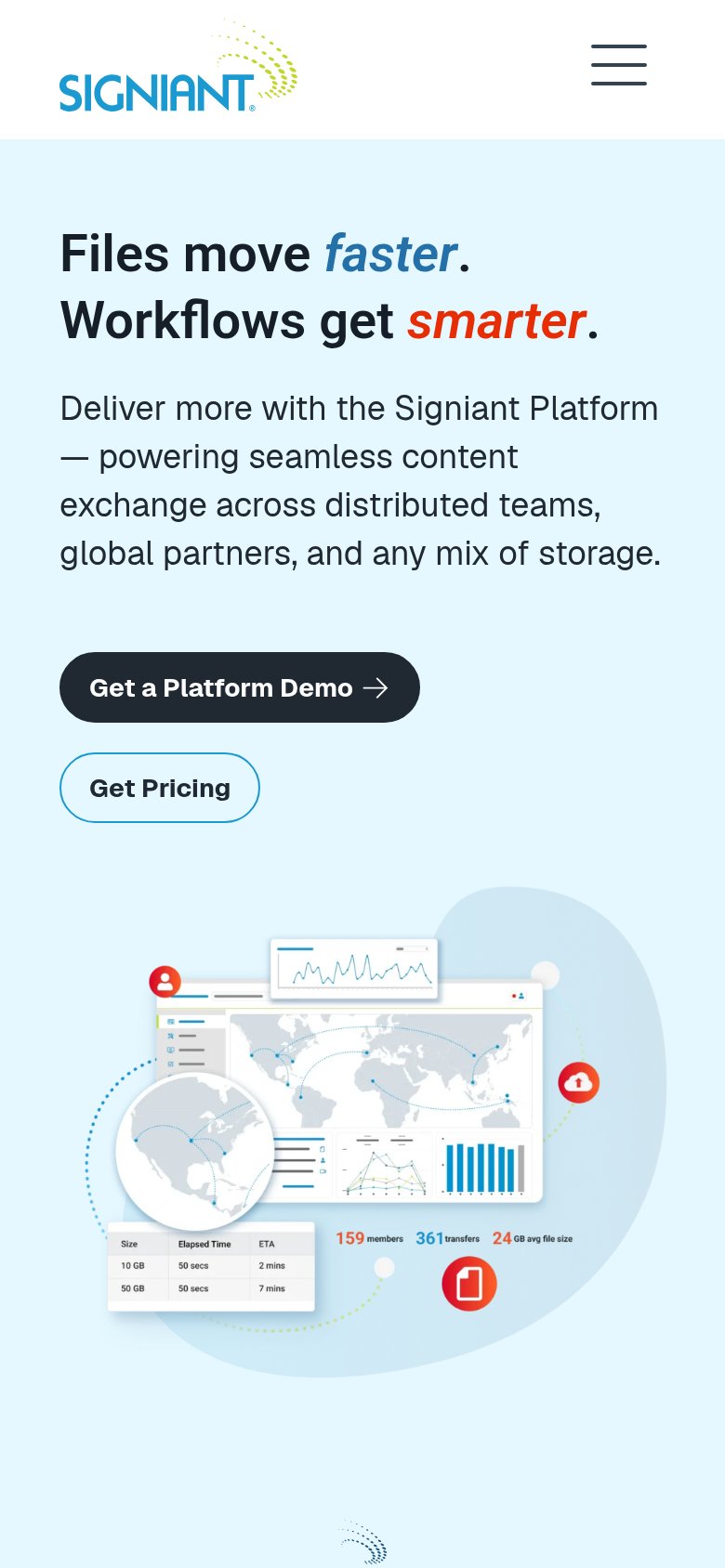
80StrongThe phone experience as a first-class citizen.
What works
What to improve