
Your landing page’s weakest score is CTA.
How Scratchpad ranks
CTA
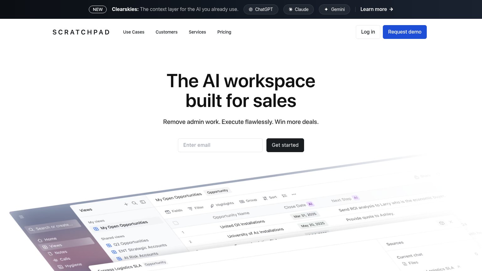
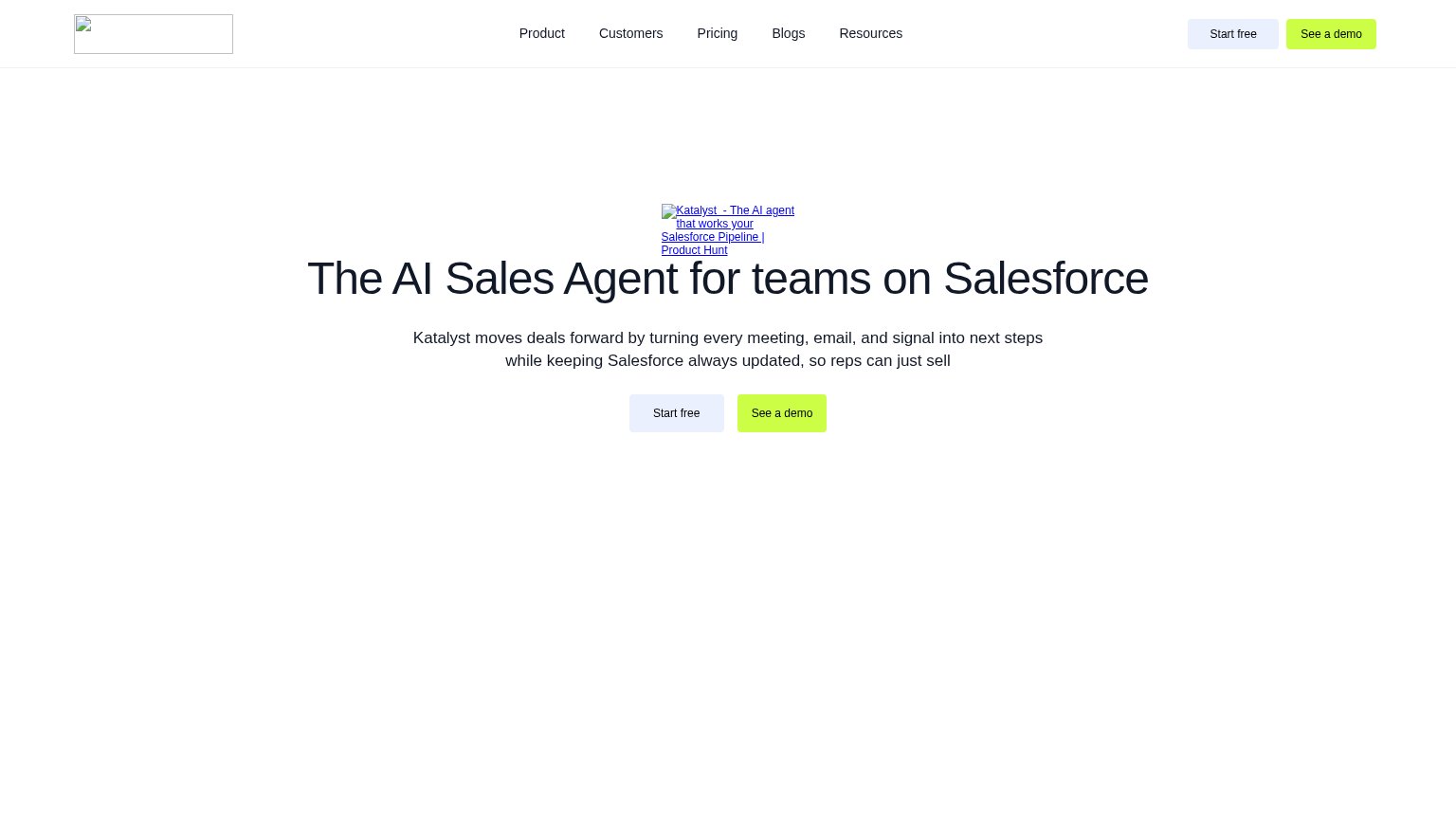
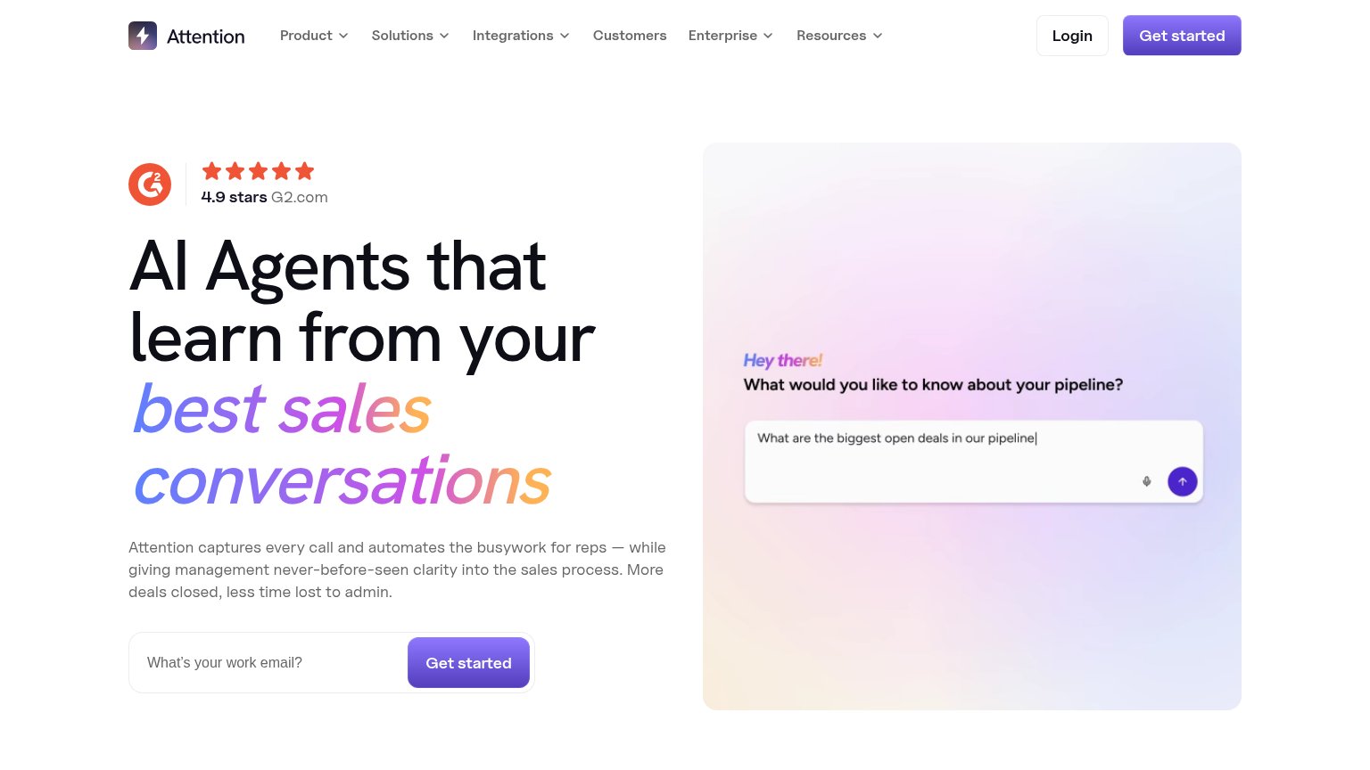
68FairCopy, size, verb, cost-feel — does the primary CTA earn the click?

Problems
- generic label, no payoff named
- email field gates the click
- demo button outshines primary
- two competing CTA labels
Trust
68FairProof that the product is real, competent, and safe to try.
| Trust read | |
|---|---|
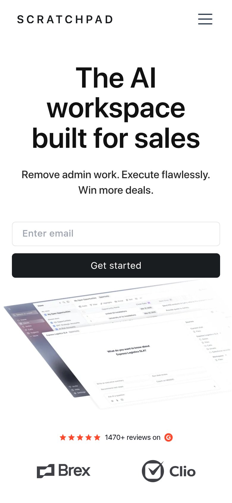
| Scratchpad | ★★★★★ 1470+ reviews on G2 |
| "Trusted by the fastest growing B2B teams" heading above a customer logo strip (mobile) | |
| Product UI mockup showing "Conversation Data Sources" with Gmail, Slack, and Teams integrations and an opportunity panel | |
| Customer logo strip featuring MongoDB, WSP, Ramp, together.ai, Cloud Software Group, and XBOW | |
| "4.9 stars G2.com" rating badge in the desktop hero | |
| "NEXT BEST ACTIONS — AI Prioritized" product UI panel with concrete records like "Follow up with Dana Reyes — Replied to |
Value props
72FairTitle, subtitle, hero — do they sell the product's true value?
Scratchpad’s headline
The AI workspace built for sales
Remove admin work. Execute flawlessly. Win more deals.
Working
Could improve
Information hierarchy
76FairDoes the design help or inhibit what the page is trying to say?
What works
What to improve
Mobile web
80StrongThe phone experience as a first-class citizen.
What works
What to improve