
Your landing page’s weakest score is Trust.
How Render ranks
80Growth scoreupdated
category scores
category scoresShowHide
Trust
76FairProof that the product is real, competent, and safe to try.
| Trust read | |
|---|---|
| Render | TRUSTED BY OVER 7 MILLION BUILDERS |
| "Backed by Y Combinator" badge above the headline | |
| Customer logo wall (Tripadvisor, Cognizant, Mercado Libre, G2X, Reducto, Automattic) on the mobile fold | |
| Customer logo wall: Kilocode, Builder.io, Hatchet, Phonic, Supabase, Firecrawl, Plastic Labs, Replicate, Steel, Delos (m | |
| Customer logo row: OpenAI, DoorDash, Charles Schwab, Supreme, The Weather Company, Polymarket, Blackbox.ai |
Information hierarchy
78FairDoes the design help or inhibit what the page is trying to say?
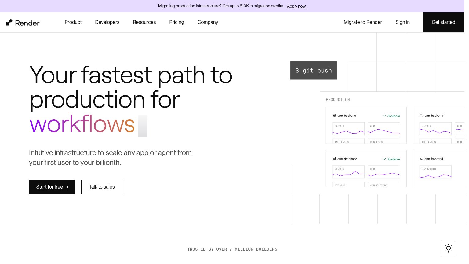 1234
- Nav Get started button — Filled black button matches the hero CTA's weight, splitting the one action into two competitors.
- Migration credits banner — Top-of-page 'Apply now' link diverts first attention to a niche offer before the value prop lands.
- Right-edge dashboard cutoff — The PRODUCTION panel and a second card column bleed off-frame, cropping metric labels mid-word.
- Migrate to Render link — Third conversion path in the nav row adds another equal-height exit beside Sign in and Get started.
Value props
78FairTitle, subtitle, hero — do they sell the product's true value?
Render’s headline
Your fastest path to production for workflows
Intuitive infrastructure to scale any app or agent from your first user to your billionth.
Working
Could improve
Mobile web
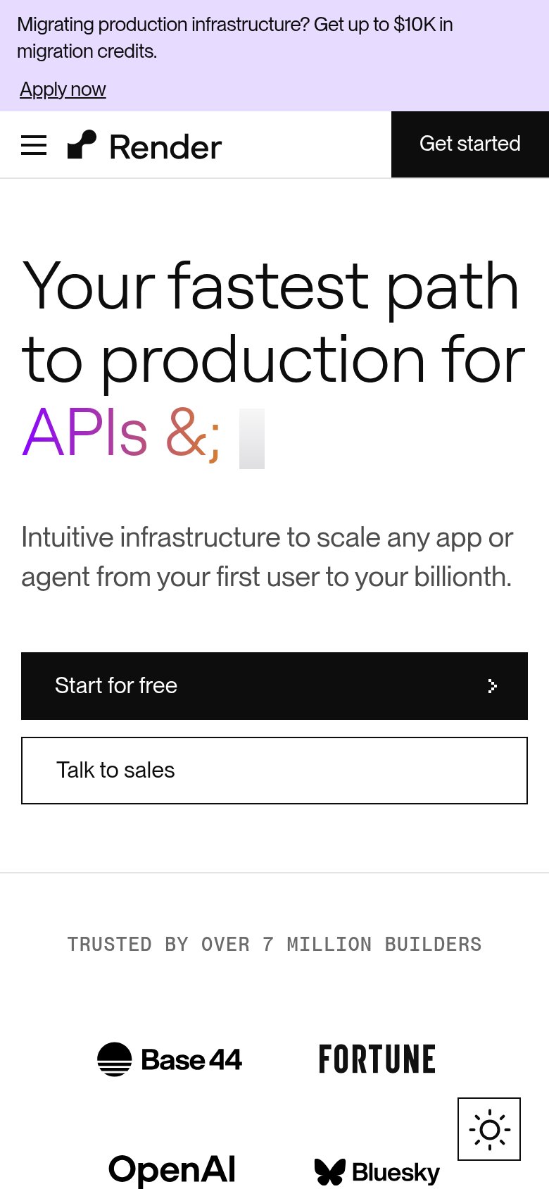
82StrongThe phone experience as a first-class citizen.
What works
What to improve
CTA
88StrongCopy, size, verb, cost-feel — does the primary CTA earn the click?
How Render compares
Recommended rewrites