
Your landing page’s weakest score is Information hierarchy.
How Reacher ranks
72Growth scoreupdated
category scores
category scoresShowHide
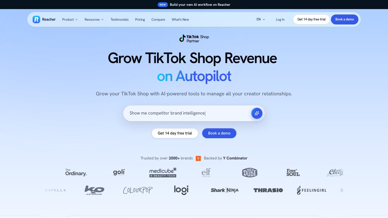
Information hierarchy
64FairDoes the design help or inhibit what the page is trying to say?
 1234
- Duplicate trial/demo CTAs — "Get 14 day free trial" and "Book a demo" appear twice in the fold (nav and hero), splitting the primary action four ways with no clear winner.
- AI prompt input — The search-style prompt box sits directly above the CTA pair and reads as the main action, competing with the actual conversion buttons.
- Seven-item nav row — Product, Resources, Testimonials, Pricing, Compare, What's New and Log In offer seven exits before the hero argument is made.
- Second logo row — Two stacked rows of brand logos push a single trust beat into two competing bands and crowd the bottom of the fold.
CTA
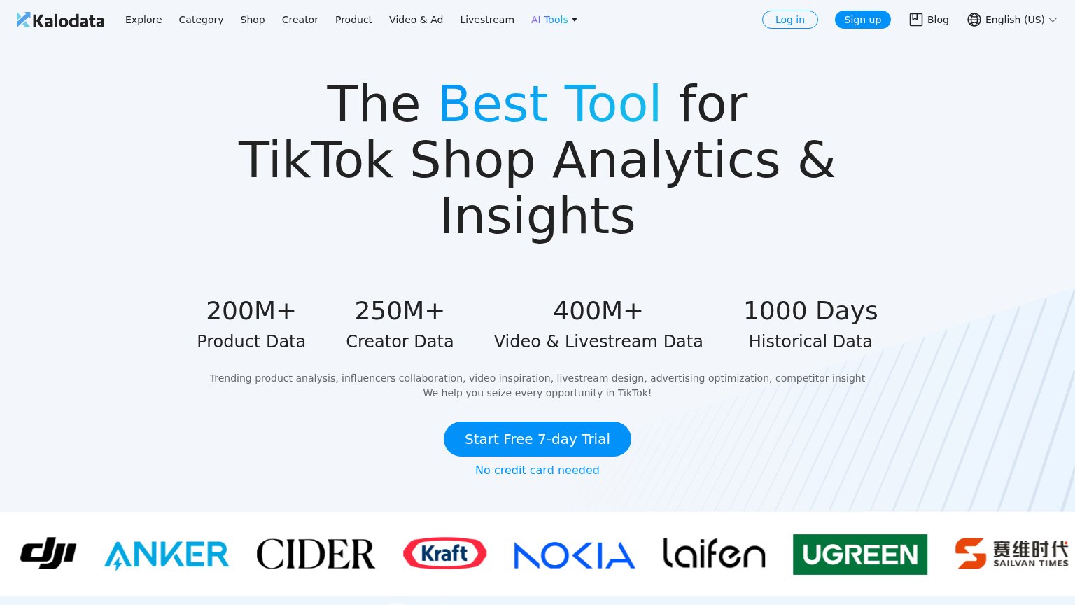
72FairCopy, size, verb, cost-feel — does the primary CTA earn the click?
Problems
- 4 words + numeral, long read
- blue demo button outweighs it
- icon-only submit on prompt input
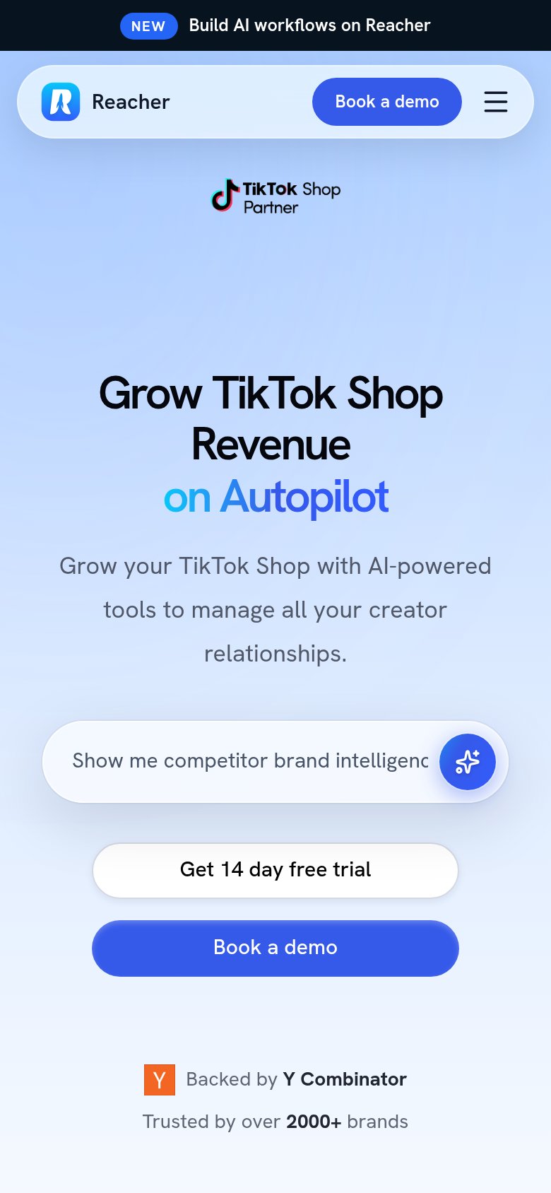
- mobile header pushes demo only
Mobile web
72FairThe phone experience as a first-class citizen.
What works
What to improve
Value props
76FairTitle, subtitle, hero — do they sell the product's true value?
Reacher’s headline
Grow TikTok Shop Revenue on Autopilot
Grow your TikTok Shop with AI-powered tools to manage all your creator relationships.
Working
Could improve
Trust
78FairProof that the product is real, competent, and safe to try.
How Reacher compares
Trust read