
Your landing page’s weakest score is CTA.
How Rave ranks
CTA
44PoorCopy, size, verb, cost-feel — does the primary CTA earn the click?
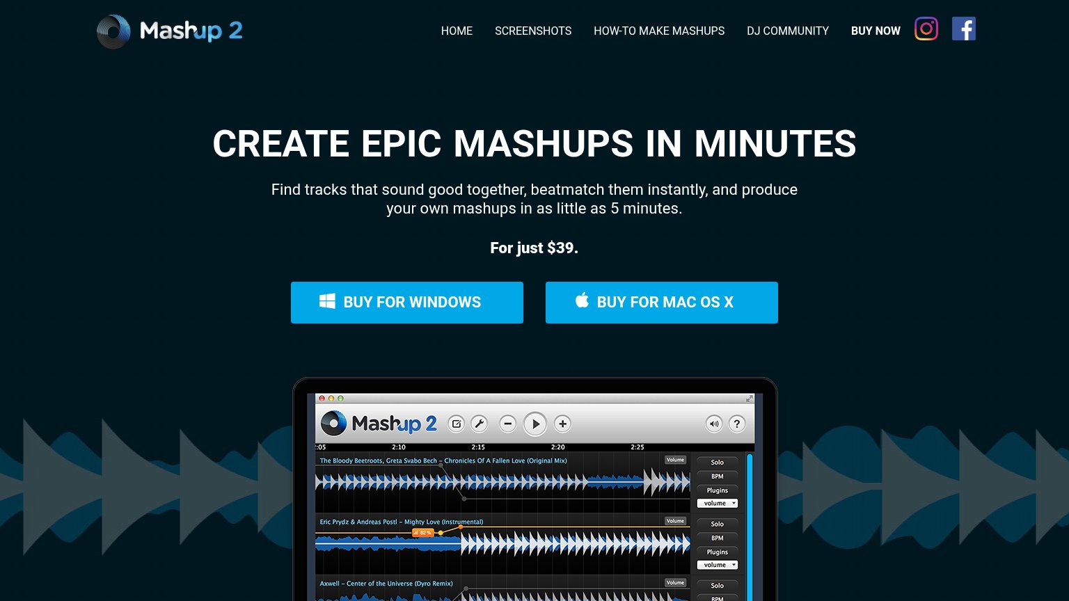
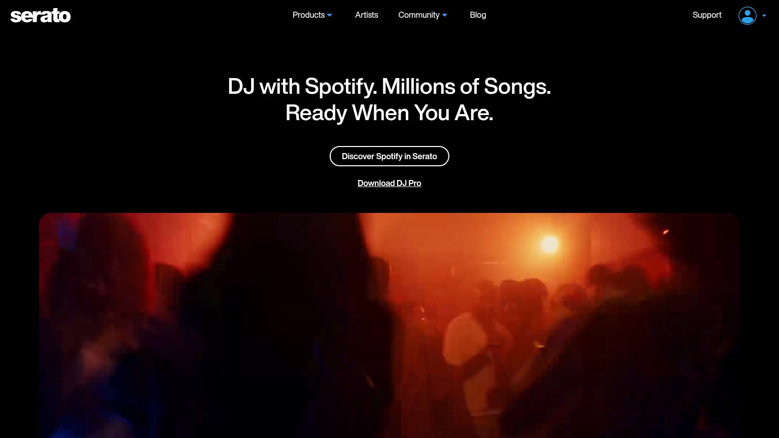
Problems
- no action verb, reads as label
- not styled as a button
- four equal options, no primary
- no download or start language
Mobile web
56FairThe phone experience as a first-class citizen.
 123
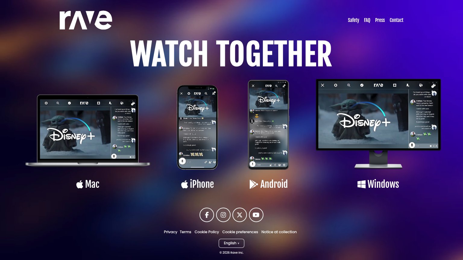
- Platform icon tiles — The four device mockups are decorative images, not visibly tappable buttons — no button chrome signals where to tap to download.
- iPhone / Mac labels — Platform labels look like captions rather than CTAs; nothing on the mobile fold says 'Download' or 'Get the app'.
- Footer link cluster — Nine small text links (Safety, FAQ, Press, Contact, Privacy, Terms...) sit in a tight two-row cluster with cramped tap targets.
Information hierarchy
58FairDoes the design help or inhibit what the page is trying to say?
What works
What to improve
Value props
58FairTitle, subtitle, hero — do they sell the product's true value?
Rave’s headline
WATCH TOGETHER
Working
Could improve
Trust
58FairProof that the product is real, competent, and safe to try.
How Rave compares
Trust read