
Your landing page’s weakest score is Mobile web.
How Quantinuum ranks
61Growth scoreupdated
category scores
category scoresShowHide
Mobile web
42PoorThe phone experience as a first-class citizen.
 12
- Consent legal copy — Two long paragraphs of oversized legal text inflate the banner far beyond a phone-appropriate footprint.
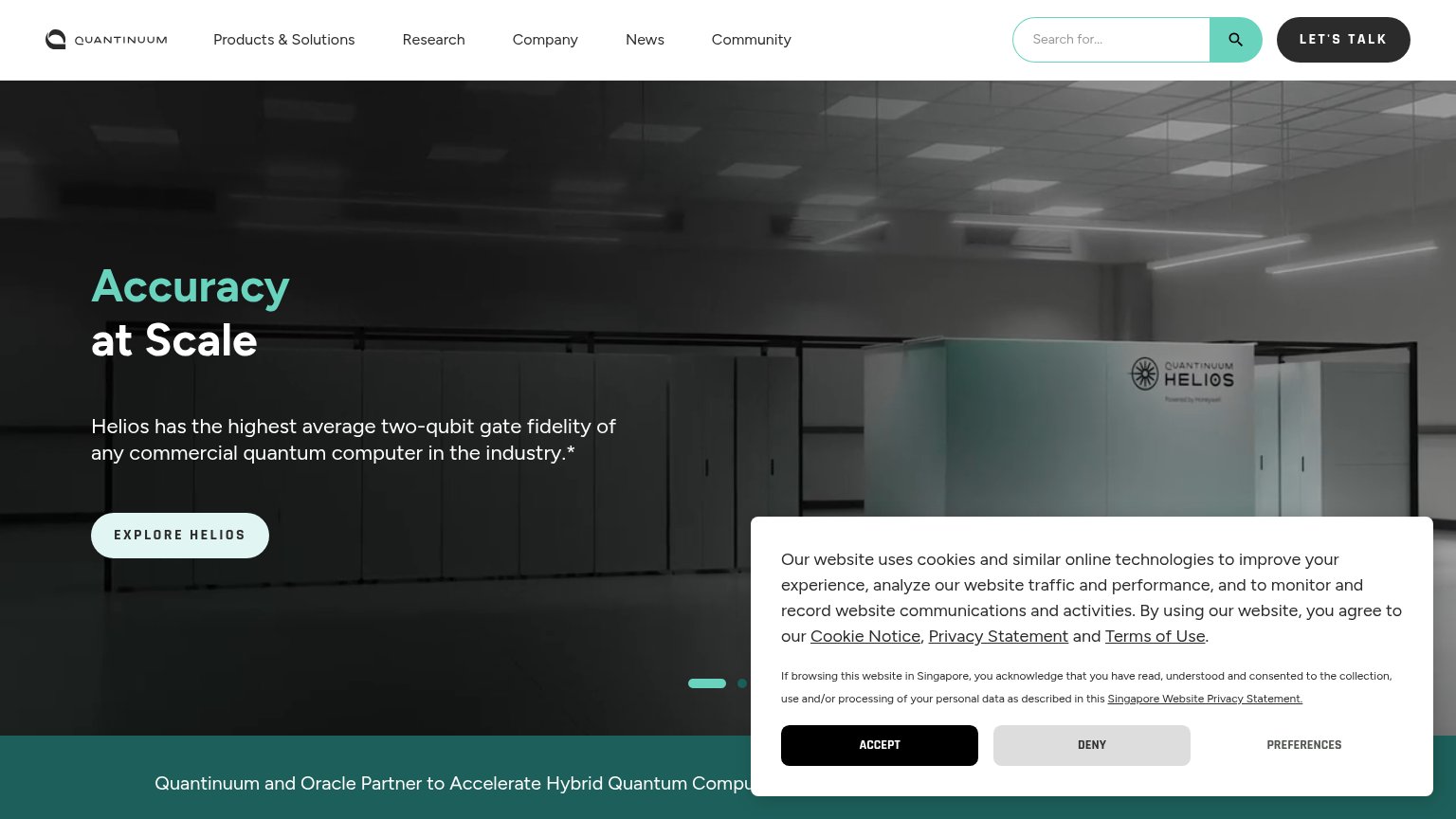
- Clipped hero headline — "at Scale" is severed by the overlay, leaving the value statement unreadable in the first viewport.
Information hierarchy
62FairDoes the design help or inhibit what the page is trying to say?
 1234
- Cookie consent banner — Covers the hero's lower-right quadrant on desktop and ~70% of the mobile viewport, burying the CTA path.
- EXPLORE HELIOS ghost button — Outlined low-contrast style loses the visual-weight contest to the solid black LET'S TALK pill in the nav.
- Carousel pagination dots — Signals the hero rotates, so the core value prop can cycle away before the visitor acts.
- Oracle news ticker — Teal partnership banner at the fold's edge adds a competing message and exit before the primary action.
CTA
62FairCopy, size, verb, cost-feel — does the primary CTA earn the click?
How Quantinuum compares
Recommended rewrites
Trust
66FairProof that the product is real, competent, and safe to try.
How Quantinuum compares
Trust read
Value props
72FairTitle, subtitle, hero — do they sell the product's true value?
Quantinuum’s headline
Accuracy at Scale
Helios has the highest average two-qubit gate fidelity of any commercial quantum computer in the industry.*
Working
Could improve