
Your landing page’s weakest score is Information hierarchy.
How PromptArmor ranks
69Growth scoreupdated
category scores
category scoresShowHide
Information hierarchy
68FairDoes the design help or inhibit what the page is trying to say?
 1234
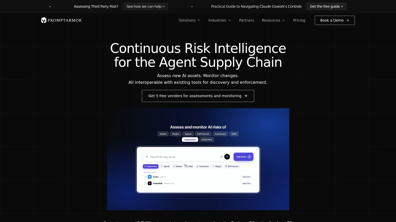
- Ghost hero CTA — "Get 5 free vendors" is a thin outline on black — the page's one action reads as a text row, not a button.
- Double announcement bar — Two competing top-bar CTAs ("See how we can help", "Get the free guide") leak attention before the headline is read.
- Book a Demo button — White-outlined nav button matches or outweighs the hero CTA, splitting the visitor between two actions.
- Five-item nav row — Solutions, Industries, Partners, Resources, Pricing add five exits above the fold, all at the same visual weight.
Value props
68FairTitle, subtitle, hero — do they sell the product's true value?
PromptArmor’s headline undersells
Continuous Risk Intelligence for the Agent Supply Chain
Assess new AI assets. Monitor changes. All interoperable with existing tools for discovery and enforcement.
Working
- CTA offers concrete free unit: 5 vendors
- Hero shot demonstrates real asset inventory
- $2T / Fortune 50 proof anchors credibility
Could improve
- Headline jargon assumes insider context
- Subhead lists features, no outcome or emotion
- No named risk or consequence in the fold
Trust
68FairProof that the product is real, competent, and safe to try.
How PromptArmor compares
Trust read
Mobile web
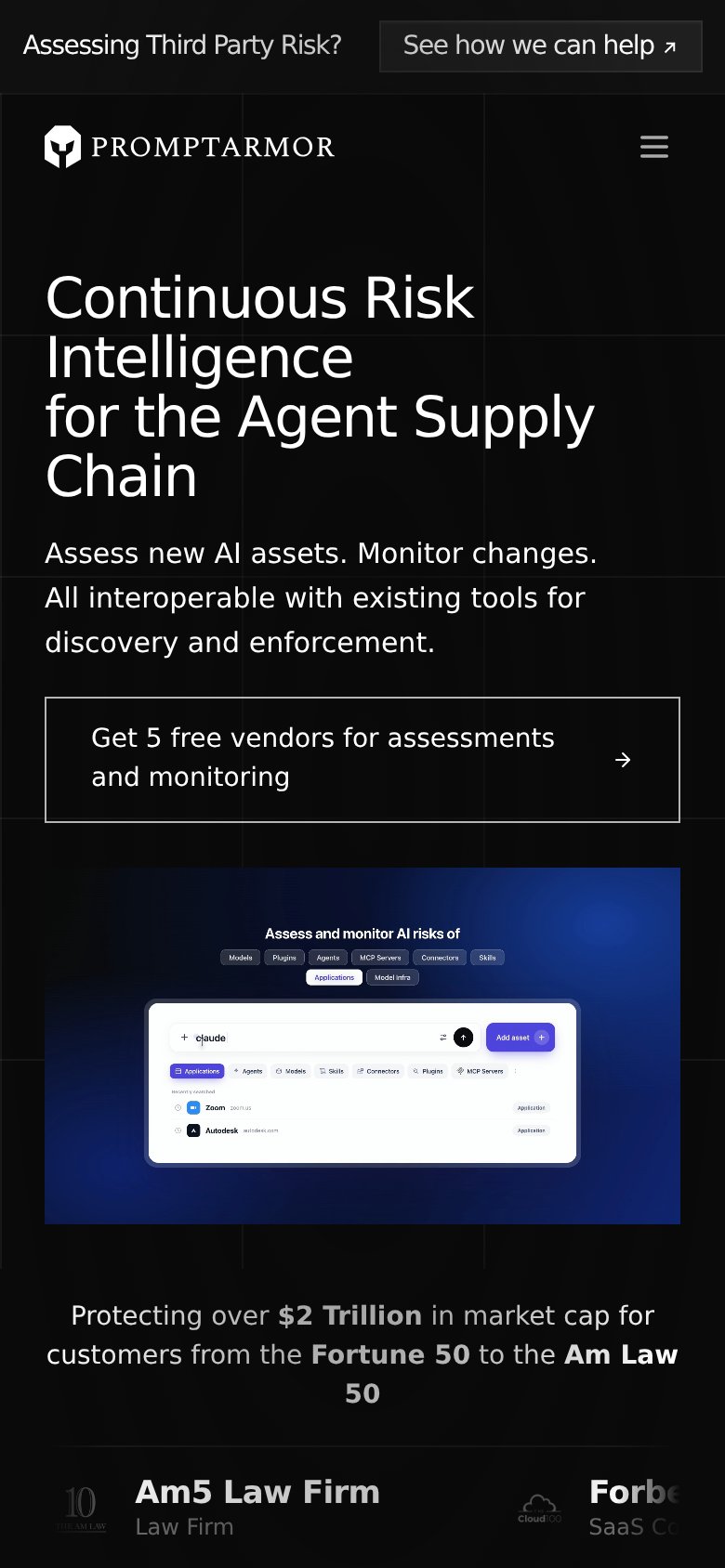
68FairThe phone experience as a first-class citizen.
What works
What to improve
CTA
72FairCopy, size, verb, cost-feel — does the primary CTA earn the click?
How PromptArmor compares
Recommended rewrites