
Your landing page’s weakest score is Mobile web.
How PCBWay ranks
59Growth scoreupdated
category scores
category scoresShowHide
Mobile web
34PoorThe phone experience as a first-class citizen.
 1234
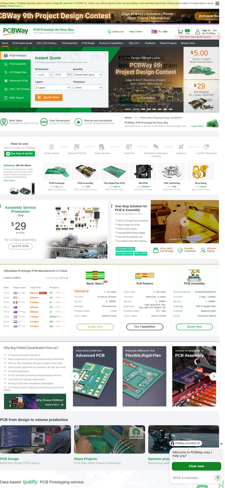
- Uncollapsed desktop nav row — Full desktop link row (Home, PCB Instant Quote, CNC, etc.) is crammed across the phone width in tiny tap targets instead of a hamburger.
- Open chat widget — PCBWay Assistant chat panel auto-opens with 'Chat now' and a message field, covering content with no conversion-valuable CTA — pure friction.
- Stacked promo headers — Holiday notice bar plus Design Contest banner plus logo header plus coupon strip stack four decks before the hero, eating the first viewport.
- Truncated contest banner — 'CBWay 9th Project Design Contest' text is clipped at the left edge — desktop banner not rescaled for the phone column.
Information hierarchy
52FairDoes the design help or inhibit what the page is trying to say?
 1234
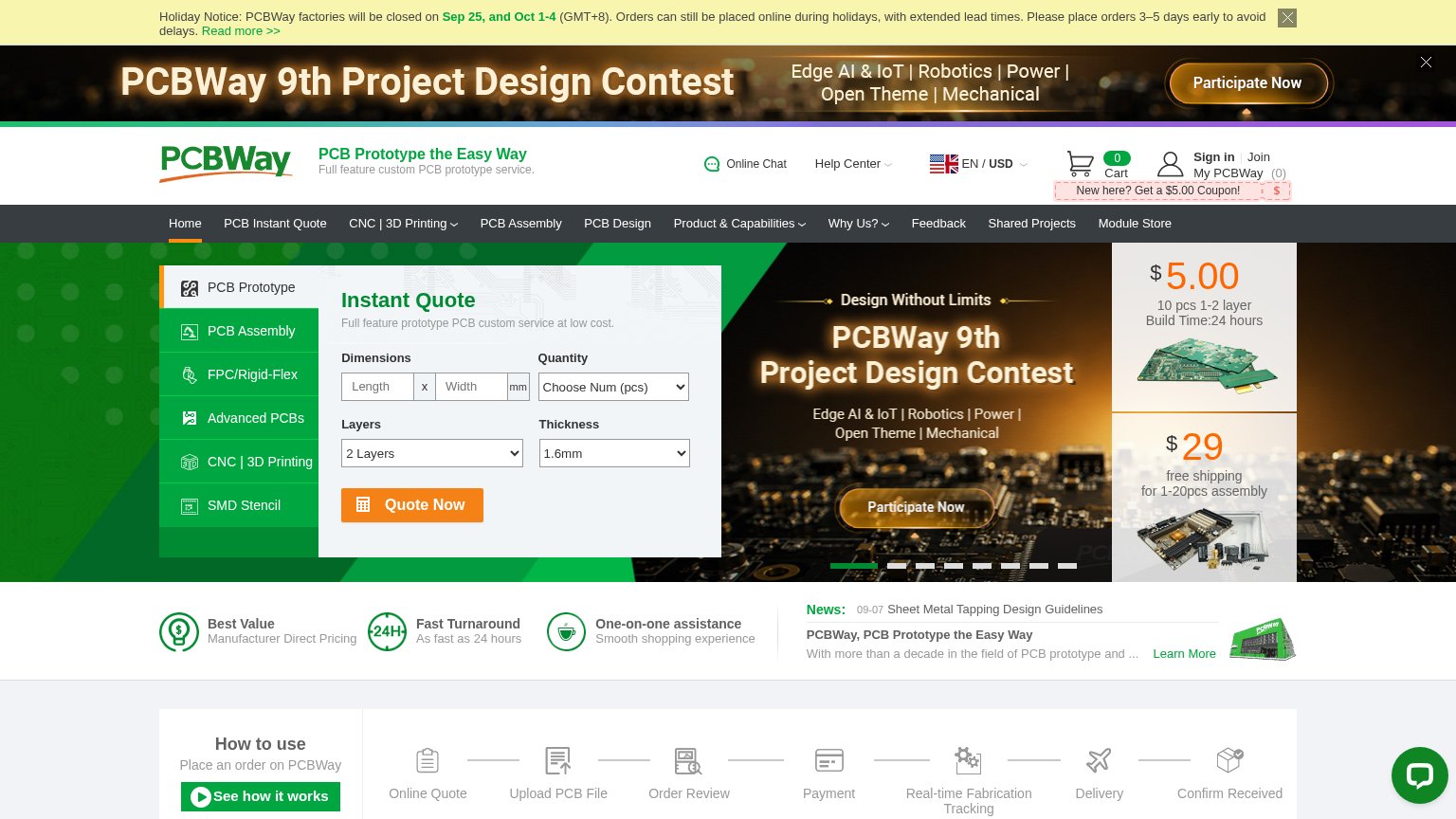
- Contest banner CTA — "Participate Now" duplicated in banner and carousel, pulling attention from Quote Now at equal weight.
- Eleven-item nav bar — Eleven equal-weight links leak attention before the visitor reaches the quote form.
- Holiday notice bar — Long operational text with a "Read more" link occupies the topmost scan position above the brand.
- Small tagline text — "PCB Prototype the Easy Way" is header-sized fine print, outranked by the contest carousel.
Value props
62FairTitle, subtitle, hero — do they sell the product's true value?
PCBWay’s headline
PCB Prototype the Easy Way
Full feature custom PCB prototype service.
Working
Could improve
Trust
72FairProof that the product is real, competent, and safe to try.
How PCBWay compares
Trust read
CTA
76FairCopy, size, verb, cost-feel — does the primary CTA earn the click?
How PCBWay compares
Recommended rewrites