
Your landing page’s weakest score is Trust.
How Outpost ranks
Trust
48PoorProof that the product is real, competent, and safe to try.
| Trust read | |
|---|---|
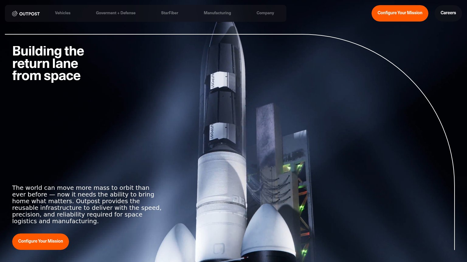
| Outpost | Photo of Outpost-branded reentry vehicle hardware on the launch pad |
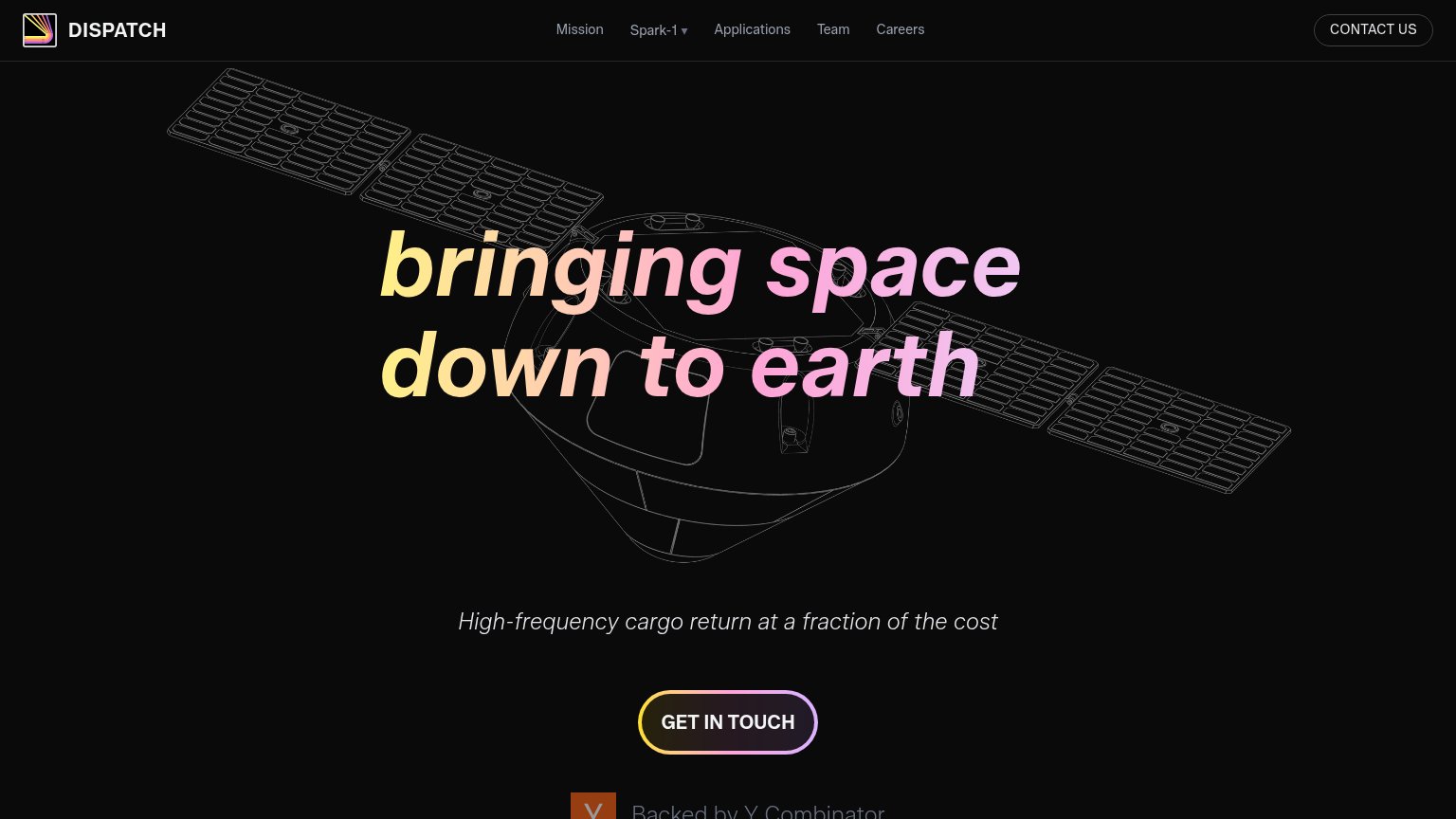
| "Backed by Y Combinator" badge below the CTA | |
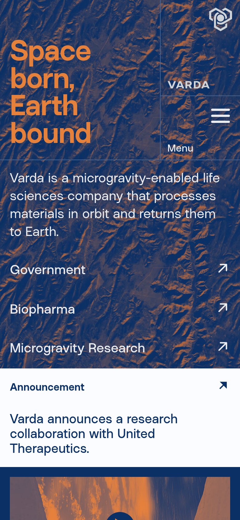
| Mobile announcement: "Varda announces a research collaboration with United Therapeutics." | |
| No visible trust signal identified. | |
| Product render of the ATMOS capsule with deployed inflatable heat shield above Earth (mobile hero image) |
Mobile web
70FairThe phone experience as a first-class citizen.
 123
- Body paragraph contrast — White text runs over the white rocket body with no scrim, making mid-paragraph lines nearly unreadable.
- Configure Outpost's Mission CTA — Desktop-proportioned button floats at half the column width instead of a full-bleed thumb target.
- Headline over fairing — "from space" overlaps the bright fairing edge, weakening contrast on the last headline line.
Value props
72FairTitle, subtitle, hero — do they sell the product's true value?
Outpost’s headline
Building the return lane from space
The world can move more mass to orbit than ever before — now it needs the ability to bring home what matters. Outpost provides the reusable infrastructure to deliver with the speed, precision, and reliability required for space logistics an
Working
Could improve
CTA
74FairCopy, size, verb, cost-feel — does the primary CTA earn the click?
How Outpost compares
Recommended rewrites
Information hierarchy
76FairDoes the design help or inhibit what the page is trying to say?
What works
What to improve