
Your landing page’s weakest score is Value props.
How Origin ranks
58Growth scoreupdated
category scores
category scoresShowHide
Value props
42PoorTitle, subtitle, hero — do they sell the product's true value?
Origin’s headline vague
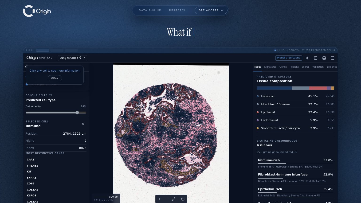
What if
Working
- Demo shows real product doing real work
- Specific data: 57,252 predicted cells
- Tissue percentages prove precision
Could improve
- Headline is an unfinished animation
- No subhead explains what Origin is
- Value must be inferred from the UI
Information hierarchy
58FairDoes the design help or inhibit what the page is trying to say?
 123
- Truncated typing headline — The animated 'What if |' headline is caught mid-type, so the fold never states what Origin is or does.
- Onboarding tooltip overlay — 'Click any cell' tooltip covers the left panel and adds a competing 'OKAY' button before the visitor reads anything.
- Cut-off left panel — 'Predicted cells' label and gene list are clipped by the tooltip and fold edge, leaving half-rendered UI in the first impression.
Trust
58FairProof that the product is real, competent, and safe to try.
How Origin compares
Trust read
CTA
64FairCopy, size, verb, cost-feel — does the primary CTA earn the click?
How Origin compares
Recommended rewrites
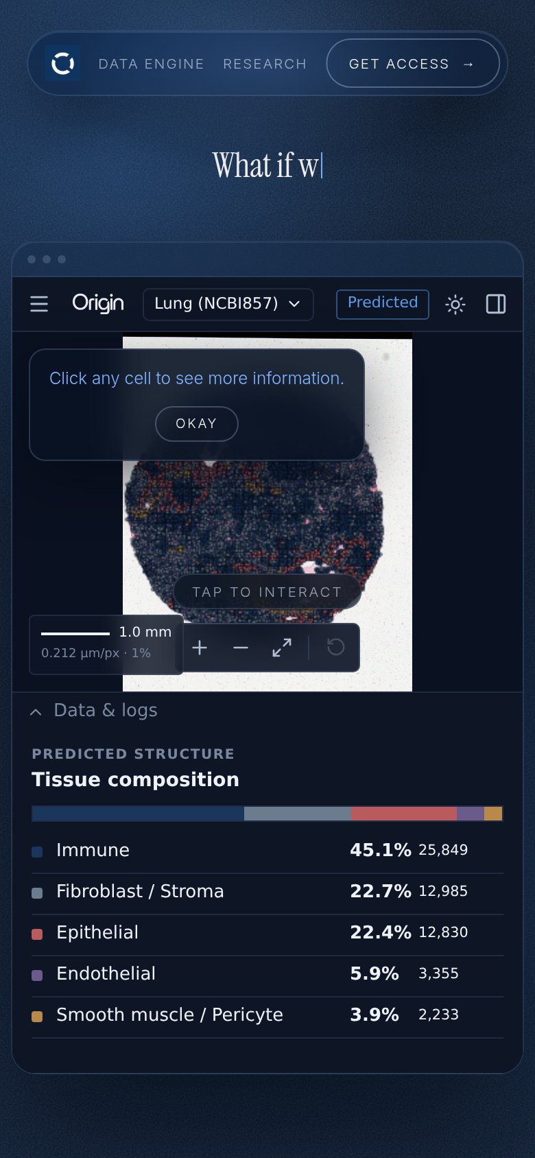
Mobile web
66FairThe phone experience as a first-class citizen.
What works
What to improve