
Your landing page’s weakest score is Mobile web.
How OptSpot ranks
- 1.
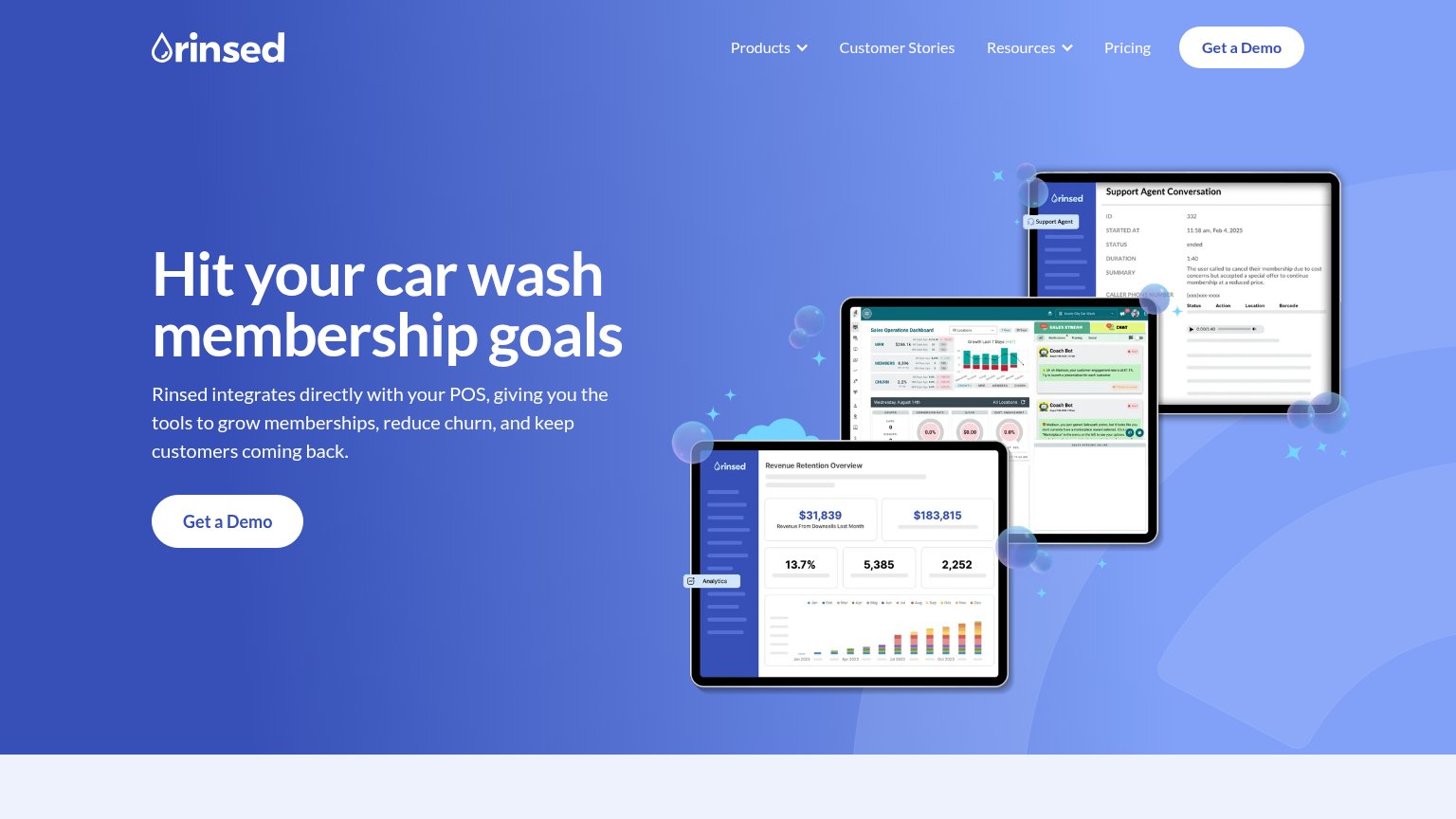
Rinsed74
- 2.
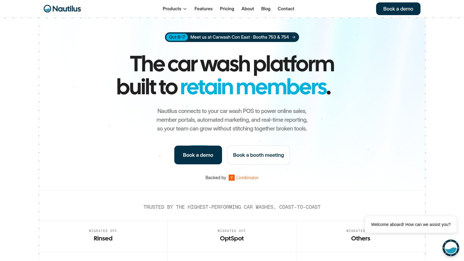
Nautilus71
- 3.
OptSpot60
Mobile web
42PoorThe phone experience as a first-class citizen.
 12
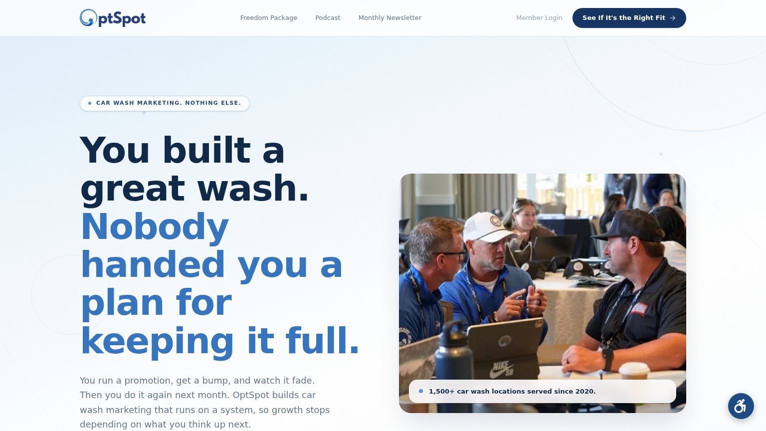
- Oversized headline block — The headline barely scaled down and wraps into eight lines, consuming most of the viewport and pushing everything else off-screen.
- Accessibility widget bubble — The floating accessibility button overlaps the body copy in the exact bottom-right zone where a sticky CTA belongs.
CTA
54FairCopy, size, verb, cost-feel — does the primary CTA earn the click?
Problems
- no CTA in hero, nav-only
- absent from mobile fold
- six words, two fixations
- weak verb 'See'
Trust
58FairProof that the product is real, competent, and safe to try.
How OptSpot compares
Trust read
Information hierarchy
68FairDoes the design help or inhibit what the page is trying to say?
What works
What to improve
Value props
78FairTitle, subtitle, hero — do they sell the product's true value?
OptSpot’s headline
You built a great wash. Nobody handed you a plan for keeping it full.
You run a promotion, get a bump, and watch it fade. Then you do it again next month. OptSpot builds car wash marketing that runs on a system, so growth stops depending on what you think up next.
Working
Could improve