
Your landing page’s weakest score is Trust.
How ODAIA ranks
Trust
42PoorProof that the product is real, competent, and safe to try.
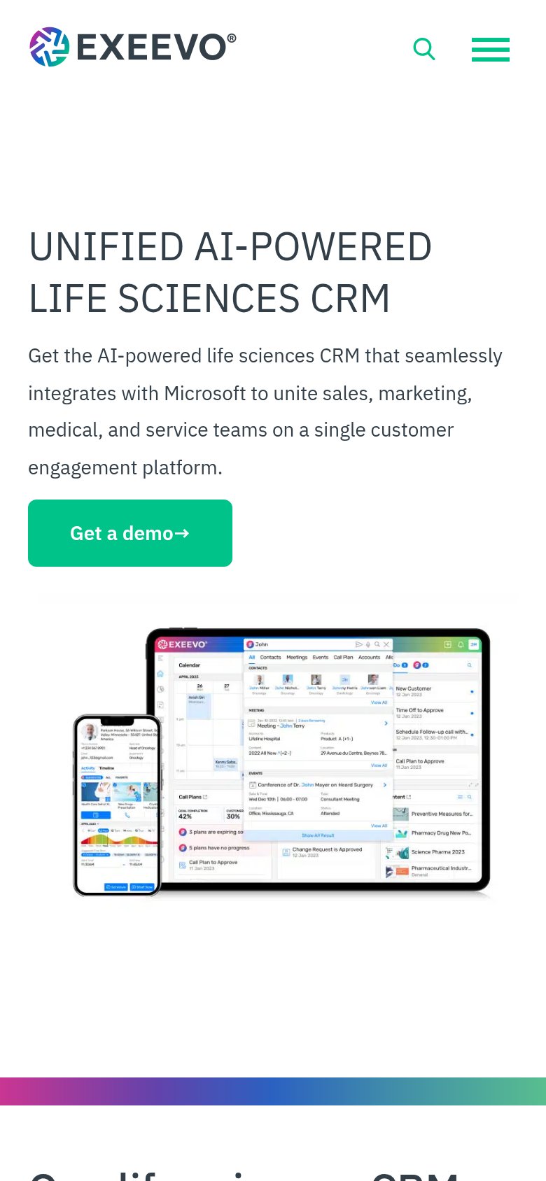
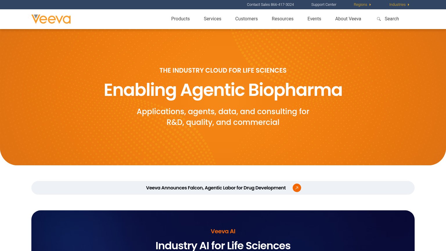
| Trust read | |
|---|---|
| ODAIA | No visible trust signal identified. |
| No visible trust signal identified. | |
| Announcement banner: "Veeva Announces Falcon, Agentic Labor for Drug Development" | |
| Detailed product UI mockup on tablet and phone showing CRM calendar, contacts, call plans, and approval workflows | |
| "Soluzioni integrate basate su tecnologie Microsoft" — Microsoft technology anchor in the subhead |
Mobile web
62FairThe phone experience as a first-class citizen.
 123
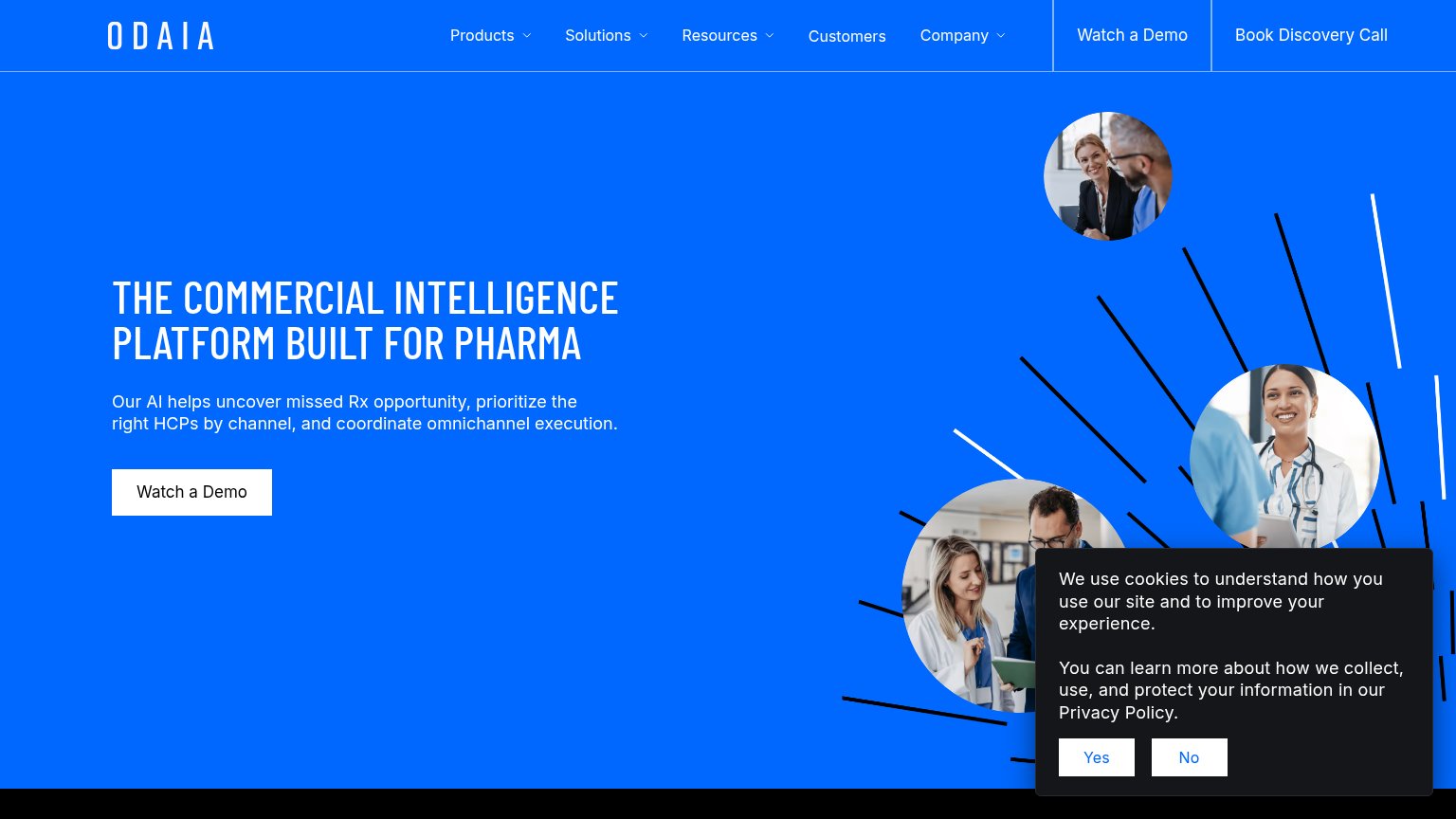
- Cookie consent banner — Dead blocker covering a third of the viewport with no conversion CTA, hiding the content below.
- Hero headline block — Desktop-scale type wraps into four tall lines, pushing the CTA to the fold's bottom edge.
- Watch a Demo button — Desktop-proportioned at half the column width instead of a thumb-friendly full-bleed tap target.
Value props
68FairTitle, subtitle, hero — do they sell the product's true value?
ODAIA’s headline
THE COMMERCIAL INTELLIGENCE PLATFORM BUILT FOR PHARMA
Our AI helps uncover missed Rx opportunity, prioritize the right HCPs by channel, and coordinate omnichannel execution.
Working
Could improve
CTA
70FairCopy, size, verb, cost-feel — does the primary CTA earn the click?
How ODAIA compares
Recommended rewrites
Information hierarchy
72FairDoes the design help or inhibit what the page is trying to say?
What works
What to improve