
Your landing page’s weakest score is Trust.
How o11 ranks
62Growth scoreupdated
category scores
category scoresShowHide
Trust
48PoorProof that the product is real, competent, and safe to try.


| Trust read | |
|---|---|
| o11 | "o11 announces new funding led by Y Combinator." announcement bar |
| "Trusted by data-driven companies" section header signaling a customer logo section | |
| Real product UI screenshot showing pipeline lineage with "BigQuery — Connected", "Git repository — Connected", "Storage | |
| "Definite runs as a private deployment in your own cloud (AWS, GCP, Azure, or anywhere with Kubernetes); you keep contro |
Information hierarchy
64FairDoes the design help or inhibit what the page is trying to say?
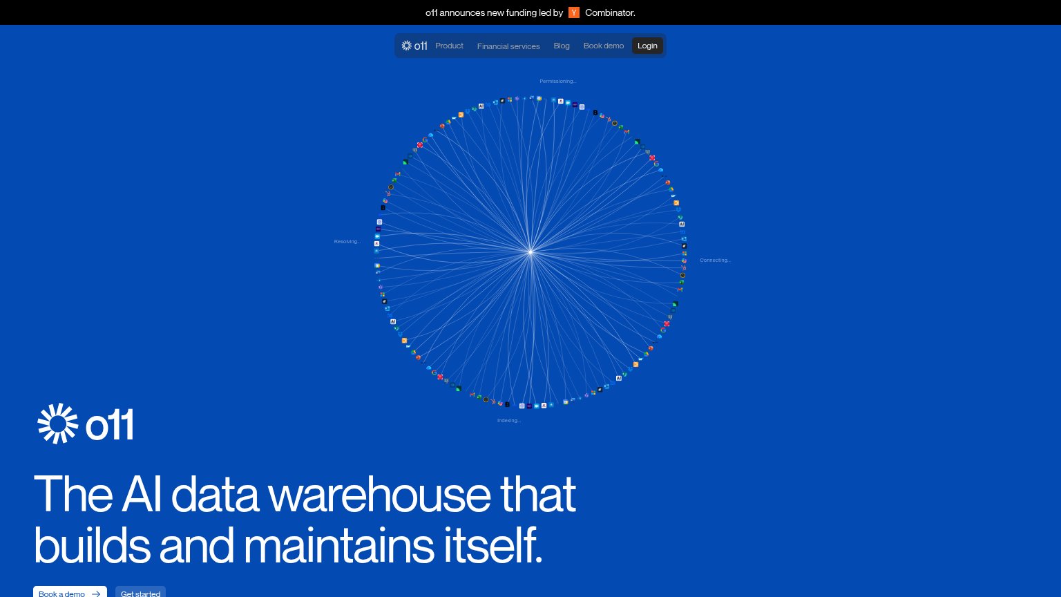
1234- Headline clipped by fold — The hero headline and CTA pair sit at the very bottom edge — 'Book a demo' is cut off, so the fold's key message and action arrive half-hidden.
- Radial integrations visual — The full-height burst graphic occupies the entire scan path and outranks the headline, pushing the value prop and CTAs below the viewer's first glance.
- Equal-weight CTA pair — 'Book a demo' and 'Get started' sit side by side at similar weight, splitting the single conversion into two competing actions.
- YC announcement banner — The topmost element is a funding banner linking away from the page before the visitor sees what o11 is.
Mobile web
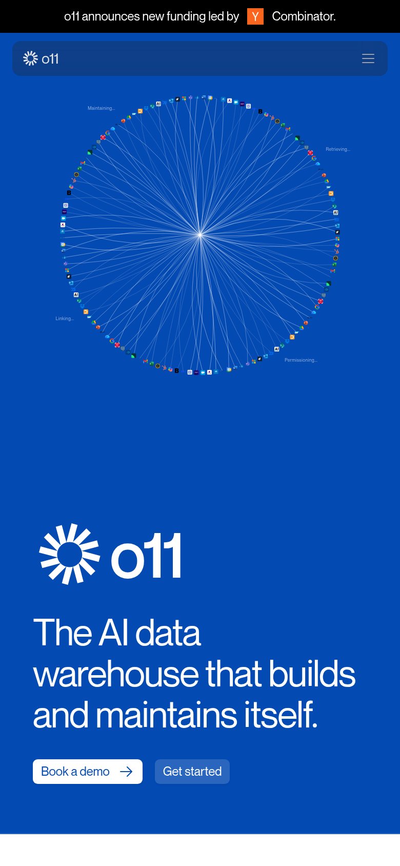
64FairThe phone experience as a first-class citizen.
What works
What to improve
CTA
68FairCopy, size, verb, cost-feel — does the primary CTA earn the click?
How o11 compares
Recommended rewrites
Value props
68FairTitle, subtitle, hero — do they sell the product's true value?
o11’s headline
The AI data warehouse that builds and maintains itself.
Working
Could improve