
Your landing page’s weakest score is Mobile web.
How Newgrounds ranks
- 1.
CrazyGames67
- 2.
Poki64
- 3.
Wavedash56
- 4.
Newgrounds51
51Growth scoreupdated
category scores
category scoresShowHide
Mobile web
34PoorThe phone experience as a first-class citizen.
 1234
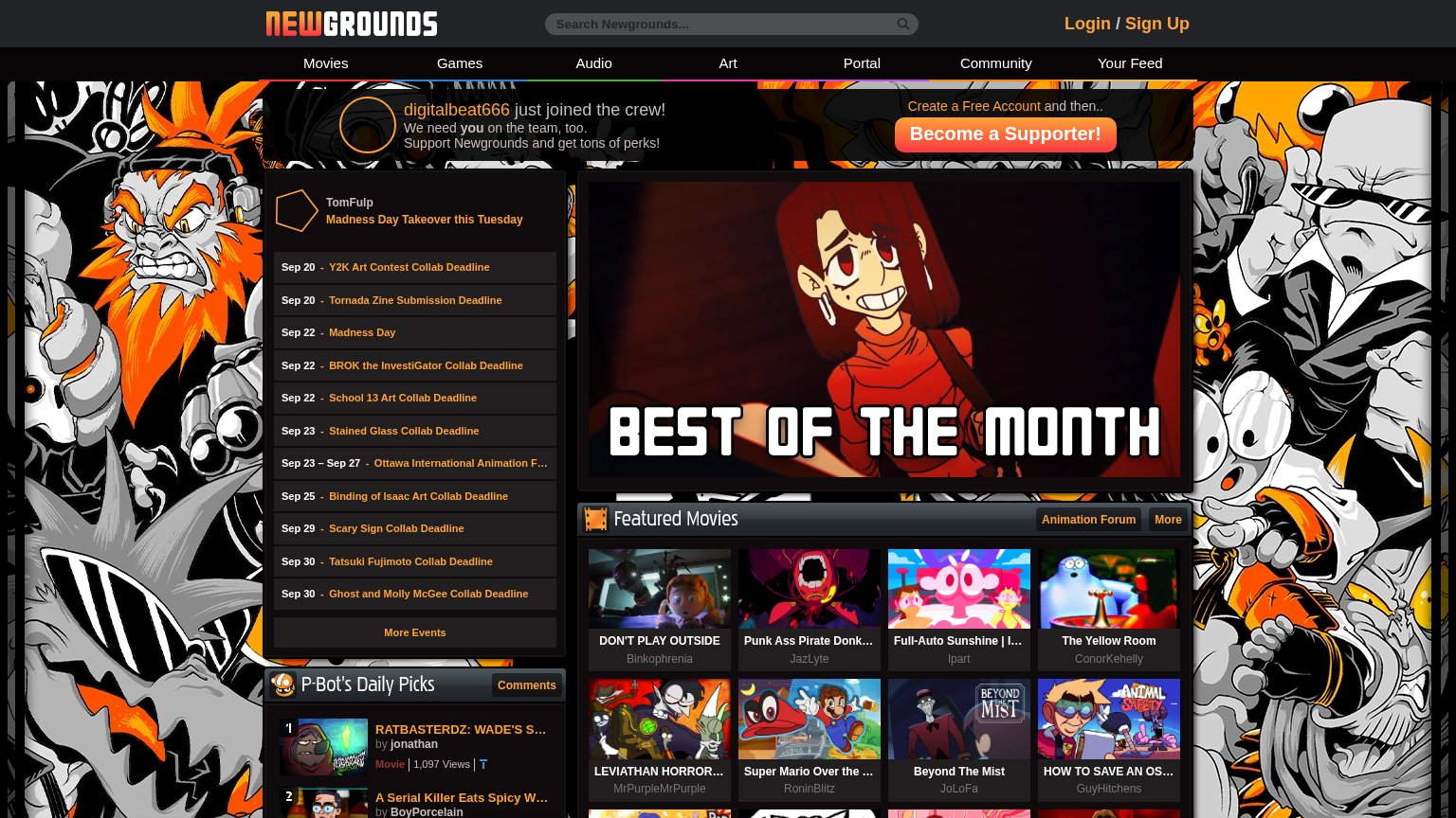
- Clipped hero column — 'Best of the Month' hero and Featured Movies thumbnails are cut off at the right edge, hiding the page's core content.
- Truncated nav row — Desktop link row runs off-screen with no hamburger; links beyond Audio and the signup CTA are unreachable.
- Cut-off supporter banner — Banner text clips mid-sentence and its 'Become a Supporter!' CTA is pushed entirely off the viewport.
- Event deadline wall — Eleven stacked collab-deadline rows dominate the first fold with no conversion action anywhere among them.
Value props
42PoorTitle, subtitle, hero — do they sell the product's true value?
Newgrounds’s headline undersells
digitalbeat666 just joined the crew!
We need you on the team, too. Support Newgrounds and get tons of perks!
Working
- Content itself proves an active community
- Social proof of a new member joining
- Event calendar signals constant activity
Could improve
- No statement of what Newgrounds is
- "Tons of perks" names nothing concrete
- Hero space sells donations, not the product
Information hierarchy
52FairDoes the design help or inhibit what the page is trying to say?
What works
What to improve
CTA
62FairCopy, size, verb, cost-feel — does the primary CTA earn the click?
How Newgrounds compares
Recommended rewrites
Trust
66FairProof that the product is real, competent, and safe to try.
How Newgrounds compares
Trust read