
Your landing page’s weakest score is Information hierarchy.
How n8n ranks
77Growth scoreupdated
category scores
category scoresShowHide
Information hierarchy
72FairDoes the design help or inhibit what the page is trying to say?
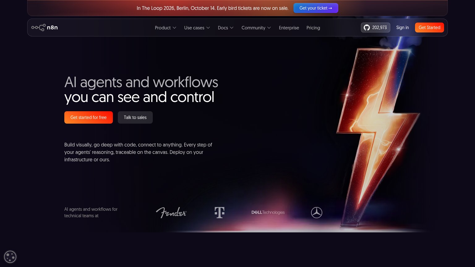 1234
- Conference ticket banner — Blue "Get n8n's ticket" button is the first CTA in scan order, pulling attention to an event before the product pitch lands.
- GitHub star counter — 202,973-star badge is a bright outbound exit sitting next to the header CTA at nearly equal visual weight.
- Header Get Started — Duplicates the hero's "Get started for free" in the same orange, splitting the primary action across two competing buttons.
- Faded logo strip — Fender, Telekom, and Dell marks are so low-contrast against the dark background that the social proof barely registers.
Trust
74FairProof that the product is real, competent, and safe to try.
| Trust read | |
|---|---|
| n8n | GitHub star counter "202,973" in the header |
| Integration wall with real tool logos (Gmail, PostgreSQL, WhatsApp, Asana, Dropbox) in the mobile fold | |
| "TRUSTED BY AI LEADERS" logo strip with Red Bull, Rakuten, Contentful, Roblox, Docusign, Pipedrive, PostHog | |
| GitHub OSS badge showing 17,990 stars | |
| GitHub "Star 13,982" counter in the header | |
| No visible trust signal identified. |
Value props
78FairTitle, subtitle, hero — do they sell the product's true value?
n8n’s headline
AI agents and workflows you can see and control
Build visually, go deep with code, connect to anything. Every step of your agents' reasoning, traceable on the canvas. Deploy on your infrastructure or ours.
Working
Could improve
Mobile web
78FairThe phone experience as a first-class citizen.
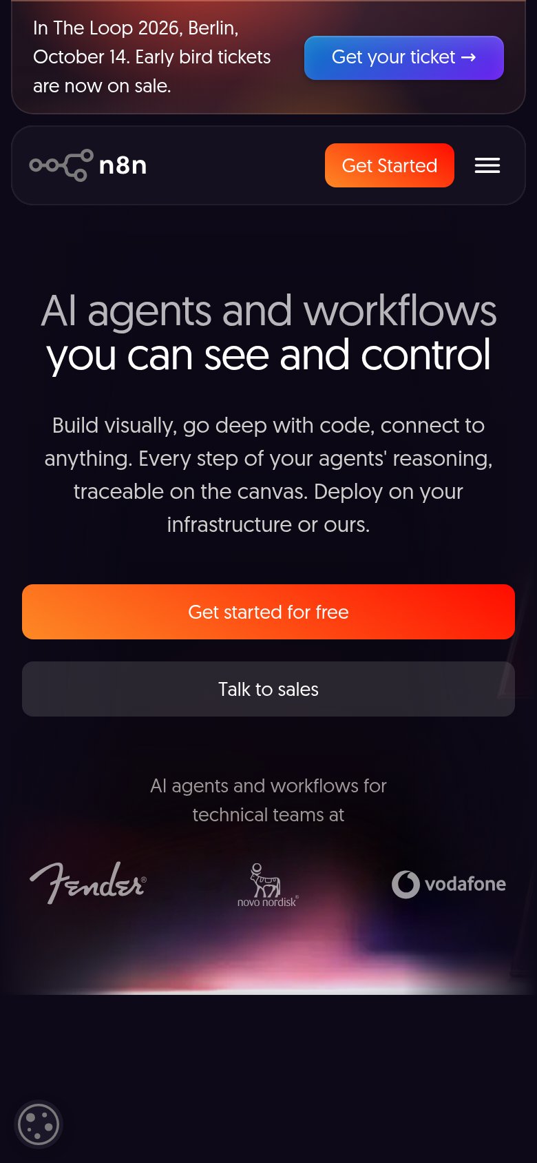
What works
What to improve
CTA
82StrongCopy, size, verb, cost-feel — does the primary CTA earn the click?
How n8n compares
Recommended rewrites