
Your landing page’s weakest score is Information hierarchy.
How Moondream ranks
- 1.
Moondream78
- 2.
Landing AI72
- 3.
Roboflow71
- 4.
Overshoot67
78Growth scoreupdated
category scores
category scoresShowHide
Information hierarchy
72FairDoes the design help or inhibit what the page is trying to say?
 1234
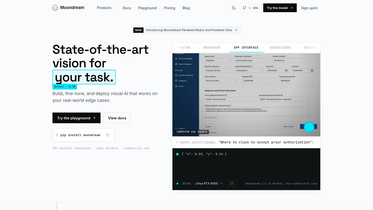
- Header CTA cluster — "Try the model", "Sign up/in", and the GitHub badge stack three same-row actions that compete with the hero's "Try the playground" button.
- Six-item nav row — Products, Docs, Playground, Pricing, Blog plus GitHub give the fold nine-plus exit paths before the primary CTA is reached.
- NEW announcement banner — The Parakeet banner sits directly above the headline and pulls the first click toward a product update instead of the conversion.
- Demo tab strip — Five uppercase tabs (TAGGING, WAREHOUSE, APP INTERFACE...) invite exploration clicks inside the hero panel, siphoning attention from the CTA pair.
Mobile web
76FairThe phone experience as a first-class citizen.
 123
- Try the playground button — Primary CTA sits below the mobile fold; visitors must scroll past the headline and subhead to find it.
- Detect annotation label — The 'detect · 0.98' overlay collides with the headline's descenders and reads as visual noise on the small screen.
- NEW banner — The Parakeet announcement bar occupies a wide band above the headline, delaying the value statement.
Trust
78FairProof that the product is real, competent, and safe to try.
How Moondream compares
Trust read
CTA
82StrongCopy, size, verb, cost-feel — does the primary CTA earn the click?
How Moondream compares
Recommended rewrites
Value props
82StrongTitle, subtitle, hero — do they sell the product's true value?
Moondream’s headline
State-of-the-art vision for your task.
Build, fine-tune, and deploy visual AI that works on your real-world edge cases.
Working
Could improve