
Your landing page’s weakest score is Information hierarchy.
How Microsandbox ranks
- 1.
Daytona81
- 2.
E2B80
- 3.
Modal76
- 4.
Microsandbox72
- 5.
Butter43
72Growth scoreupdated
category scores
category scoresShowHide
Information hierarchy
68FairDoes the design help or inhibit what the page is trying to say?
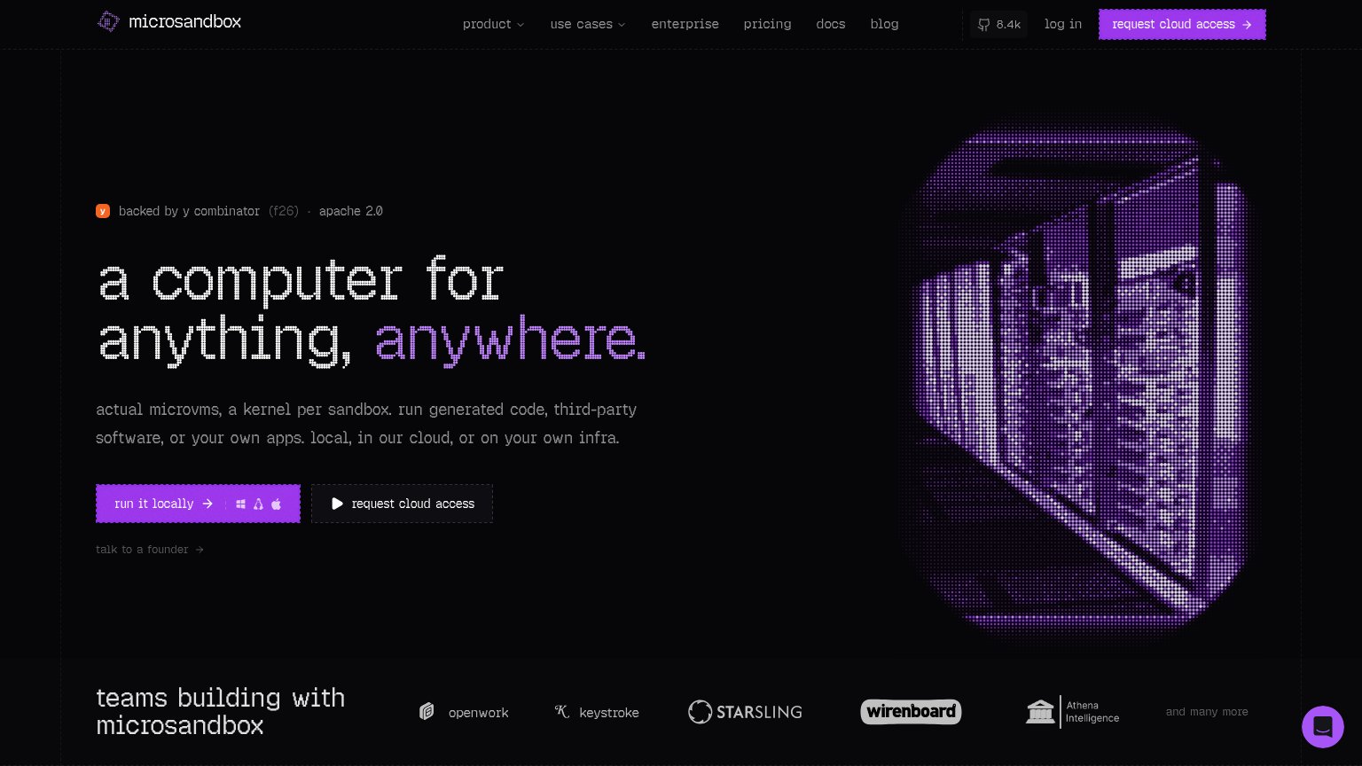 1234
- Dual hero CTAs — "run it locally" and "request cloud access" sit side-by-side at similar footprint, splitting the primary action while the header repeats "request cloud access" a third time.
- Header nav row — Seven nav items plus GitHub badge and log in give the fold ten exit paths that all compete with the conversion action.
- "talk to a founder" link — A third low-contrast CTA beneath the button pair adds a fourth path from a single decision point.
- OS icons in CTA — Windows/Linux/Apple glyphs crammed inside the primary button add noise to the one element that should read instantly.
CTA
72FairCopy, size, verb, cost-feel — does the primary CTA earn the click?
Problems
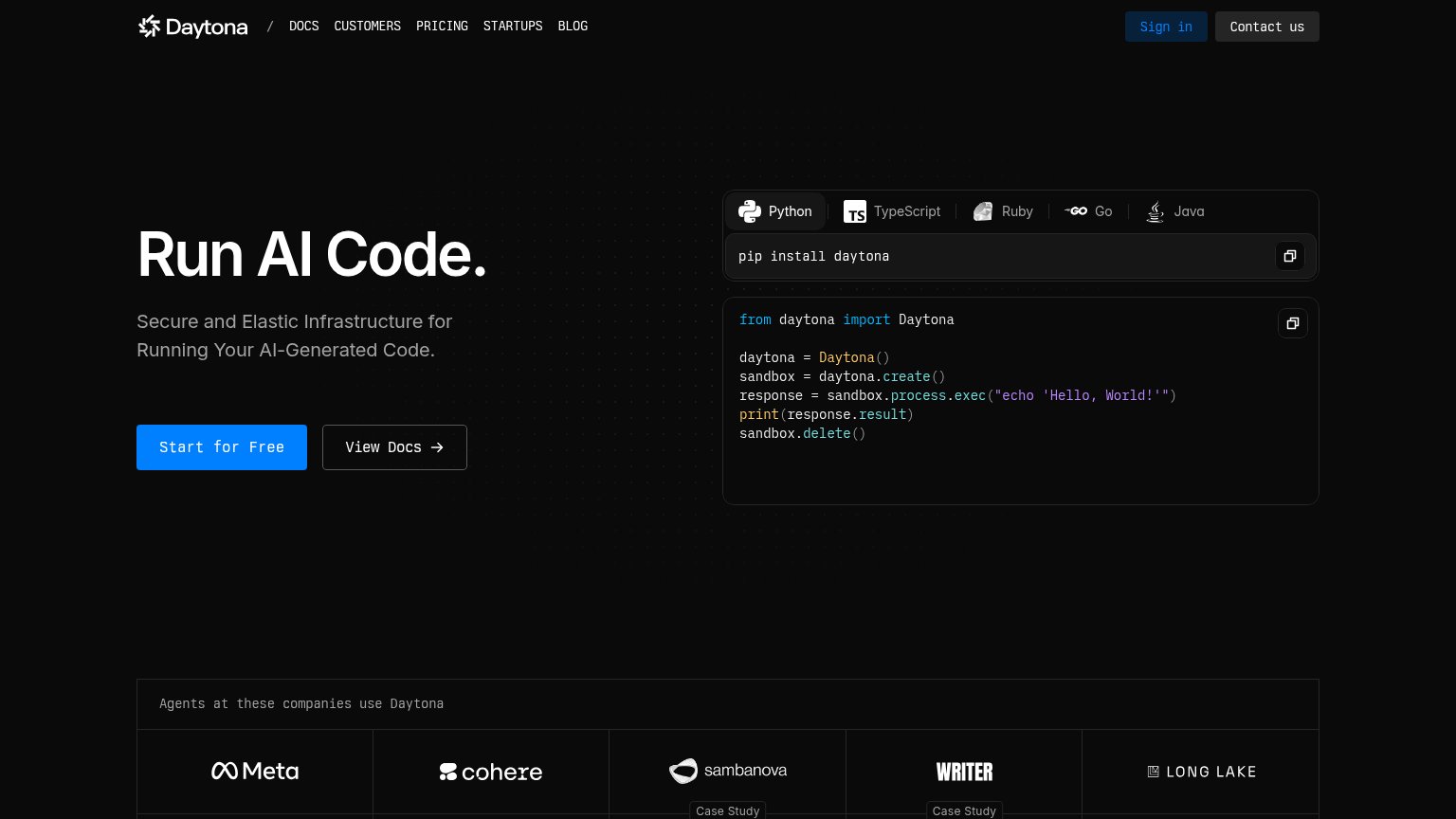
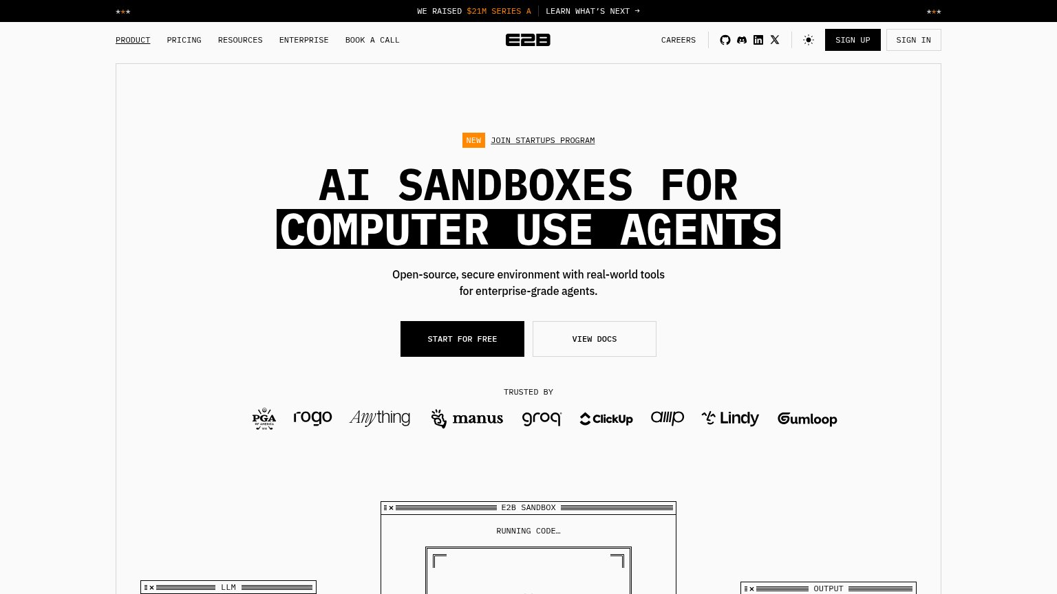
- no 'free' despite apache 2.0 badge
- header CTA differs from hero CTA
- three competing asks in hero
- 'locally' presumes dev-tool context
Value props
72FairTitle, subtitle, hero — do they sell the product's true value?
Microsandbox’s headline
a computer for anything, anywhere.
actual microvms, a kernel per sandbox. run generated code, third-party software, or your own apps. local, in our cloud, or on your own infra.
Working
Could improve
Trust
72FairProof that the product is real, competent, and safe to try.
How Microsandbox compares
Trust read
Mobile web
76FairThe phone experience as a first-class citizen.
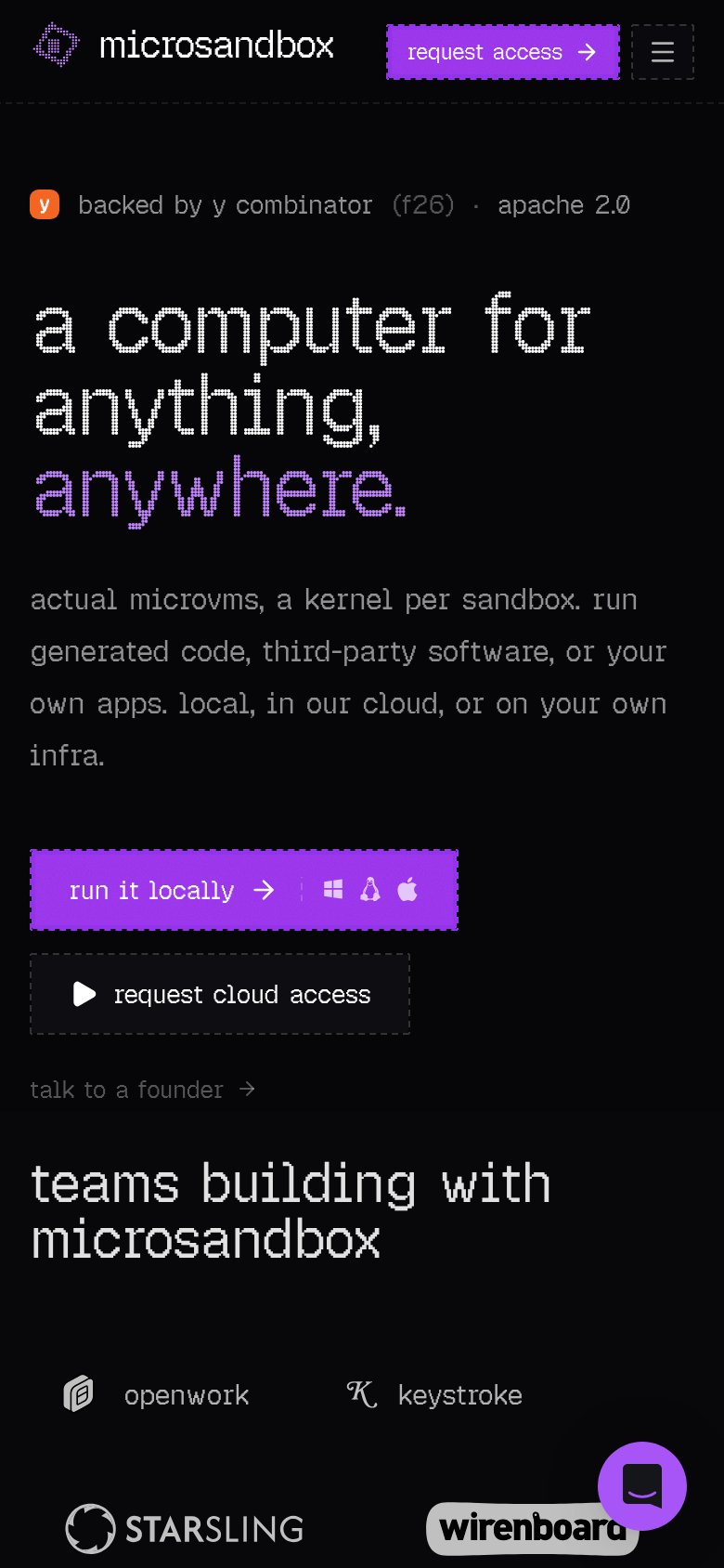
What works
What to improve