
Your landing page’s weakest score is Information hierarchy.
How Mendral ranks
78Growth scoreupdated
category scores
category scoresShowHide
Information hierarchy
72FairDoes the design help or inhibit what the page is trying to say?
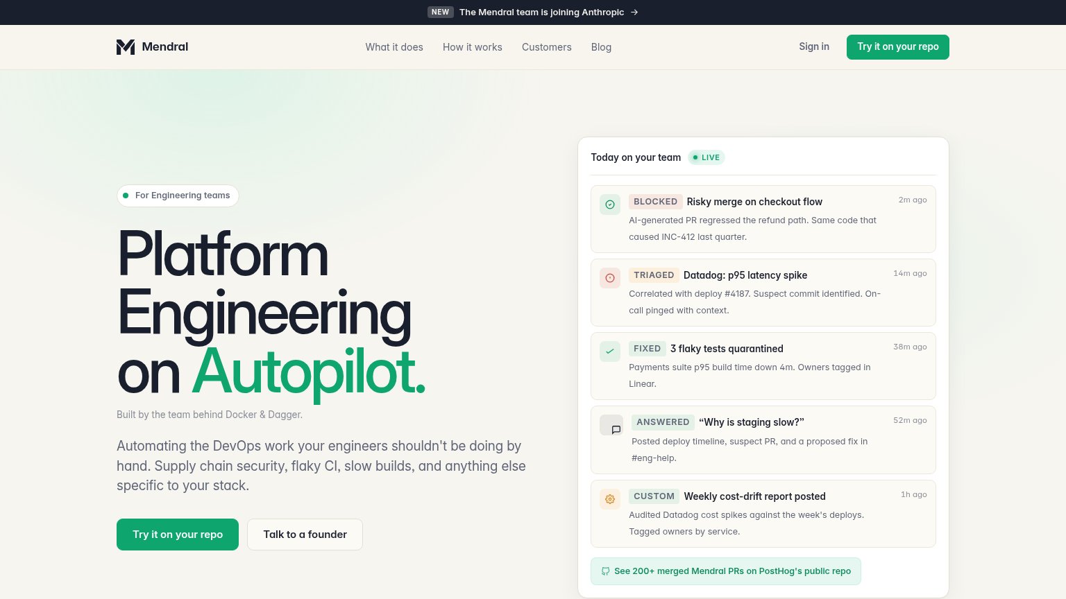 1234
- Anthropic announcement banner — Top-of-page banner announces the team is joining Anthropic, pulling attention and clicks away before the hero can convert.
- Duplicate CTA pair — "Try it on Mendral's repo" appears twice in the fold (nav and hero), splitting the visitor's action target instead of concentrating it.
- Live activity feed — Five same-weight cards with badges, timestamps, and body copy compete with the headline as a second dense reading task.
- PostHog repo link — Outbound proof link at the feed's foot is styled as a green pill, echoing the primary CTA color and inviting an exit.
Trust
76FairProof that the product is real, competent, and safe to try.
| Trust read | |
|---|---|
| Mendral | "See 200+ merged Mendral PRs on PostHog's public repo" link beneath the live activity panel |
| Embedded Devin session demo showing the task "Migrate all gradient text to #317CFF in both repos, then test" with real P | |
| No visible trust signal identified. | |
| Customer logo wall (Brex, Zillow, Faire, Cockroach Labs, Klaviyo, Retool, Google[x], Zipline) under "The CI reliability | |
| Terminal demo running 'codegen search "summarize a PR"' with real directory results |
Mobile web
78FairThe phone experience as a first-class citizen.
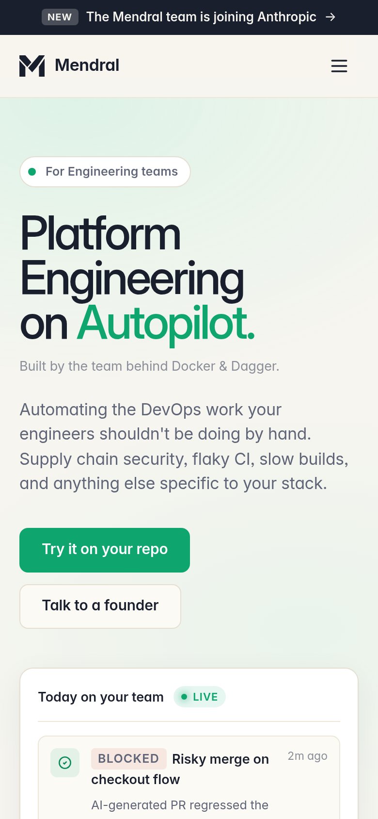
What works
What to improve
CTA
82StrongCopy, size, verb, cost-feel — does the primary CTA earn the click?
How Mendral compares
Recommended rewrites
Value props
82StrongTitle, subtitle, hero — do they sell the product's true value?
Mendral’s headline
Platform Engineering on Autopilot.
Automating the DevOps work your engineers shouldn't be doing by hand. Supply chain security, flaky CI, slow builds, and anything else specific to your stack.
Working
Could improve