
Your landing page’s weakest score is CTA.
How Mechanize ranks
56Growth scoreupdated
category scores
category scoresShowHide
CTA
45PoorCopy, size, verb, cost-feel — does the primary CTA earn the click?
Problems
- text link, not a button
- styled same as other links
- 'Apply' feels high-commitment
- 'here' adds no meaning
Information hierarchy
58FairDoes the design help or inhibit what the page is trying to say?
 1234
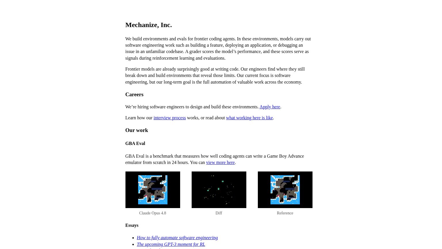
- Apply here link — The sole conversion action is an inline text link identical in weight to five other blue links — invisible at a glance.
- Intro paragraph block — Two long same-weight paragraphs form a text wall before any heading or action, slowing the scan to a full read.
- Interview process links — Two exit links styled at the same weight sit directly under Apply here, splitting attention from the one action.
- Essays link list — Outbound essay links creep into the fold and compete with the careers action at equal visual weight.
Trust
58FairProof that the product is real, competent, and safe to try.
How Mechanize compares
Trust read
Mobile web
58FairThe phone experience as a first-class citizen.
What works
What to improve
Value props
62FairTitle, subtitle, hero — do they sell the product's true value?
Mechanize’s headline
Mechanize, Inc.
We build environments and evals for frontier coding agents. In these environments, models carry out software engineering work such as building a feature, deploying an application, or debugging an issue in an unfamiliar codebase. A grader sc
Working
Could improve