
Your landing page’s weakest score is Mobile web.
How Mastra ranks
69Growth scoreupdated
category scores
category scoresShowHide
Mobile web
62FairThe phone experience as a first-class citizen.
 123
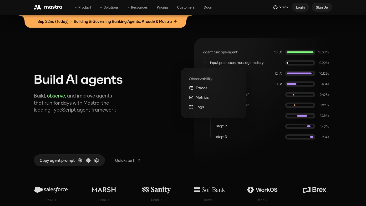
- Clipped announcement banner — Banner text is cut off on both edges ("...ning Banking Agents: Arcade & Mastr..."), reading as a rendering bug in the first thing visitors see.
- Oversized hero graphic — A tall graphic of empty gray placeholder shapes consumes a third of the fold and pushes the primary CTA to the viewport's bottom edge.
- Copy agent prompt button — The primary CTA sits at the very bottom of the fold and is not full-width, leaving a small tap target after a long scroll past decoration.
Information hierarchy
66FairDoes the design help or inhibit what the page is trying to say?
 1234
- Copy agent prompt CTA — Dark low-contrast pill blends into the black background; three unexplained icons dilute a CTA that should read in one second.
- Observability tooltip overlay — Floating panel covers the trace-waterfall visual mid-row, truncating span labels and adding a competing block to the hero's right half.
- Announcement banner — High-saturation orange strip outranks the headline in visual weight and adds an exit link before the value prop is read.
- Partner logo row — Six logos each with their own 'Read →' link creep into the fold, adding six exits at equal weight.
CTA
68FairCopy, size, verb, cost-feel — does the primary CTA earn the click?
How Mastra compares
Recommended rewrites
Value props
72FairTitle, subtitle, hero — do they sell the product's true value?
Mastra’s headline
Build AI agents
Build, observe, and improve agents that run for days with Mastra, the leading TypeScript agent framework
Working
Could improve
Trust
76FairProof that the product is real, competent, and safe to try.
How Mastra compares
Trust read