
Your landing page’s weakest score is Information hierarchy.
How Manus ranks
- 1.
Hemlock70
- 2.
StretchSense66
- 3.
Manus64
- 4.
WEART49
64Growth scoreupdated
category scores
category scoresShowHide
Information hierarchy
58FairDoes the design help or inhibit what the page is trying to say?
 123
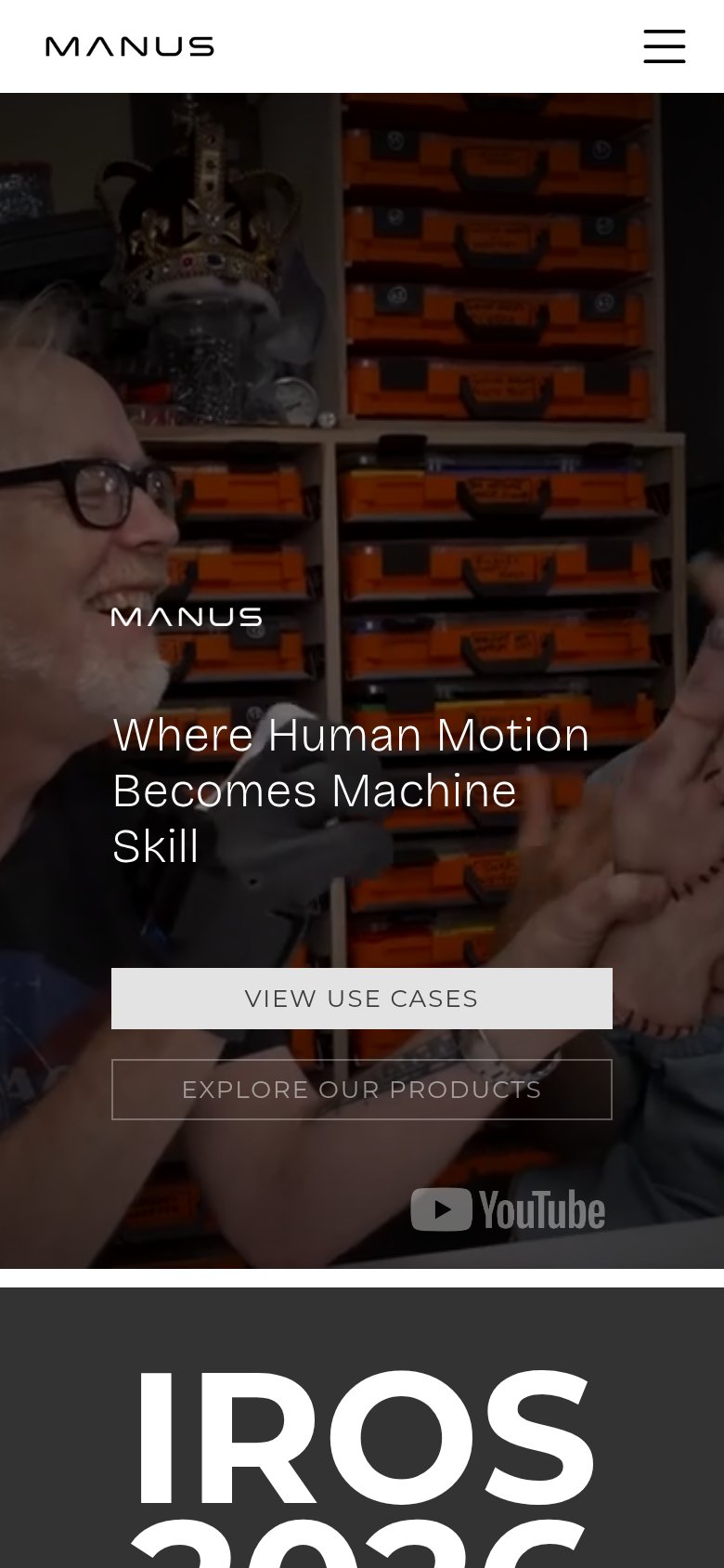
- Two equal-weight CTAs — "VIEW USE CASES" and "EXPLORE OUR PRODUCTS" sit side by side at similar size, so no single action reads as primary.
- IROS 2026 banner — The event block with its own "FIND OUT MORE" CTA crowds into the fold and competes with the hero for the first decision.
- YouTube watermark — The prominent YouTube logo in the hero invites an off-site exit before either CTA is considered.
Value props
62FairTitle, subtitle, hero — do they sell the product's true value?
Manus’s headline undersells
Where Human Motion Becomes Machine Skill
Working
- Names real outcome: motion to machine skill
- Hero video shows glove actually in use
- YouTube badge adds third-party proof
Could improve
- No subhead saying what Manus sells
- Zero numbers or proof points in fold
- Nexus/Core 3.2 jargon needs context
Trust
62FairProof that the product is real, competent, and safe to try.
How Manus compares
Trust read
CTA
66FairCopy, size, verb, cost-feel — does the primary CTA earn the click?
How Manus compares
Recommended rewrites
Mobile web
72FairThe phone experience as a first-class citizen.
What works
What to improve