
Your landing page’s weakest score is Mobile web.
How Loman AI ranks
Mobile web
42PoorThe phone experience as a first-class citizen.
 123
- Expert call modal — Covers most of the first viewport and fully hides the hero's primary CTA behind its own booking flow.
- Clipped headline text — Desktop-sized headline wraps to three lines and gets cut mid-word at "Restaurants" by the modal.
- Countdown urgency banner — "Limited expert calls" 03:00 timer adds dark-pattern pressure inside an already intrusive overlay.
Trust
48PoorProof that the product is real, competent, and safe to try.
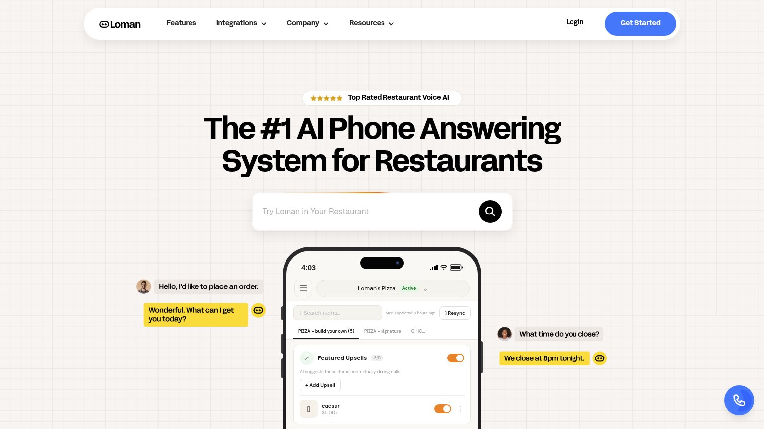
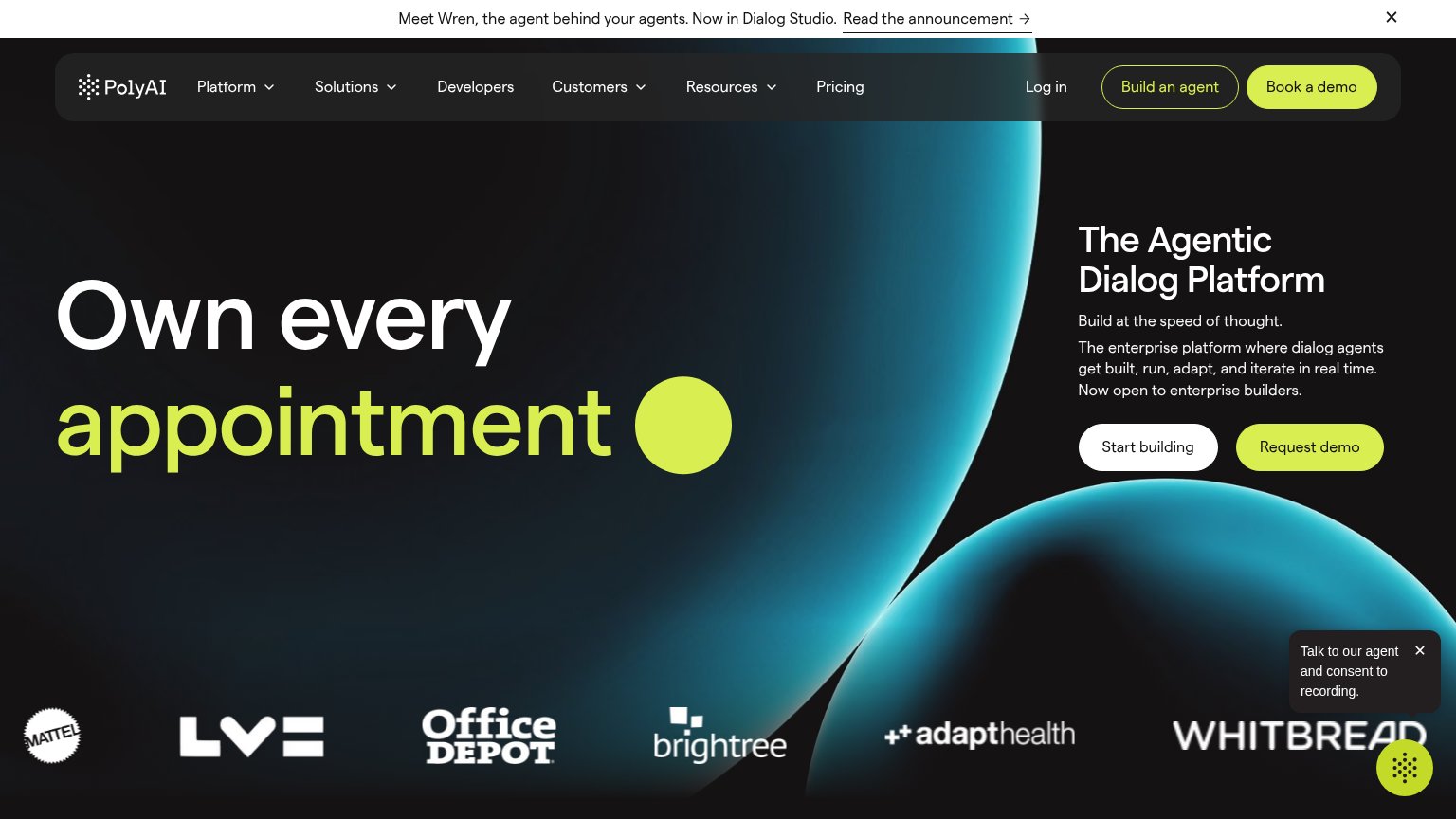
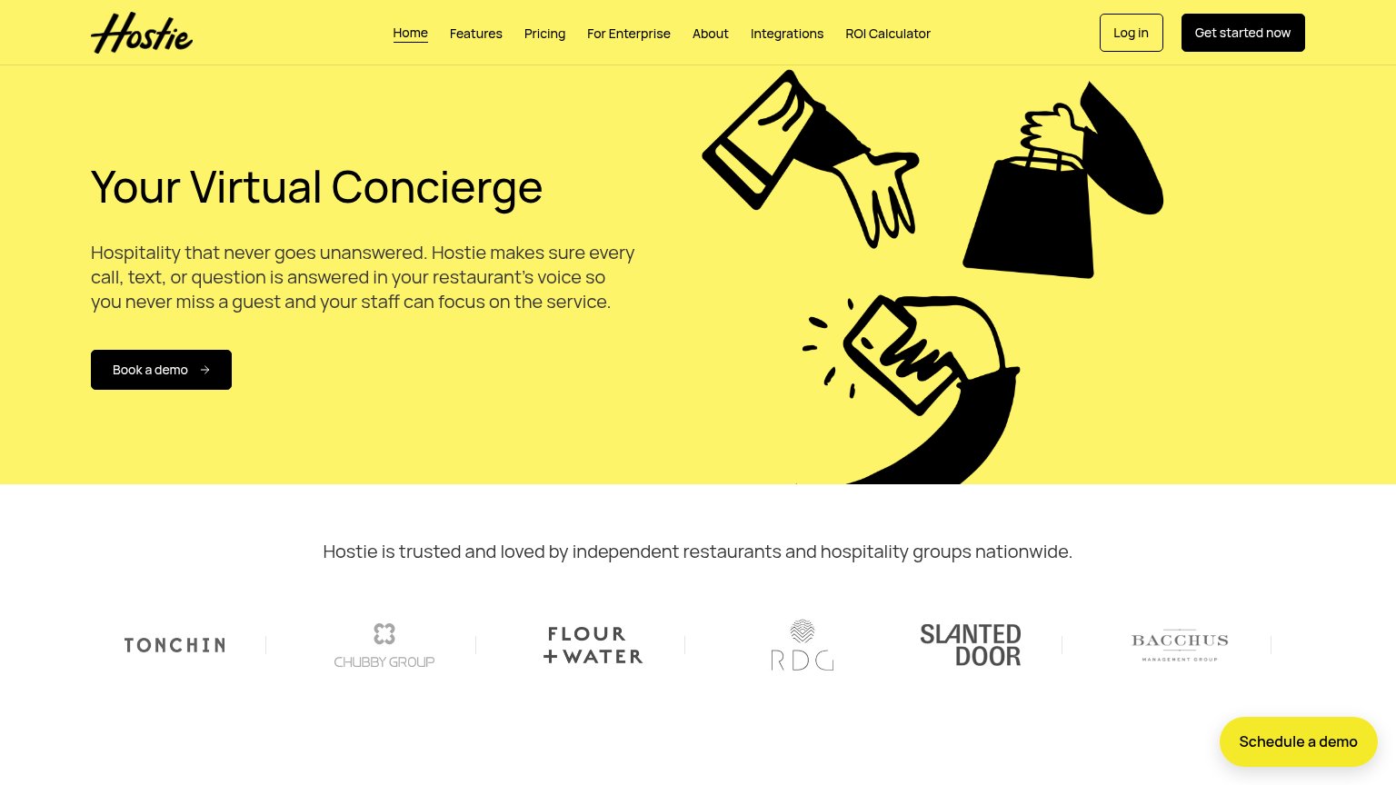
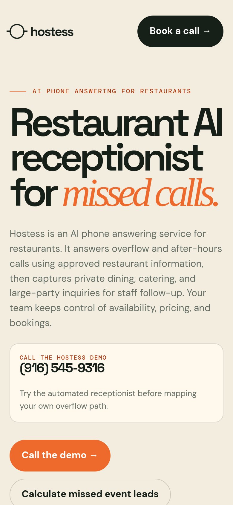
| Trust read | |
|---|---|
| Loman AI | Product UI mockup showing "Loman's Pizza" dashboard with "Menu updated 3 hours ago" and "Featured Upsells" panel |
| "CALL THE HOSTESS DEMO (916) 545-9316" live demo phone number | |
| "Setup in as little as 30 mins, delivering at least 20x ROI" benefit claim | |
| Customer logo strip: Tonchin, Chubby Group, Flour + Water, RDG, Slanted Door, Bacchus Management Group | |
| Customer logo strip (Mattel, Office Depot, Brightree, AdaptHealth, Whitbread) | |
| "Activate in 30 minutes or less" setup-speed claim (mobile) |
Information hierarchy
64FairDoes the design help or inhibit what the page is trying to say?
What works
What to improve
Value props
68FairTitle, subtitle, hero — do they sell the product's true value?
Loman AI’s headline
The #1 AI Phone Answering System for Restaurants
Working
Could improve
CTA
72FairCopy, size, verb, cost-feel — does the primary CTA earn the click?
How Loman AI compares
Recommended rewrites