
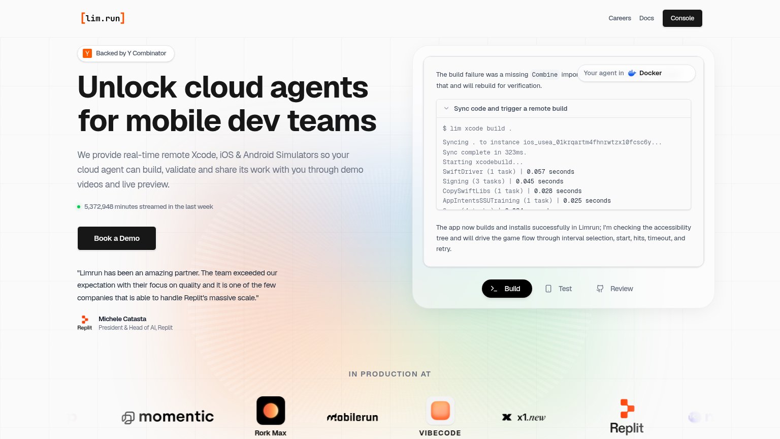
Your landing page’s weakest score is CTA.
How Limrun ranks
CTA
68FairCopy, size, verb, cost-feel — does the primary CTA earn the click?
Problems
- high-commitment sales-call feel
- no self-serve path in hero
- label differs from nav's 'Console'
Mobile web
72FairThe phone experience as a first-class citizen.
 123
- Uncollapsed desktop nav — Careers, Docs, and the Console pill remain a full desktop link row instead of collapsing to a hamburger, crowding the header.
- Six-line subheadline — The long subhead runs six large lines, pushing the Book a Demo CTA down to the bottom edge of the first viewport.
- Clipped mobilerun logo — The 'IN PRODUCTION AT' logo row cuts the mobilerun mark off at the screen edge, looking broken rather than scrollable.
Value props
78FairTitle, subtitle, hero — do they sell the product's true value?
Limrun’s headline
Unlock cloud agents for mobile dev teams
We provide real-time remote Xcode, iOS & Android Simulators so your cloud agent can build, validate and share its work with you through demo videos and live preview.
Working
Could improve
Information hierarchy
82StrongDoes the design help or inhibit what the page is trying to say?
What works
What to improve
Trust
88StrongProof that the product is real, competent, and safe to try.
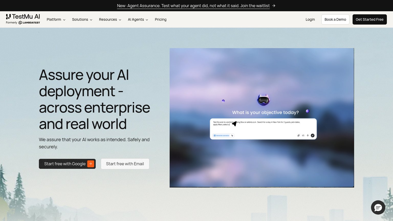
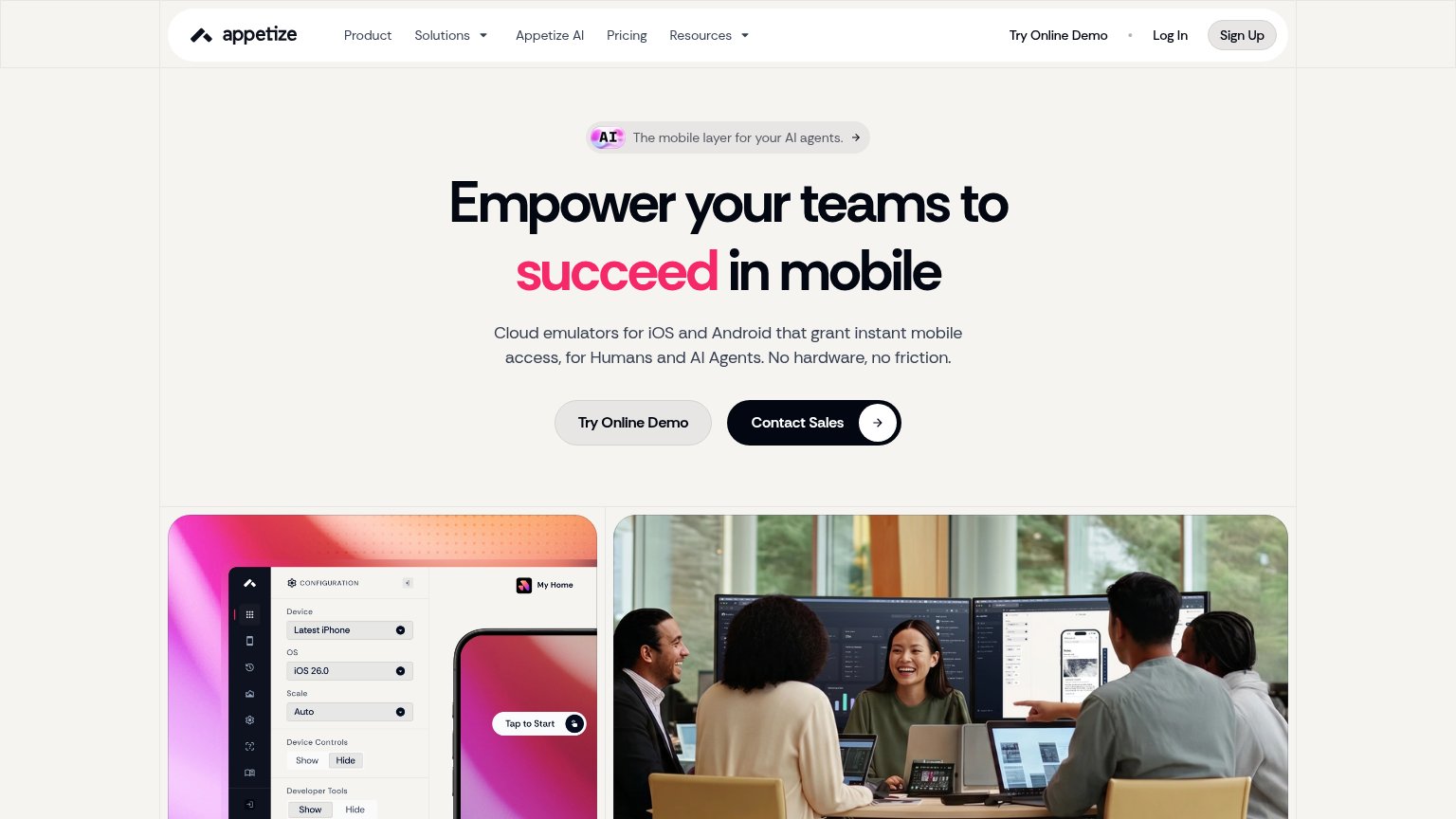
How Limrun compares
Trust read