
Your landing page’s weakest score is Trust.
How liblab ranks
Trust
44PoorProof that the product is real, competent, and safe to try.


| Trust read | |
|---|---|
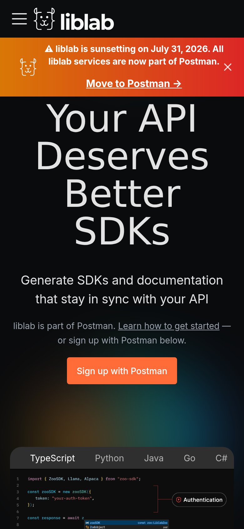
| liblab | Code-editor demo with TypeScript/Python/Java/Go/C# tabs showing real SDK code and an "Authentication" callout |
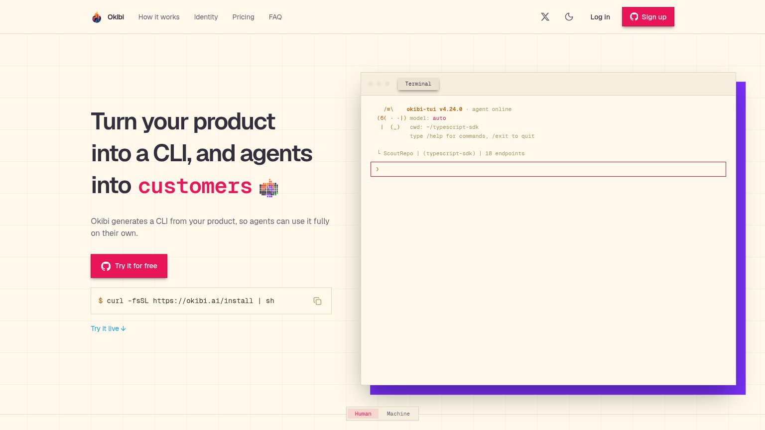
| Terminal demo showing "okibi-tui v4.24.0 · agent online" with "ScoutRepo | (typescript-sdk) | 18 endpoints" | |
| Multi-language code demo tabs (TypeScript, Python, Go, Java, Ruby, C#, PHP) showing a real Anthropic SDK snippet | |
| "TRUSTED BY" logo bar with Google, Mistral AI, MoonPay, Fifth Third, PlanetScale, LaunchDarkly | |
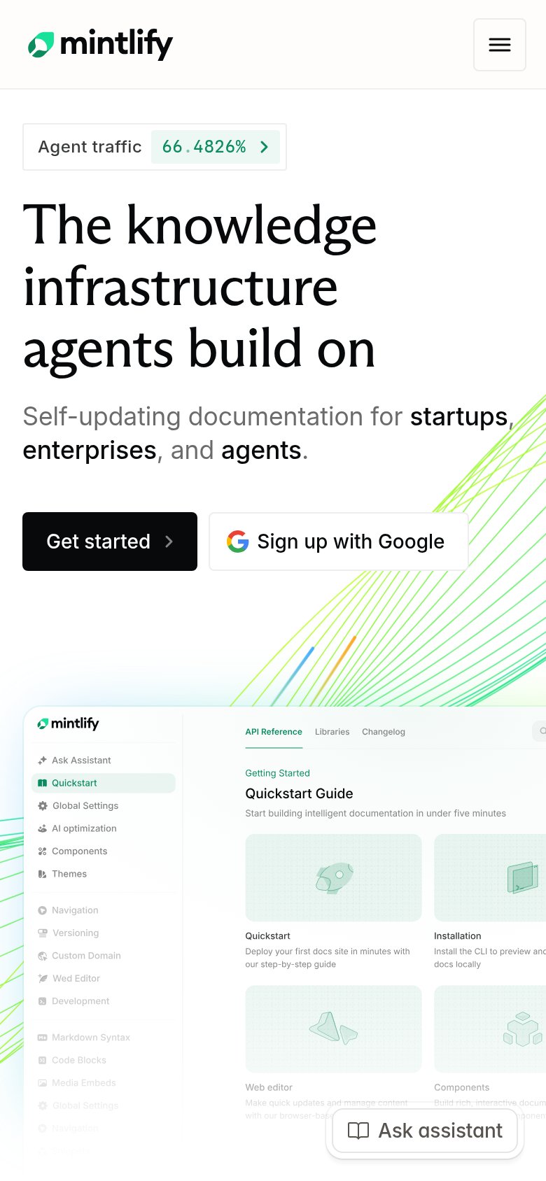
| Detailed real product screenshot of the Mintlify docs UI showing the "Quickstart Guide" ('Start building intelligent doc |
Mobile web
58FairThe phone experience as a first-class citizen.
123- Oversized hero headline — Barely scaled down from desktop; wraps into four huge lines and pushes the CTA off-screen.
- Sunsetting banner — Three-deck banner eats ~15% of the first viewport and competes with the page's own signup CTA.
- Sign up button — Sits far below the first viewport and is desktop-proportioned instead of thumb-friendly full-width.
CTA
62FairCopy, size, verb, cost-feel — does the primary CTA earn the click?
How liblab compares
Recommended rewrites
Information hierarchy
68FairDoes the design help or inhibit what the page is trying to say?
What works
What to improve
Value props
68FairTitle, subtitle, hero — do they sell the product's true value?
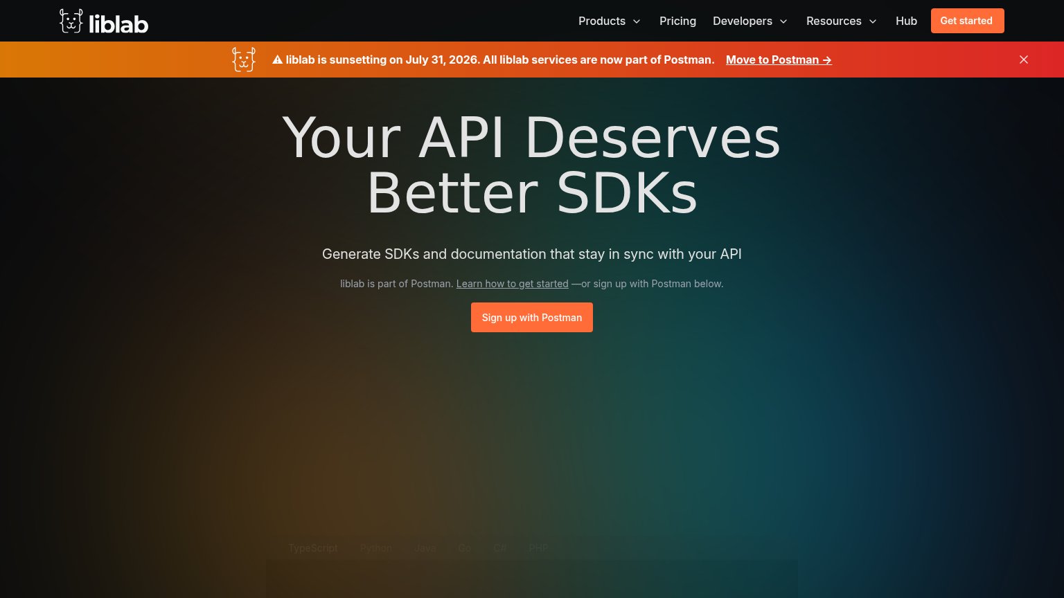
liblab’s headline
Your API Deserves Better SDKs
Generate SDKs and documentation that stay in sync with your API
Working
Could improve