
Your landing page’s weakest score is Value props.
How Karman+ ranks
46Growth scoreupdated
category scores
category scoresShowHide
Value props
32PoorTitle, subtitle, hero — do they sell the product's true value?
Karman+’s headline vague
Prospector - Rapid Prototyping for Deep Space
Working
- Distinctive space-domain positioning
- Live asteroid tool visible behind hero
- Product name 'Prospector' surfaced
Could improve
- Hero is a blog headline, not a value prop
- No subhead explains what Karman+ does
- Only CTA is 'Read story', not product
Information hierarchy
38PoorDoes the design help or inhibit what the page is trying to say?
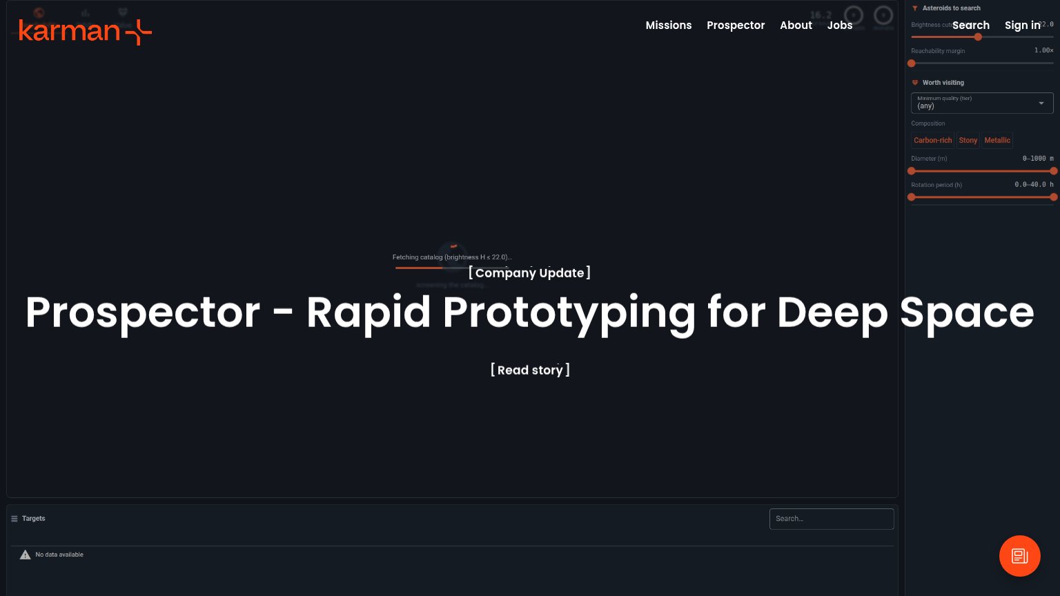 1234
- Right-rail filter panel — A full 'Asteroids to search' tool panel with sliders and dropdowns competes with the hero at equal prominence, splitting the fold into two unrelated arguments.
- Nav overlaps search controls — 'Search' and 'Sign in' nav links collide with the panel's slider values (22.0), leaving both illegible and signaling broken layout.
- Read story CTA — The primary '[ Read story ]' CTA is bare bracketed text with no button treatment, so it disappears against the dark hero within one second of scanning.
- Empty Targets table — A data table stating 'No data available' creeps into the fold, adding a broken-feeling third panel below the hero message.
Trust
42PoorProof that the product is real, competent, and safe to try.
How Karman+ compares
Trust read
CTA
58FairCopy, size, verb, cost-feel — does the primary CTA earn the click?
How Karman+ compares
Recommended rewrites
Mobile web
58FairThe phone experience as a first-class citizen.
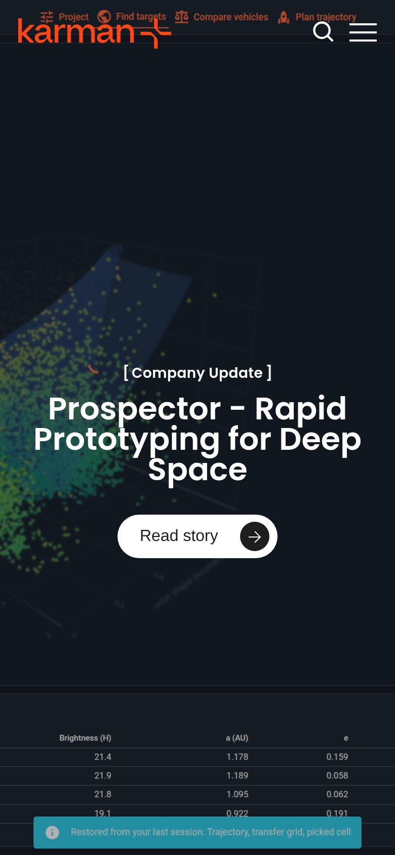
What works
What to improve