
Your landing page’s weakest score is Mobile web.
How Jobright ranks
74Growth scoreupdated
category scores
category scoresShowHide
Mobile web
62FairThe phone experience as a first-class citizen.
 123
- App-install banner — Persistent install interstitial stacks on the header, eating fold space and competing with the page's own CTAs.
- Split CTA pair — "Sign up for free" shares the row with "Hire with Jobright" at half-width, diluting the primary tap instead of going full-bleed.
- JOIN NOW header button — Duplicates the hero's "Sign up for free" action, adding a third competing signup control above the fold.
Information hierarchy
68FairDoes the design help or inhibit what the page is trying to say?
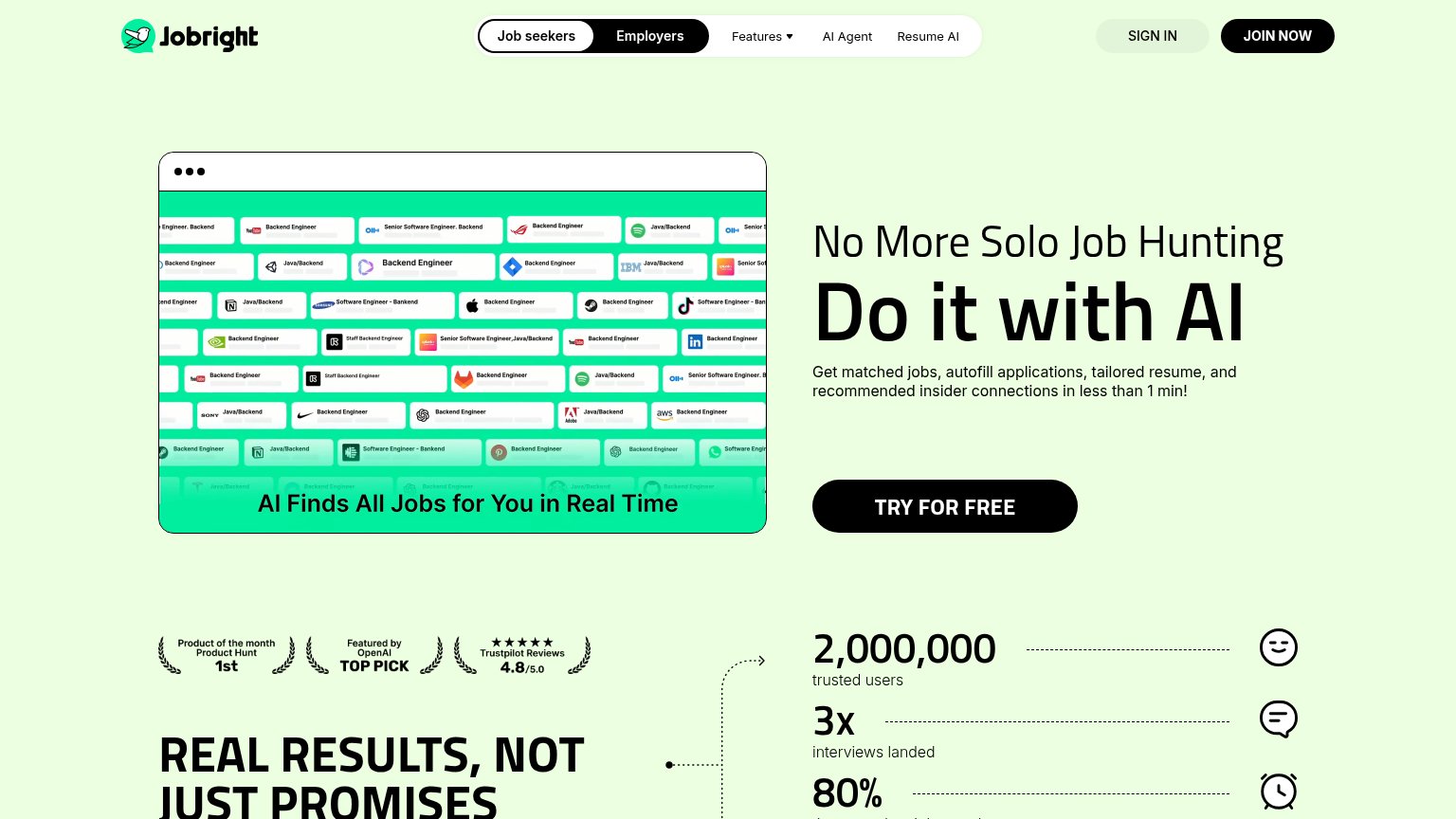 1234
- JOIN NOW header button — Styled at the same black-pill weight as TRY FOR FREE, splitting the primary action across two competing CTAs.
- Job cards screenshot — Dozens of tiny same-weight job chips create a dense visual wall that competes with the headline for first attention.
- Nav bar cluster — Seven interactive targets (Job seekers, Employers, Features, AI Agent, Resume AI, Sign in, Join) leak attention before the hero CTA.
- Employers nav toggle — An equally weighted audience switch in the fold invites half-committed visitors to exit the job-seeker funnel.
Trust
76FairProof that the product is real, competent, and safe to try.
How Jobright compares
Trust read
Value props
82StrongTitle, subtitle, hero — do they sell the product's true value?
Jobright’s headline
No More Solo Job Hunting Do it with AI
Get matched jobs, autofill applications, tailored resume, and recommended insider connections in less than 1 min!
Working
Could improve
CTA
84StrongCopy, size, verb, cost-feel — does the primary CTA earn the click?
How Jobright compares
Recommended rewrites