
Your landing page’s weakest score is Trust.
How Inkbox ranks
- 1.
AgentMail76
- 2.
Inkbox74
- 3.
Pinch (Agentuity)64
74Growth scoreupdated
category scores
category scoresShowHide
Trust
58FairProof that the product is real, competent, and safe to try.
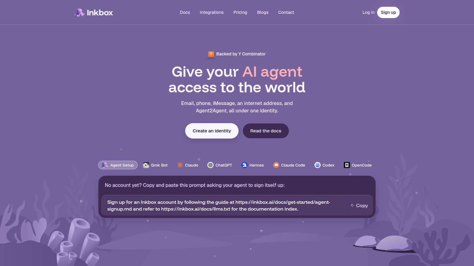
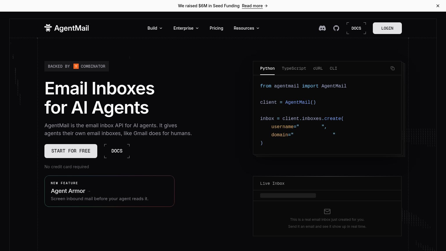
| Trust read | |
|---|---|
| Inkbox | "Backed by Y Combinator" badge above the headline |
| "BACKED BY Y COMBINATOR" badge above the headline | |
| No visible trust signal identified. |
Information hierarchy
76FairDoes the design help or inhibit what the page is trying to say?
1234- Agent tab row — Eight equal-weight agent tabs create a leak-prone decision point directly under the CTAs.
- Read the docs button — Styled at near-equal size and prominence to "Create an identity", splitting first-click attention.
- Nav link row — Five text links plus Log in offer more exits than a conversion fold needs.
- Copy prompt panel — Large dark block with a raw URL string reads as heavy as the hero, pulling scan focus from the primary CTA.
Value props
76FairTitle, subtitle, hero — do they sell the product's true value?
Inkbox’s headline
Give your AI agent access to the world
Email, phone, iMessage, an internet address, and Agent2Agent, all under one identity.
Working
Could improve
CTA
80StrongCopy, size, verb, cost-feel — does the primary CTA earn the click?
How Inkbox compares
Recommended rewrites
Mobile web
80StrongThe phone experience as a first-class citizen.
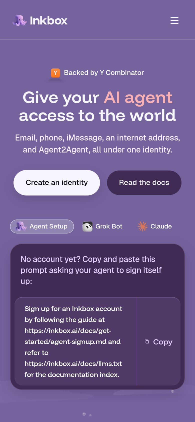
What works
What to improve