
Your landing page’s weakest score is Trust.
How HyperProbe ranks
Trust
52FairProof that the product is real, competent, and safe to try.
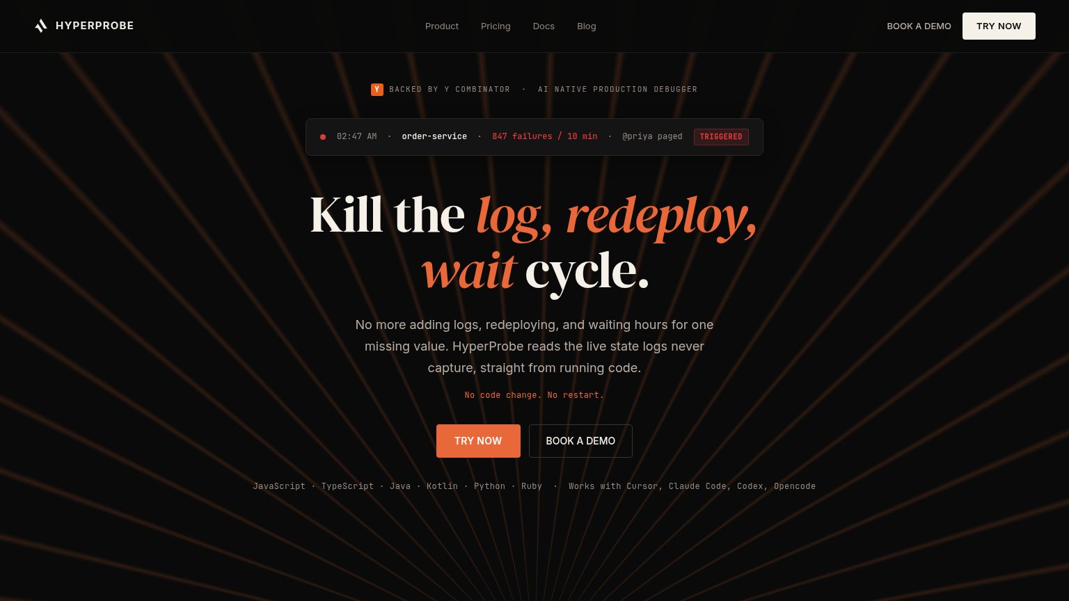
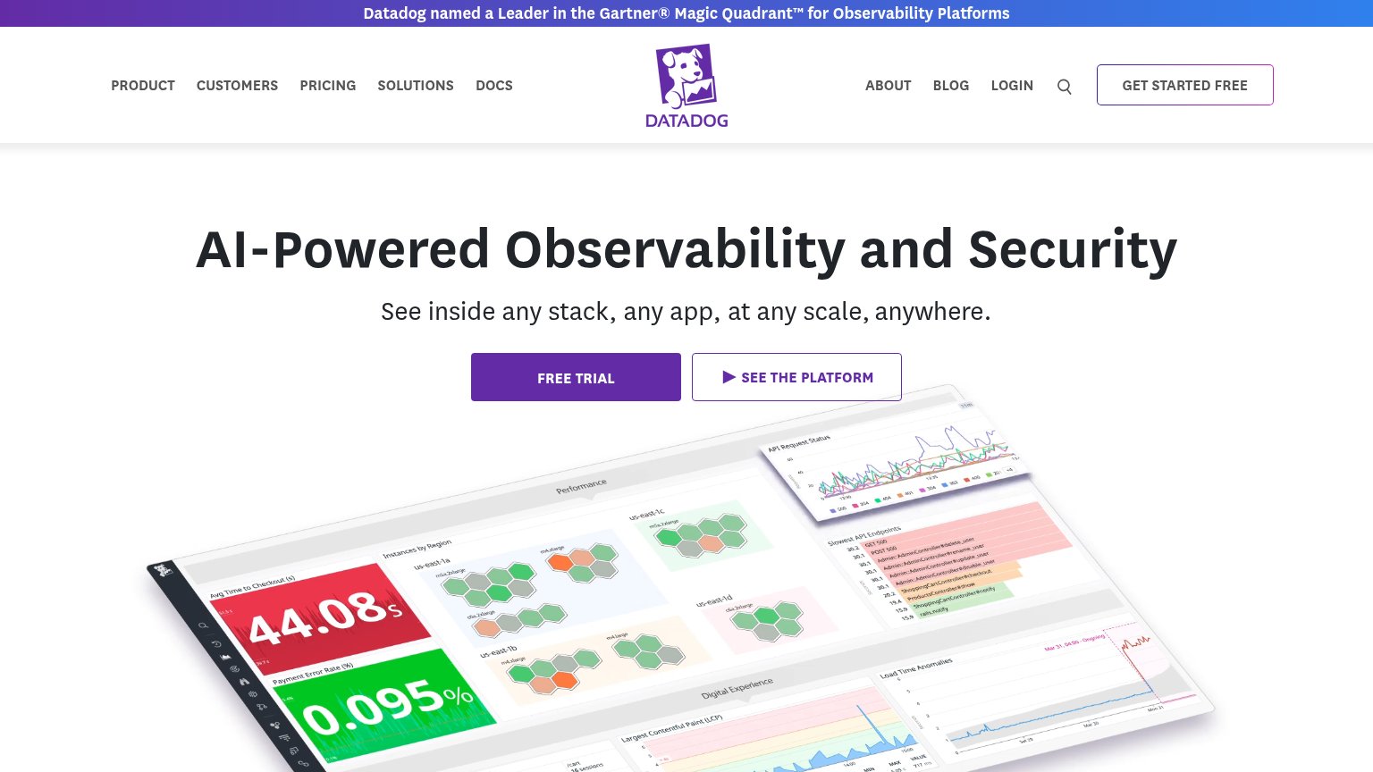
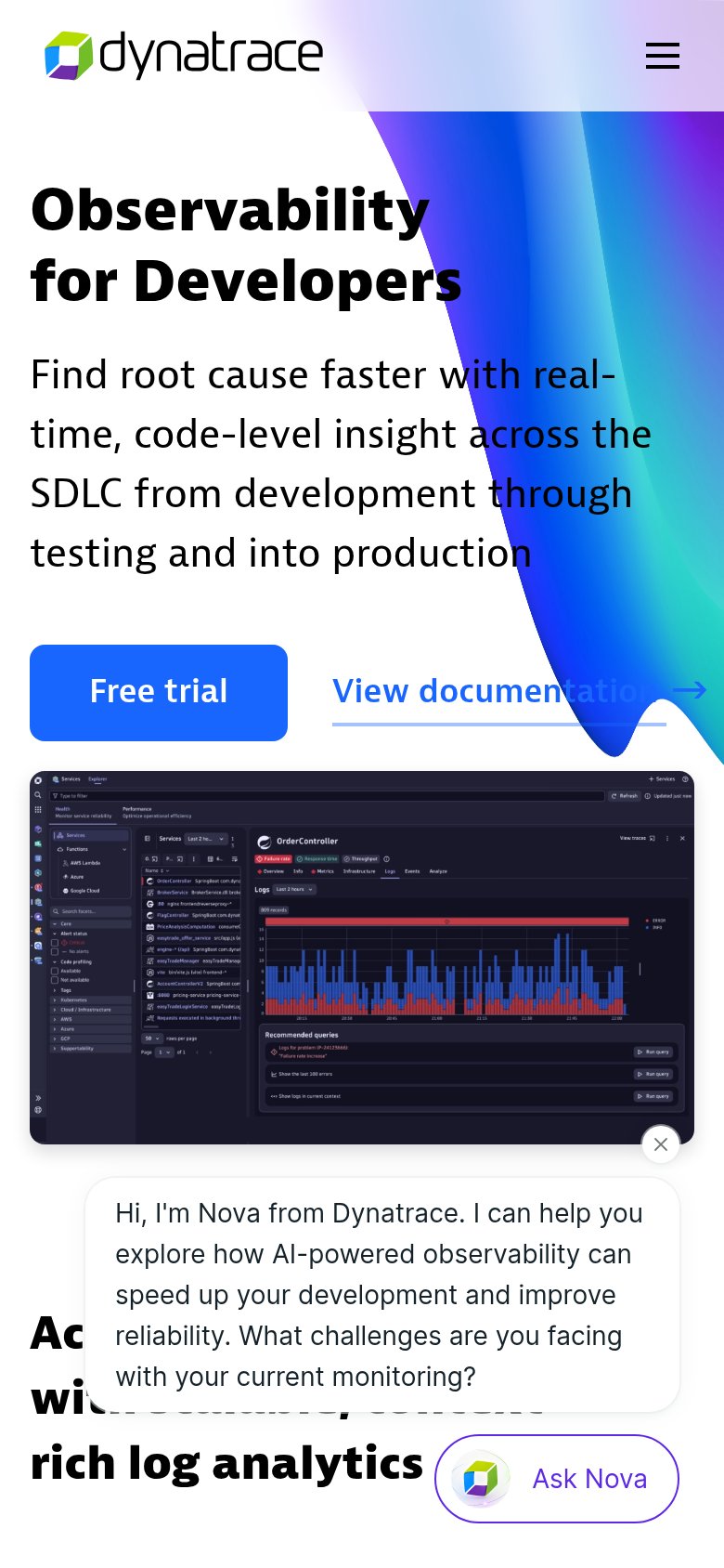
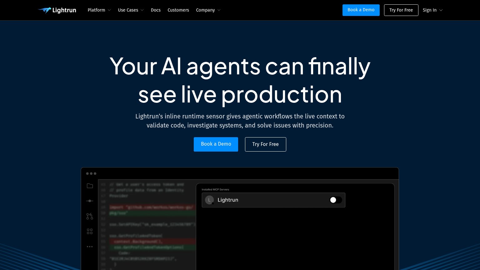
| Trust read | |
|---|---|
| HyperProbe | "BACKED BY Y COMBINATOR" badge above the headline |
| Detailed real product screenshot of the log analytics console showing the "OrderController" service with failure-rate ch | |
| Real IDE product screenshot with code editor and "Installed MCP Servers" Lightrun panel | |
| Banner: "Datadog named a Leader in the Gartner® Magic Quadrant™ for Observability Platforms" |
Mobile web
62FairThe phone experience as a first-class citizen.
 123
- Wrapped BOOK A DEMO — Uncollapsed nav link wraps to two lines and crowds the logo instead of folding into a menu.
- Ragged alert card — Alert metadata wraps into five uneven lines, eating a third of the fold and pushing the CTA down.
- Half-width TRY NOW — Primary button sits below the fold and stays half-width instead of a thumb-friendly full-bleed bar.
CTA
76FairCopy, size, verb, cost-feel — does the primary CTA earn the click?
How HyperProbe compares
Recommended rewrites
Information hierarchy
82StrongDoes the design help or inhibit what the page is trying to say?
What works
What to improve
Value props
86StrongTitle, subtitle, hero — do they sell the product's true value?
HyperProbe’s headline
Kill the log, redeploy, wait cycle.
No more adding logs, redeploying, and waiting hours for one missing value. HyperProbe reads the live state logs never capture, straight from running code.
Working
Could improve