
Your landing page’s weakest score is Information hierarchy.
How Hugging Face LeRobot ranks
- 1.
Hugging Face LeRobot73
- 2.
Intrinsic60
- 3.
Physical Intelligence56
- 4.
Skild AI50
- 5.
The Robot Learning Company32
73Growth scoreupdated
category scores
category scoresShowHide
Information hierarchy
58FairDoes the design help or inhibit what the page is trying to say?
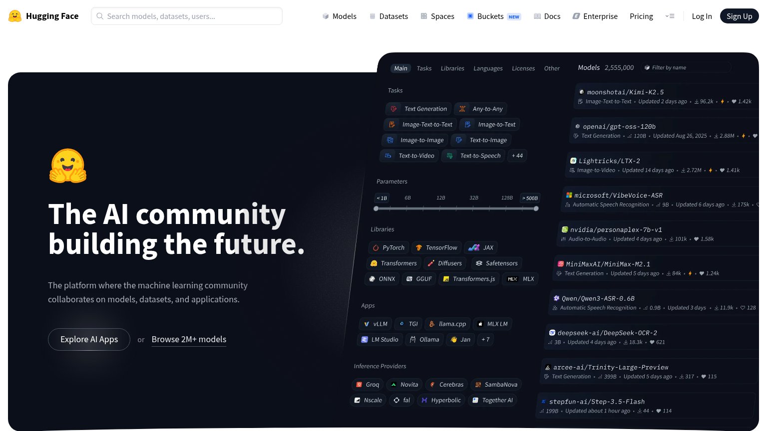 1234
- Model browser panel — Dense filter/model-list panel competes with the headline at equal visual weight, splitting the fold into two shouting halves.
- Explore AI Apps button — Ghost-outline styling on dark background gives the primary CTA almost no contrast; it reads weaker than the Sign Up pill in the nav.
- Top navigation row — Ten-plus destinations (Models, Datasets, Spaces, Buckets, Docs, Enterprise, Pricing, Log In) leak attention before the hero CTA.
- Task/library tag cloud — Dozens of same-weight pill tags (Text Generation, PyTorch, vLLM, Groq…) form a feature index the eye cannot prioritize.
CTA
72FairCopy, size, verb, cost-feel — does the primary CTA earn the click?
Problems
- ghost style, low contrast on dark hero
- 'or' split dilutes primary action
- nav 'Sign Up' pill outshines hero CTA
- no payoff or number in label
Value props
72FairTitle, subtitle, hero — do they sell the product's true value?
Hugging Face LeRobot’s headline
The AI community building the future.
The platform where the machine learning community collaborates on models, datasets, and applications.
Working
Could improve
Mobile web
81StrongThe phone experience as a first-class citizen.
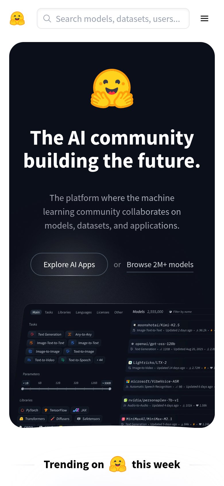
What works
What to improve
Trust
82StrongProof that the product is real, competent, and safe to try.
How Hugging Face LeRobot compares
Trust read