
Your landing page’s weakest score is Mobile web.
How Eddie AI ranks
78Growth scoreupdated
category scores
category scoresShowHide
Mobile web
72FairThe phone experience as a first-class citizen.
 1234
- Header without menu — All nav links and the header CTA disappear on mobile with no hamburger replacement.
- Truncated announcement banner — Banner text cuts off mid-word and wraps its arrow onto a second row, consuming a large slice of the fold.
- Try it for free — CTA stays a desktop-proportioned pill instead of a full-width thumb-friendly button.
- Secondary action stack — "Download the desktop app" and "Install on Claude & ChatGPT" compete with the primary CTA directly beneath it.
Information hierarchy
76FairDoes the design help or inhibit what the page is trying to say?
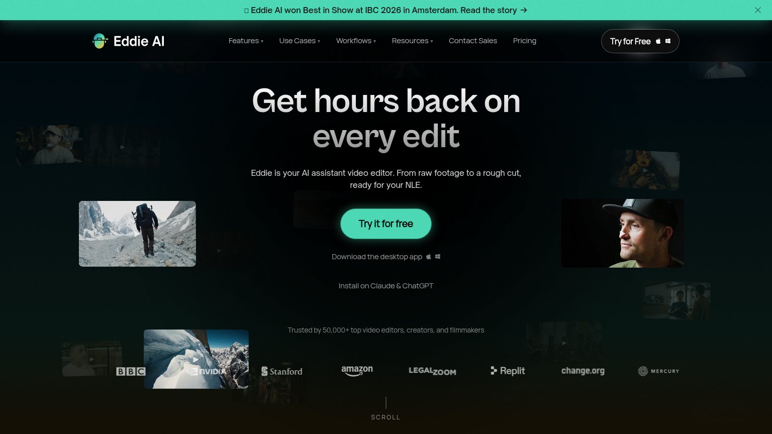 1234
- Duplicate CTA row — "Try for Free" in the nav duplicates the hero "Try it for free" at similar weight, splitting the one action into two targets.
- Announcement banner — Bright mint banner with a "Read the story" link is the highest-contrast element on the page and pulls the first click away from conversion.
- Secondary install links — "Download the desktop app" and "Install on Claude & ChatGPT" stack directly under the CTA, adding two decision branches right at the action point.
- Six-item nav — Features, Use Cases, Workflows, Resources, Contact Sales, and Pricing offer six exit paths before the visitor reaches the hero promise.
Trust
78FairProof that the product is real, competent, and safe to try.
How Eddie AI compares
Trust read
CTA
82StrongCopy, size, verb, cost-feel — does the primary CTA earn the click?
How Eddie AI compares
Recommended rewrites
Value props
82StrongTitle, subtitle, hero — do they sell the product's true value?
Eddie AI’s headline
Get hours back on every edit
Eddie is your AI assistant video editor. From raw footage to a rough cut, ready for your NLE.
Working
Could improve