
Your landing page’s weakest score is Trust.
How Hex ranks
Trust
58FairProof that the product is real, competent, and safe to try.
| Trust read | |
|---|---|
| Hex | Embedded product demo notebook "Galactic Revenue Insights" showing real SQL cells, Agent/Notebook/App tabs, and an agent |
| "Backed by Y Combinator | Pareto" investor strip | |
| Live prompt interface with model selector "Julius 1.2" and capability chips (Browser Agent, Build Website, Video, Image, | |
| No visible trust signal identified. | |
| 'Ana is ready' agent prompt demo with integration icons (Snowflake, dbt, Tableau, Power BI) |
Mobile web
72FairThe phone experience as a first-class citizen.
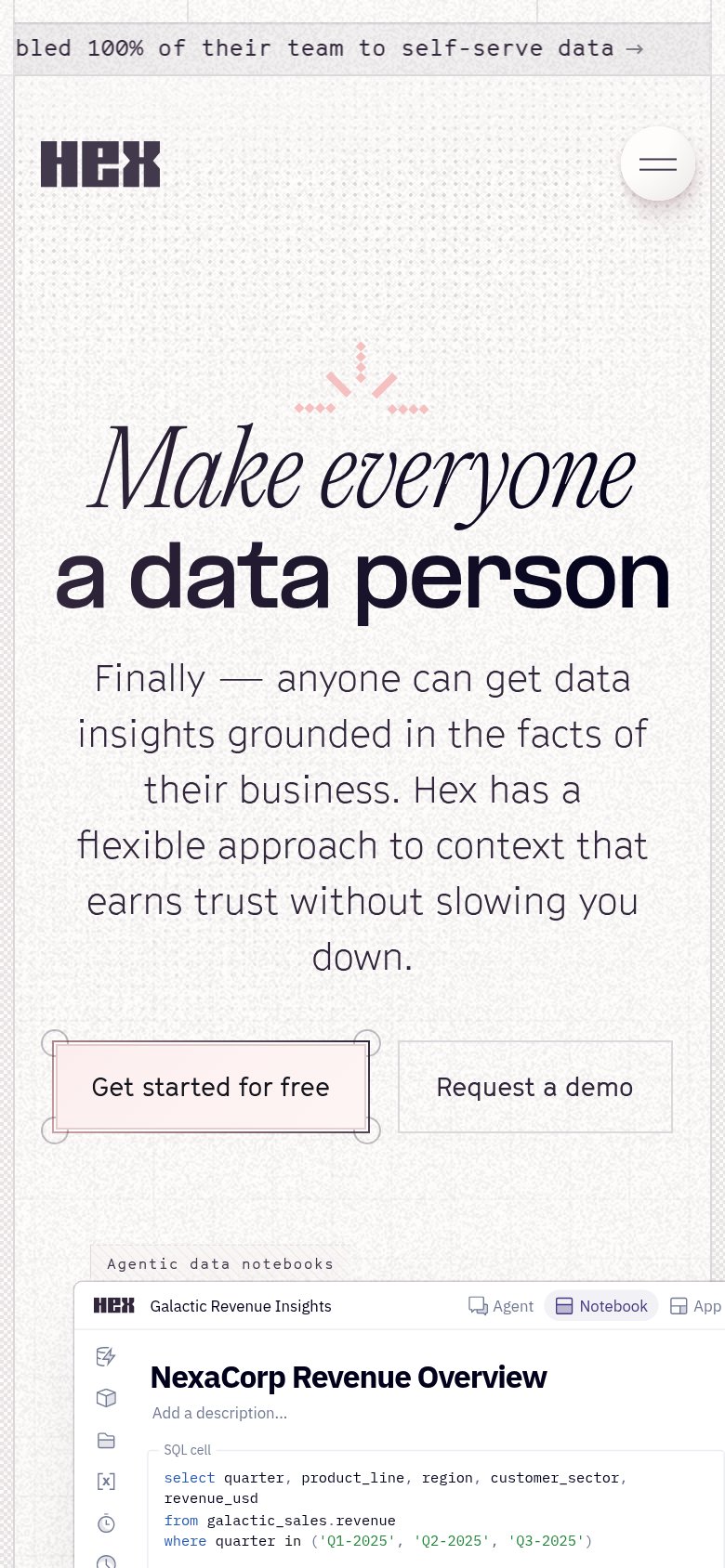 1234
- Six-line subheadline — Body copy wraps into six long lines, pushing both CTAs toward the bottom of the fold.
- Side-by-side CTA pair — "Get started for free" and "Request a demo" split the column instead of stacking full-width for the thumb.
- Request a demo button — Hairline border and no fill make the secondary CTA nearly invisible against the textured background.
- Scrolling ticker bar — Truncated marquee text "bled 100% of their team…" reads as broken above the logo.
Value props
76FairTitle, subtitle, hero — do they sell the product's true value?
Hex’s headline
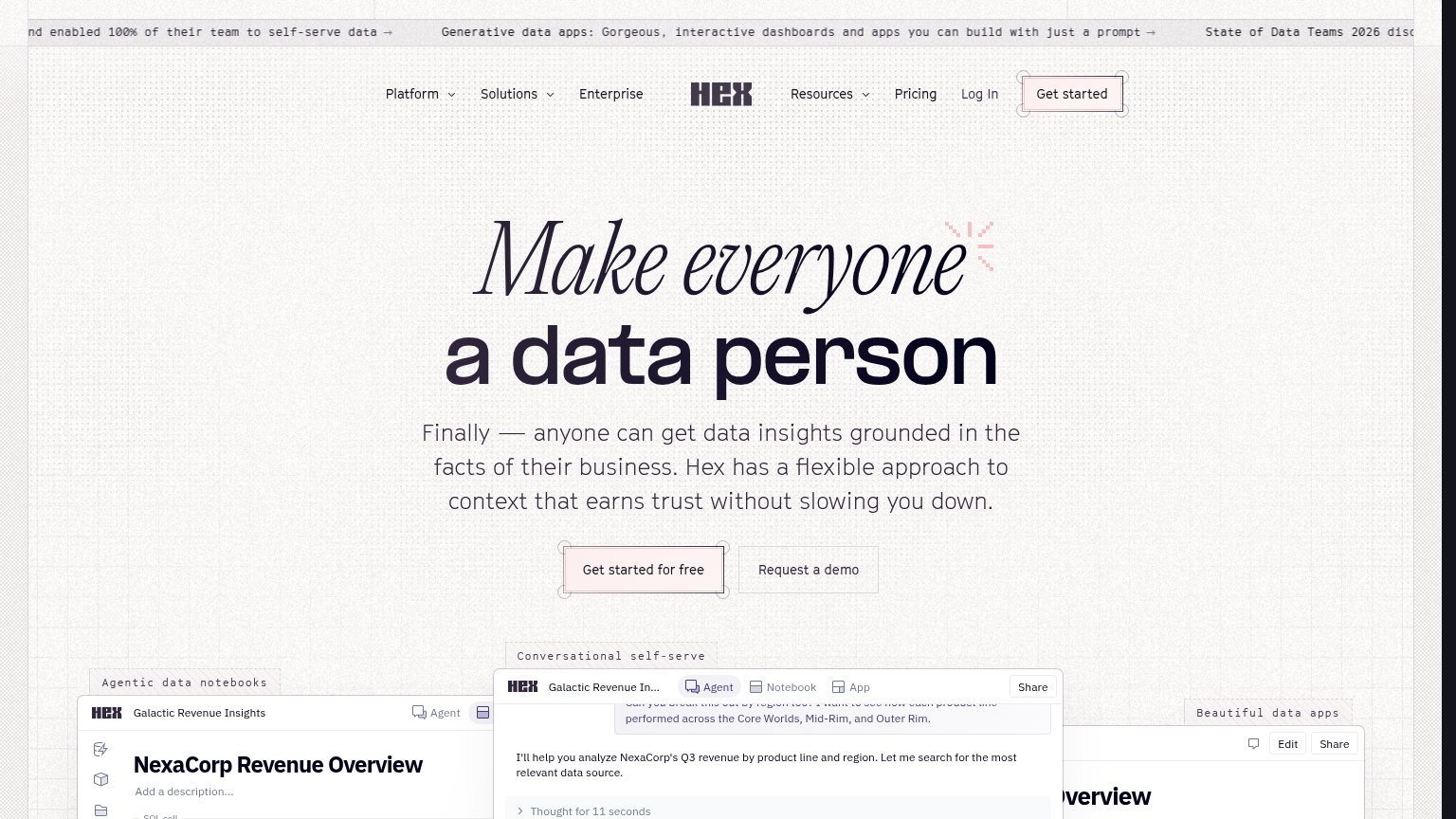
Make everyone a data person
Finally — anyone can get data insights grounded in the facts of their business. Hex has a flexible approach to context that earns trust without slowing you down.
Working
Could improve
Information hierarchy
78FairDoes the design help or inhibit what the page is trying to say?
What works
What to improve
CTA
82StrongCopy, size, verb, cost-feel — does the primary CTA earn the click?
How Hex compares
Recommended rewrites