
Your landing page’s weakest score is Trust.
How #paid ranks
Trust
52FairProof that the product is real, competent, and safe to try.
| Trust read | |
|---|---|
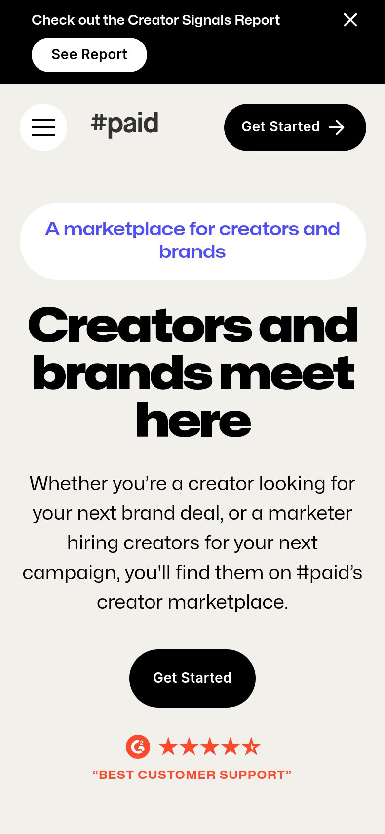
| #paid | G2 badge with ~4.5-star rating and "BEST CUSTOMER SUPPORT" quote below the mobile Get Started CTA |
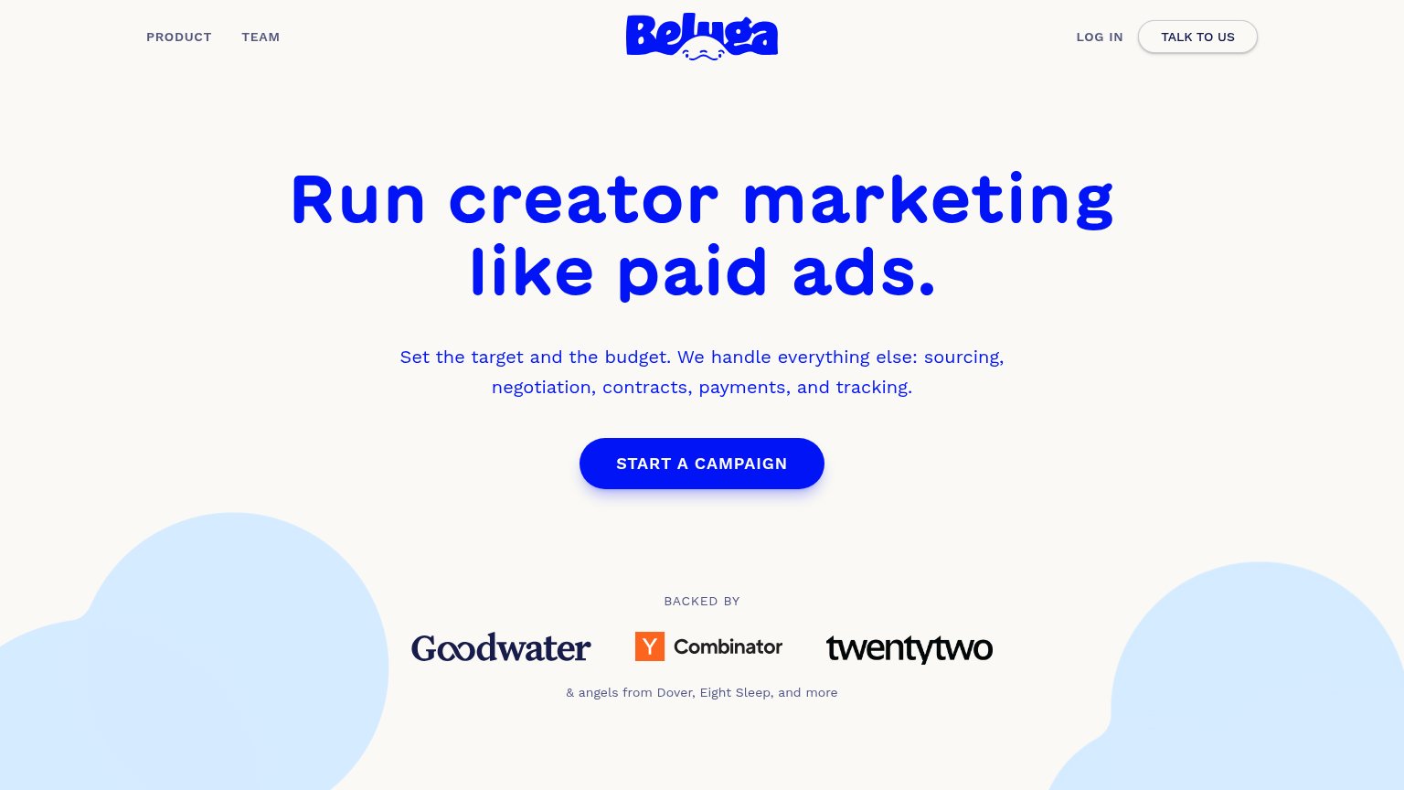
| "BACKED BY" strip with Goodwater, Y Combinator, and twentytwo logos | |
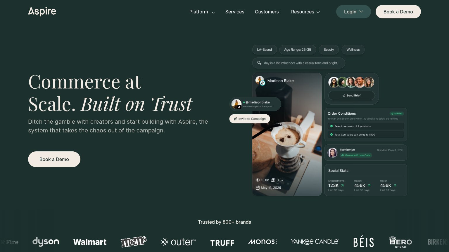
| "Trusted by 800+ brands" logo bar with Dyson, Walmart, M&M's, Yankee Candle | |
| Gia prompt input with placeholder "Find skincare creators for our holiday launch…" | |
| "CreatorIQ Connect" event banner — "October 13, 2026 | Los Angeles" with speaker Kareem Rahma | |
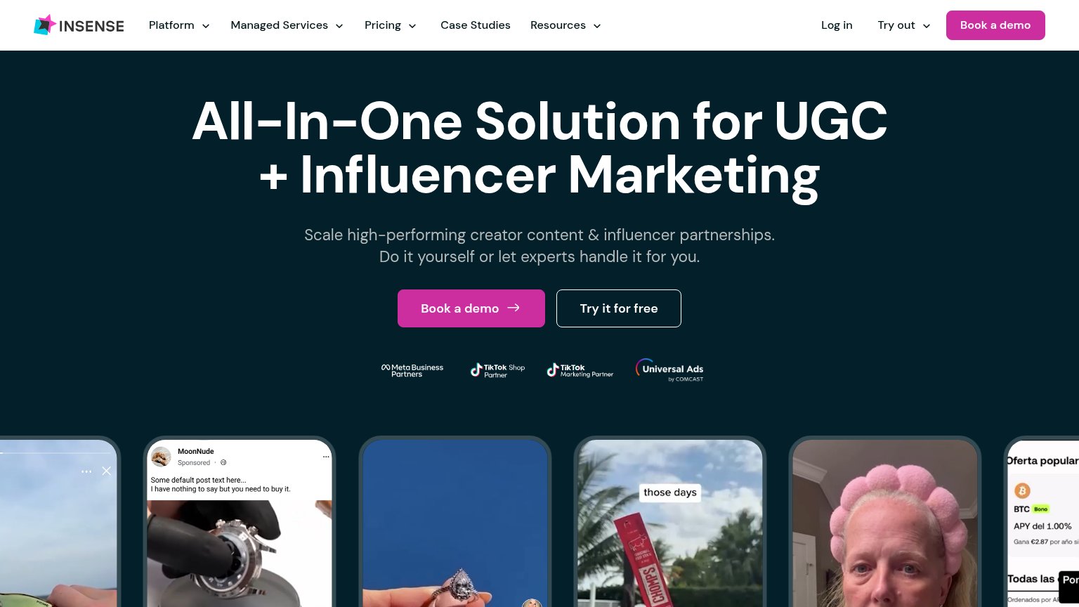
| Partner badge row: "Meta Business Partners", "TikTok Shop Partner", "TikTok Marketing Partner", "Universal Ads by Comcas |
Mobile web
62FairThe phone experience as a first-class citizen.
1234- Hero Get Started button — Desktop-proportioned button sits narrow and below the first viewport instead of full-bleed in the fold.
- Promo bar wraps — Announcement bar stacks 'See Report' onto a second row, eating the top of the mobile viewport.
- Oversized hero headline — Headline scales down too little, wrapping to three tall lines that push the CTA off-screen.
- Two-line badge pill — Eyebrow pill wraps to two lines and adds vertical bulk above the headline.
Value props
64FairTitle, subtitle, hero — do they sell the product's true value?
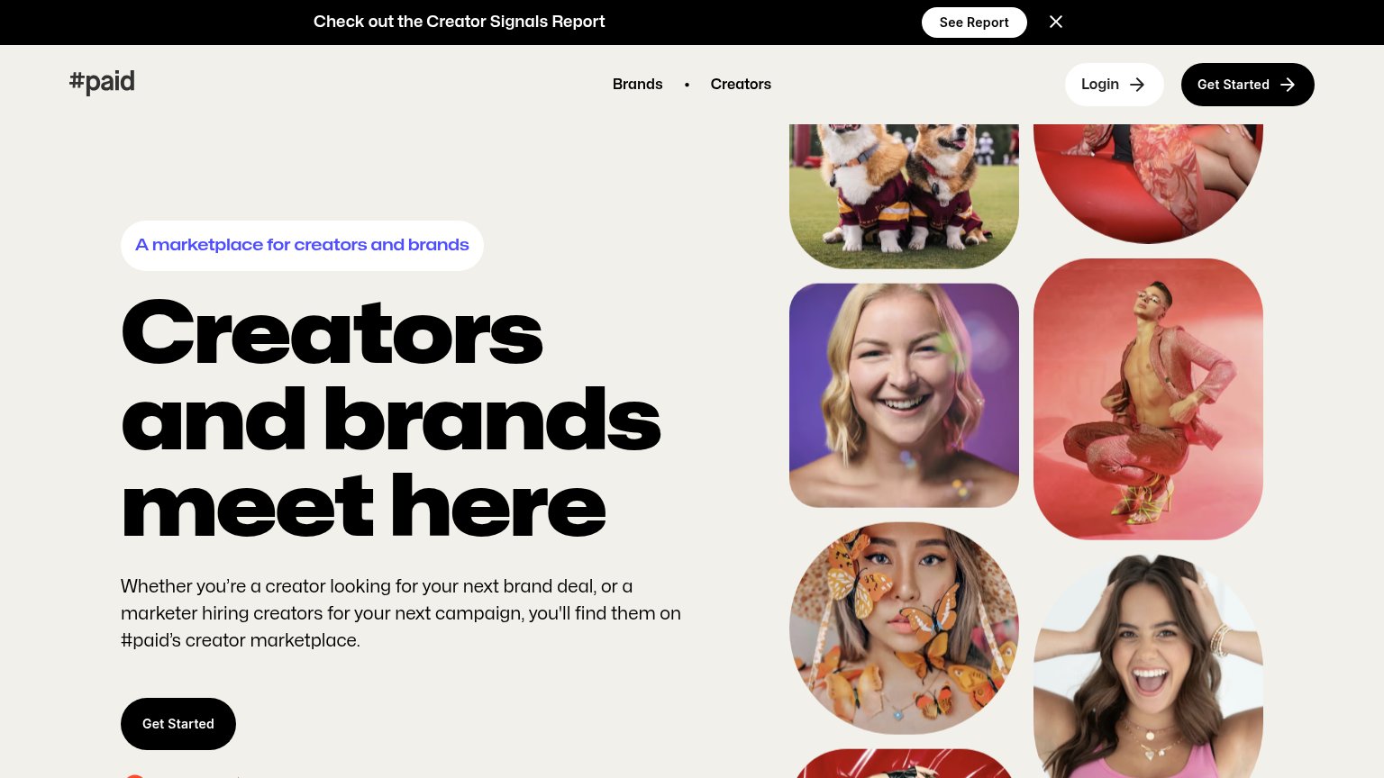
#paid’s headline
Creators and brands meet here
Whether you're a creator looking for your next brand deal, or a marketer hiring creators for your next campaign, you'll find them on #paid's creator marketplace.
Working
Could improve
CTA
72FairCopy, size, verb, cost-feel — does the primary CTA earn the click?
How #paid compares
Recommended rewrites
Information hierarchy
78FairDoes the design help or inhibit what the page is trying to say?
What works
What to improve