
Your landing page’s weakest score is Value props.
How HackerRank ranks
- 1.
HackerRank72
- 2.
Outship72
- 3.
CodeSignal71
- 4.
CoderPad68
- 5.
Woven68
- 6.
Karat64
72Growth scoreupdated
category scores
category scoresShowHide
Value props
58FairTitle, subtitle, hero — do they sell the product's true value?
HackerRank’s headline vague
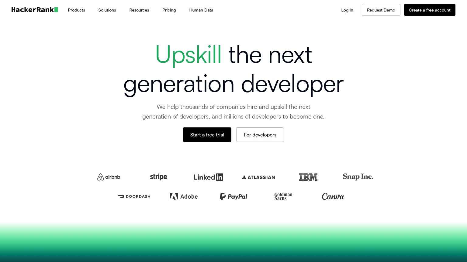
Upskill the next generation developer
We help thousands of companies hire and upskill the next generation of developers, and millions of developers to become one.
Working
- Subhead names both audiences: companies and devs
- Elite logo wall (Stripe, IBM, Goldman) builds trust
- Clear dual CTAs split hirers from developers
Could improve
- Headline never says coding assessments
- "Thousands"/"millions" instead of real numbers
- No product shown — hero is pure typography
Information hierarchy
72FairDoes the design help or inhibit what the page is trying to say?
 1234
- Three header CTAs — 'Create a free account', 'Request Demo', and 'Log In' all compete at button weight with the hero's 'Start a free trial', splitting the one action four ways.
- Duplicate black CTA styling — 'Create a free account' uses the identical black fill as the hero's 'Start a free trial', so two different signups claim primary status at once.
- For developers button — Bordered button at near-equal weight beside the primary CTA sends the trial-ready visitor down a second audience fork.
- Five-item nav row — Products, Solutions, Resources, Pricing, and Human Data give five exits before the value prop is read.
Trust
72FairProof that the product is real, competent, and safe to try.
How HackerRank compares
Trust read
CTA
78FairCopy, size, verb, cost-feel — does the primary CTA earn the click?
How HackerRank compares
Recommended rewrites
Mobile web
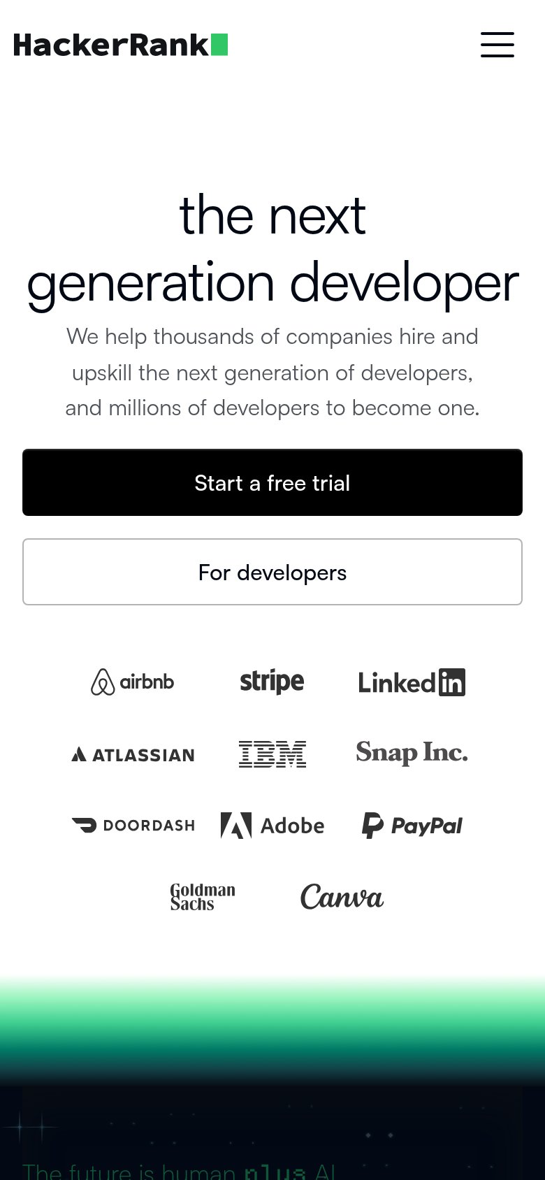
78FairThe phone experience as a first-class citizen.
What works
What to improve