
Your landing page’s weakest score is Mobile web.
How Greenlight Guru ranks
- 1.
Panacea71
- 2.
Greenlight Guru70
- 3.
Article One (formerly Certify by Enzyme)64
- 4.
RegDesk60
- 5.
Vial49
70Growth scoreupdated
category scores
category scoresShowHide
Mobile web
54FairThe phone experience as a first-class citizen.
 1234
- Get a Demo button — Primary CTA sits at the bottom edge of the fold, half-obscured and crowded by the chat launcher
- Ask Audrey chat — Chat bubble overlaps the 'GET A DEMO' button, intercepting the exact thumb zone of the primary tap
- Hero headline block — Headline wraps into six cramped lines, pushing the CTA and email field far down the viewport
- Body paragraph — Nine-line desktop-length paragraph stacks a second message between headline and CTA
Information hierarchy
68FairDoes the design help or inhibit what the page is trying to say?
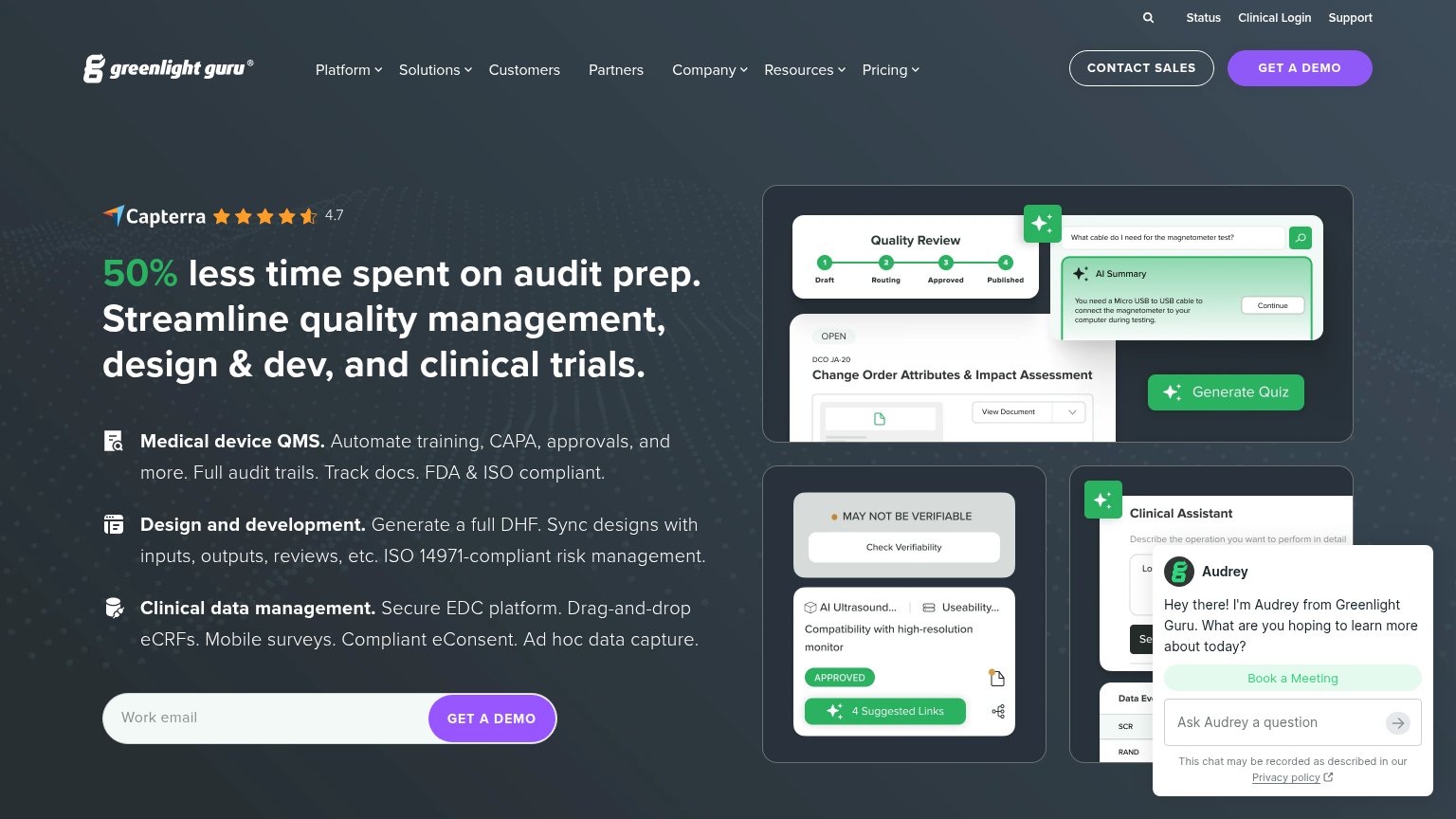 1234
- Audrey chat popup — Auto-opened widget covers the Clinical Assistant screenshot and adds a competing green 'Book a Meeting' action.
- Header GET A DEMO — Identical purple styling to the inline form CTA splits the primary action into two equal-weight targets.
- Utility nav row — Status, Clinical Login, Support and search stack four extra exits above an already seven-item nav.
- CONTACT SALES button — Outlined pill sits beside the demo CTA at near-equal weight, forking the conversion path in the header.
Trust
72FairProof that the product is real, competent, and safe to try.
How Greenlight Guru compares
Trust read
CTA
74FairCopy, size, verb, cost-feel — does the primary CTA earn the click?
How Greenlight Guru compares
Recommended rewrites
Value props
84StrongTitle, subtitle, hero — do they sell the product's true value?
Greenlight Guru’s headline
50% less time spent on audit prep. Streamline quality management, design & dev, and clinical trials.
Medical device QMS. Automate training, CAPA, approvals, and more. Full audit trails. Track docs. FDA & ISO compliant.
Working
Could improve