
Your landing page’s weakest score is Trust.
How Golioth ranks
67Growth scoreupdated
category scores
category scoresShowHide
Trust
48PoorProof that the product is real, competent, and safe to try.
| Trust read | |
|---|---|
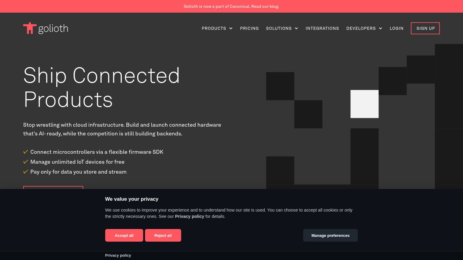
| Golioth | Banner: "Golioth is now a part of Canonical. Read our blog." |
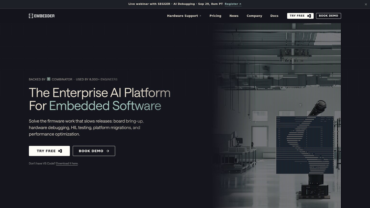
| BACKED BY Y COMBINATOR · USED BY 8,000+ ENGINEERS | |
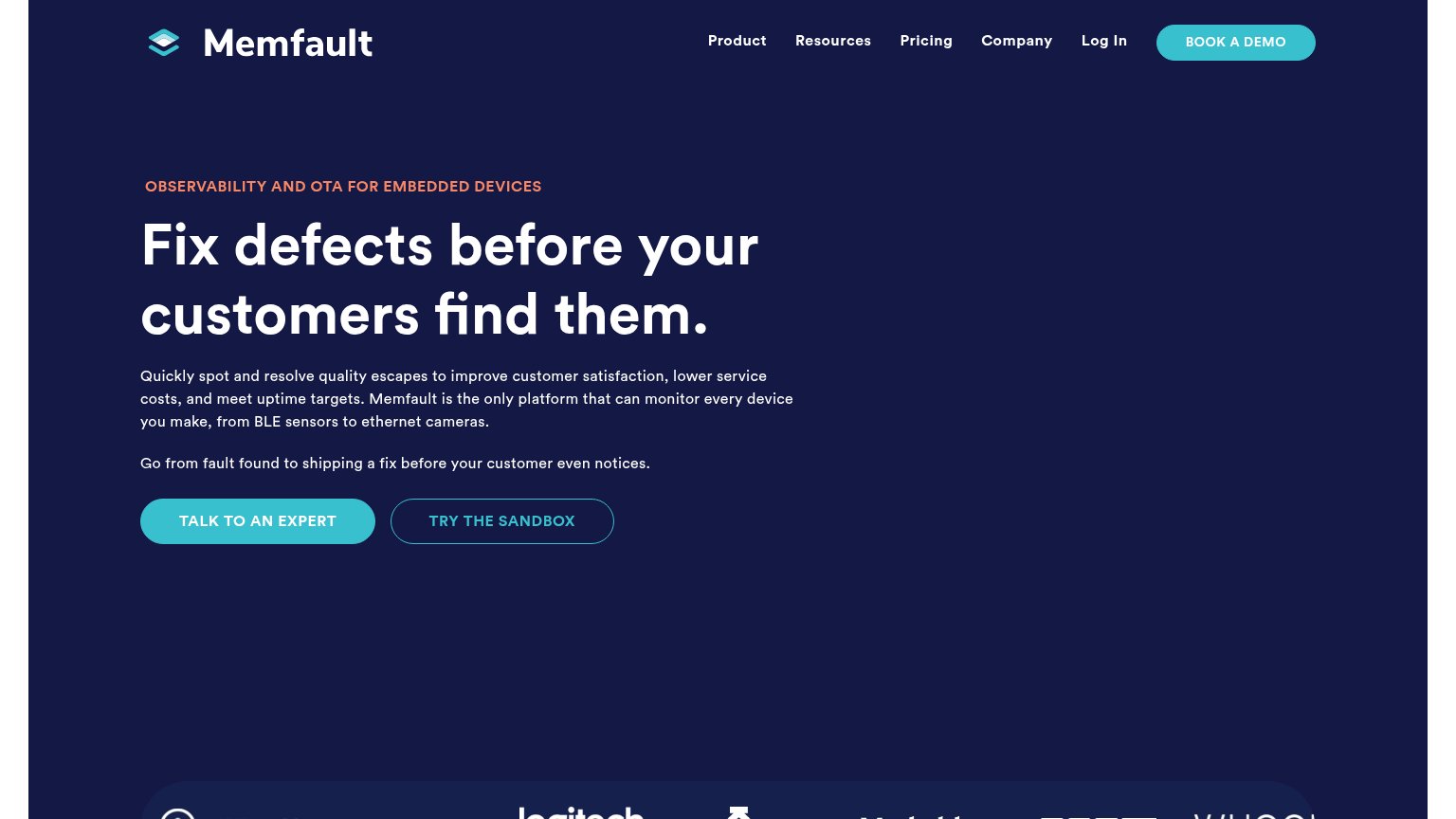
| Customer logo strip at the bottom of the desktop fold (Logitech and other brand marks partially visible) | |
| Code snippet showing embedd API usage (EMBEDD_RESULT hal_status check) overlaid on the circuit-board visual in the mobil |
Information hierarchy
68FairDoes the design help or inhibit what the page is trying to say?
1234- Cookie consent modal — Its filled Accept/Reject buttons outshine and physically cover the page's primary CTA.
- Clipped primary CTA — The main action button is cut off at the fold and hidden behind the cookie banner.
- SIGN UP nav button — Same red-outline styling as the primary CTA, creating a competing action in the nav.
- Canonical announcement banner — Red high-contrast blog link is the first thing seen and leads attention off-page.
CTA
72FairCopy, size, verb, cost-feel — does the primary CTA earn the click?
How Golioth compares
Recommended rewrites
Mobile web
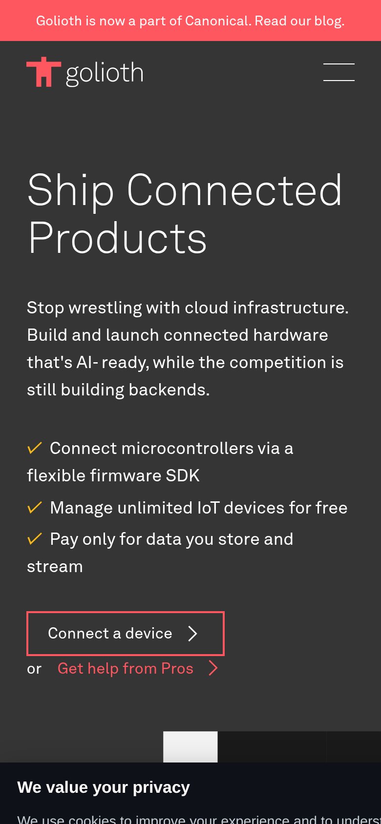
72FairThe phone experience as a first-class citizen.
What works
What to improve
Value props
76FairTitle, subtitle, hero — do they sell the product's true value?
Golioth’s headline
Ship Connected Products
Stop wrestling with cloud infrastructure. Build and launch connected hardware that's AI- ready, while the competition is still building backends.
Working
Could improve