
Your landing page’s weakest score is Trust.
How burnt ranks
Trust
42PoorProof that the product is real, competent, and safe to try.
| Trust read | |
|---|---|
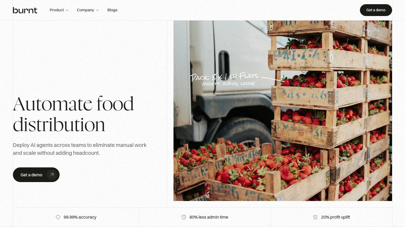
| burnt | Metric strip: "99.99% accuracy · 80% less admin time · 20% profit uplift" |
| "FSMA 204 Compliance" nav item signaling regulatory readiness | |
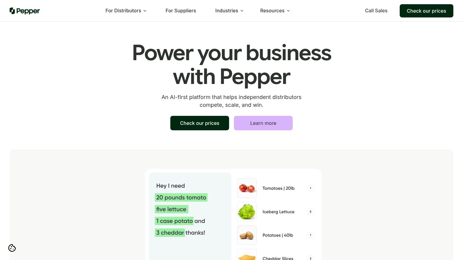
| Product demo parsing "Hey I need 20 pounds tomato…" into order line items (Tomatoes | 20lb, Iceberg Lettuce) | |
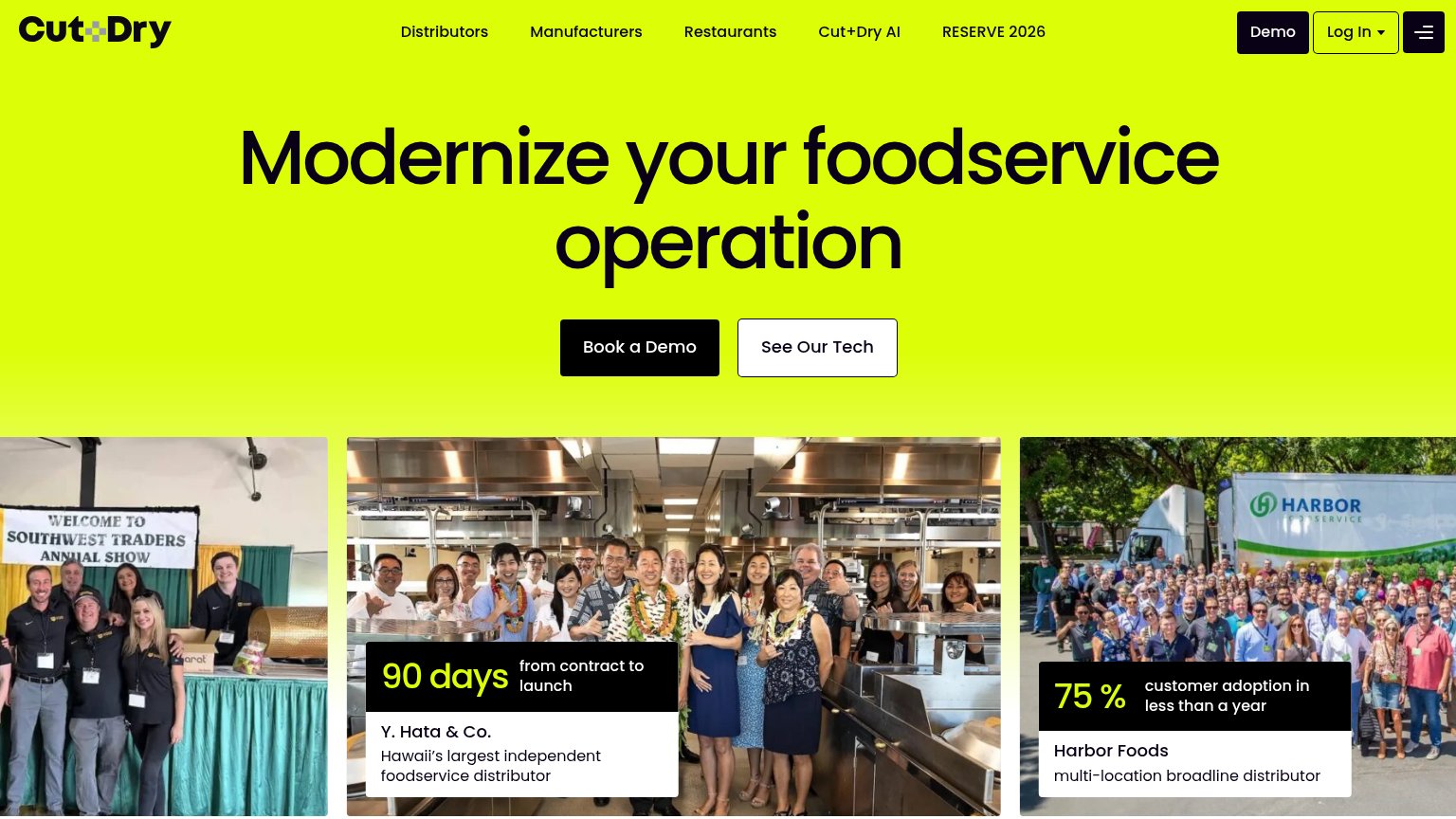
| Case card: "75% customer adoption in less than a year — Harbor Foods, multi-location broadline distributor" over a real | |
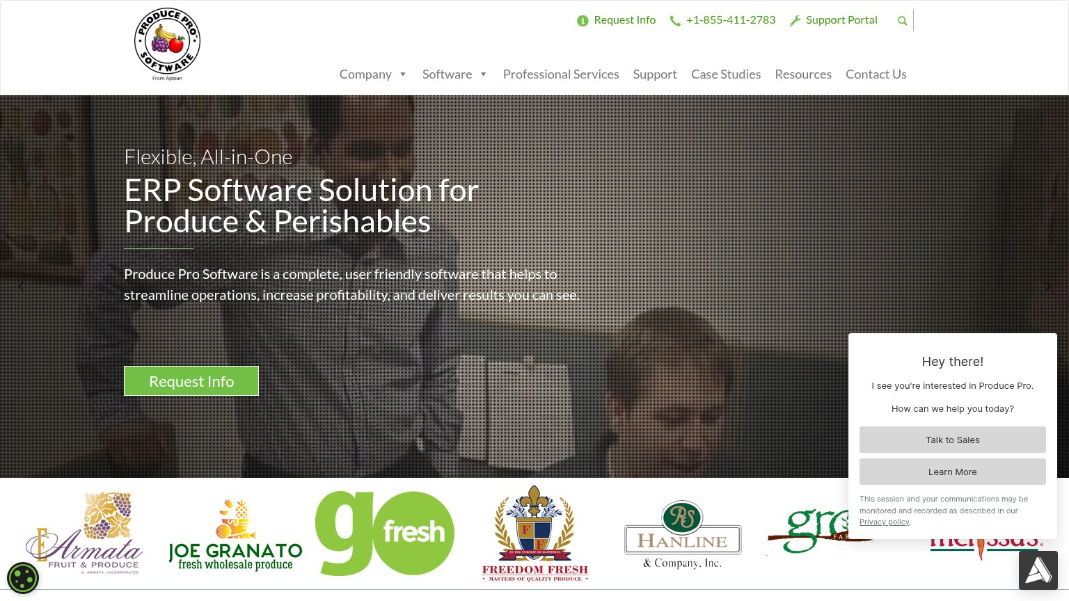
| Customer logo strip (Armata Fruit & Produce, Joe Granato, GoFresh, Freedom Fresh, Hanline & Company) |
Mobile web
54FairThe phone experience as a first-class citizen.
 12
- Get a demo button — Primary CTA is a compact pill occupying under half the column width instead of a full-bleed, thumb-friendly button.
- Duplicate header CTA — A second "Get a demo" pill sits in the header inches above the identical hero CTA, adding redundancy without new function.
CTA
72FairCopy, size, verb, cost-feel — does the primary CTA earn the click?
How burnt compares
Recommended rewrites
Value props
72FairTitle, subtitle, hero — do they sell the product's true value?
burnt’s headline
Automate food distribution
Deploy AI agents across teams to eliminate manual work and scale without adding headcount.
Working
Could improve
Information hierarchy
78FairDoes the design help or inhibit what the page is trying to say?
What works
What to improve