
Your landing page’s weakest score is Trust.
How Olive ranks
Trust
52FairProof that the product is real, competent, and safe to try.



| Trust read | |
|---|---|
| Olive | Interactive product demo showing a prompt producing a customer health dashboard with churn risk, ARR, and account detail |
| Product demo screenshot showing a generated 'Top 5 Most Popular Films by Rental Count and Revenue' chart | |
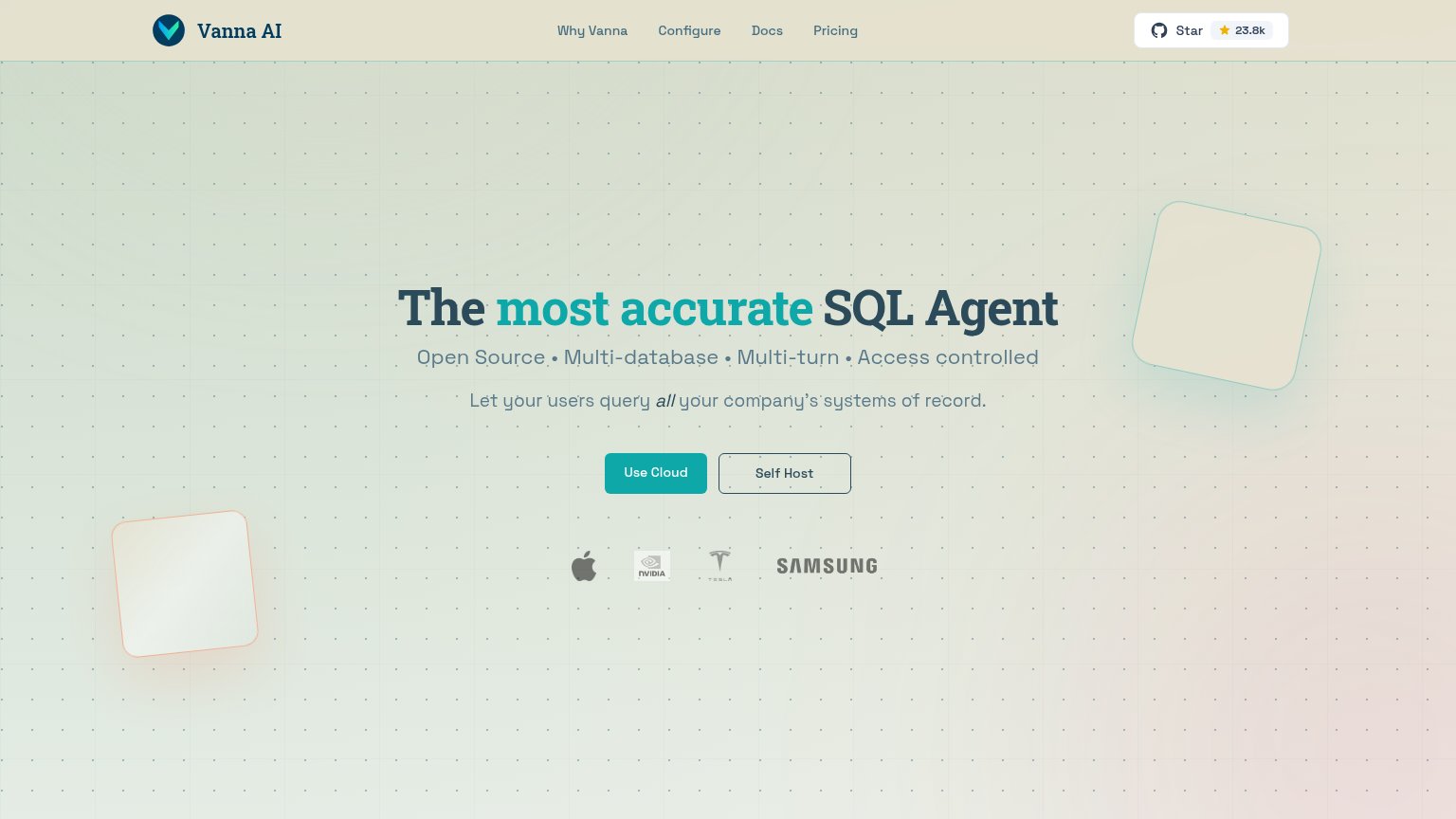
| GitHub "Star 23.8k" badge in the navigation | |
| "SOC 2, GDPR, HIPAA COMPLIANCE-READY" proof chip above the CTA | |
| Live prompt interface with model selector "Julius 1.2" and capability chips (Browser Agent, Build Website, Video, Image, | |
| "TRUSTED BY" logo wall (Verizon, Chanel, J.Crew, Workday, Domino's, Eaton) |
Mobile web
52FairThe phone experience as a first-class citizen.
 12
- Seed round banner — Sticky promo bar with "LEARN MORE >>" takes the top slice of the fold and routes taps away from conversion.
- Dashboard demo table — Desktop-density data table (six columns, tiny labels) crammed into the phone column; text like "CSM: Sarah Chen" is squint-small.
Value props
68FairTitle, subtitle, hero — do they sell the product's true value?
Olive’s headline
Build fast, secure BI tools with AI.
Working
Could improve
Information hierarchy
72FairDoes the design help or inhibit what the page is trying to say?
What works
What to improve
CTA
72FairCopy, size, verb, cost-feel — does the primary CTA earn the click?
How Olive compares
Recommended rewrites