
Your landing page’s weakest score is Information hierarchy.
How Flow Engineering ranks
74Growth scoreupdated
category scores
category scoresShowHide
Information hierarchy
72FairDoes the design help or inhibit what the page is trying to say?
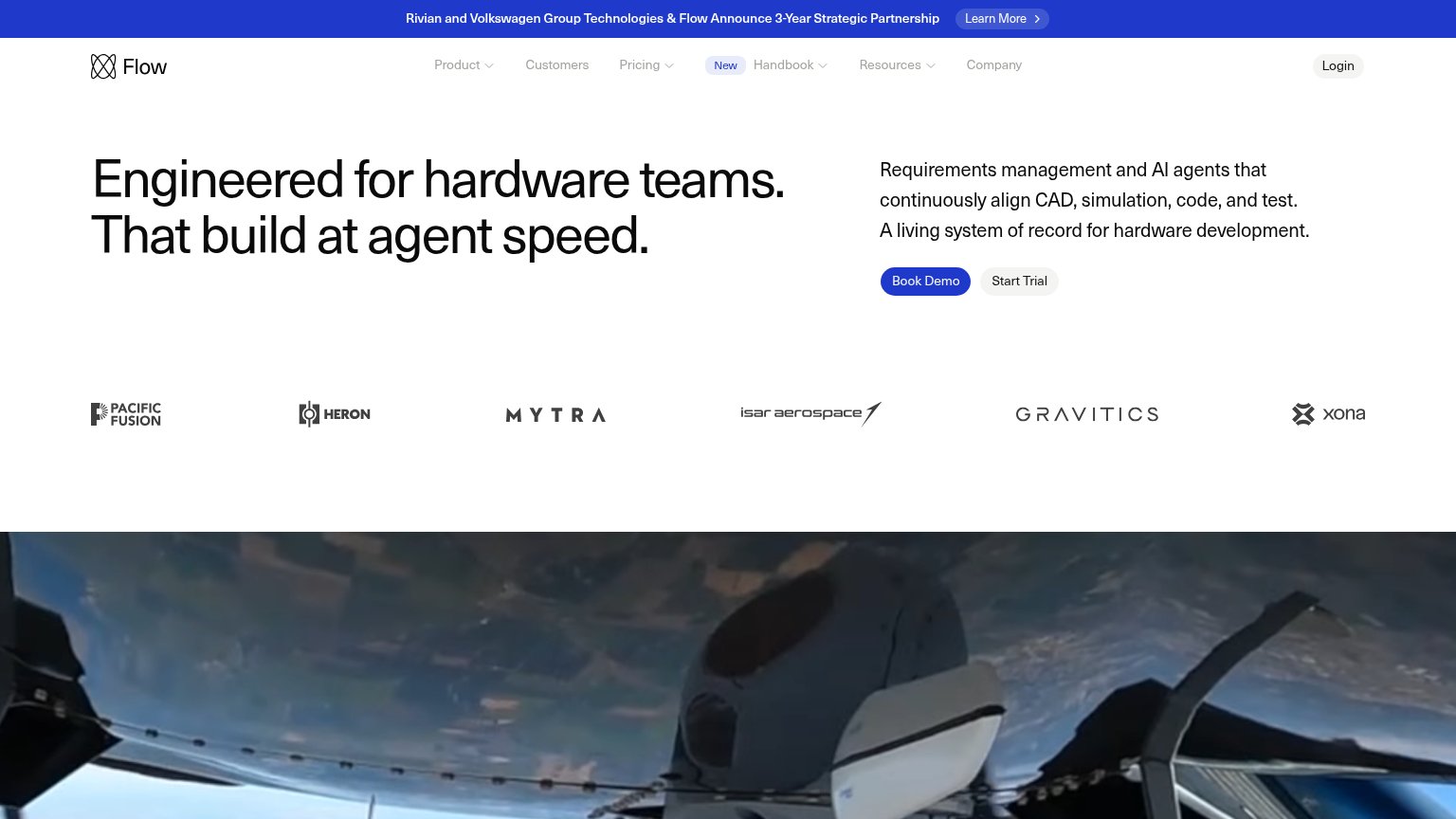 1234
- Announcement banner Learn More — High-contrast pill on a blue bar is the first scan target and pulls attention from Book Demo.
- Nav link row — Five dropdowns plus Login create eight-plus exit paths before the primary CTA.
- Hero video crop — The footage is cut at an ambiguous angle at the fold edge, reading as a dark band rather than the product's world.
- Start Trial button — Sits flush beside Book Demo at similar size, splitting the single conversion decision.
CTA
72FairCopy, size, verb, cost-feel — does the primary CTA earn the click?
Problems
- 'Book' feels costly — sales call
- cheaper trial demoted to gray chip
- button small vs. huge headline
Value props
72FairTitle, subtitle, hero — do they sell the product's true value?
Flow Engineering’s headline
Engineered for hardware teams. That build at agent speed.
Requirements management and AI agents that continuously align CAD, simulation, code, and test. A living system of record for hardware development.
Working
Could improve
Trust
74FairProof that the product is real, competent, and safe to try.
How Flow Engineering compares
Trust read
Mobile web
78FairThe phone experience as a first-class citizen.
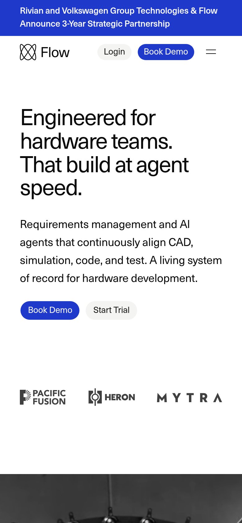
What works
What to improve